


Mezzanine introduces a new form of type-case and typesetting. based off the typeface Flaxman designed in 1967 by Edward Wright, Mezzanine borrows its quietly rebellious attitude, and challenges how languages using the Roman alphabets – such as English –
have been typeset for centuries. Mezzanine looks at typography with a modern attitude, particularly with regards to digital technology. It relinquishes the need for uppercase, and instead introduces a new mid-case, used only sparingly.
have been typeset for centuries. Mezzanine looks at typography with a modern attitude, particularly with regards to digital technology. It relinquishes the need for uppercase, and instead introduces a new mid-case, used only sparingly.

unlike boxy uppercase letters, these mezzanine case are more fluid and introduces descenders to make the overall type shape more organic and readable. some designs are mergers with previous uppercase designs, while some are taller versions of their lowercase counterparts.


research
technology has changed the way we convey and view textual information. with communication done via mobile devices and computers, it is no wonder that our method of typing and reading has changed. one main change I identified was that we were using capital letters much lesser now. this is likely due to the hassle of capitalizing the first letter of each sentence. in text and emails, we tend to break up sentences with a paragraph (or enter key), instead of using 'proper English typesetting rules.'
this shift in typesetting rules intrigued me, resulting in Mezzanine -- not simply a typeface, but the next evolution in type.

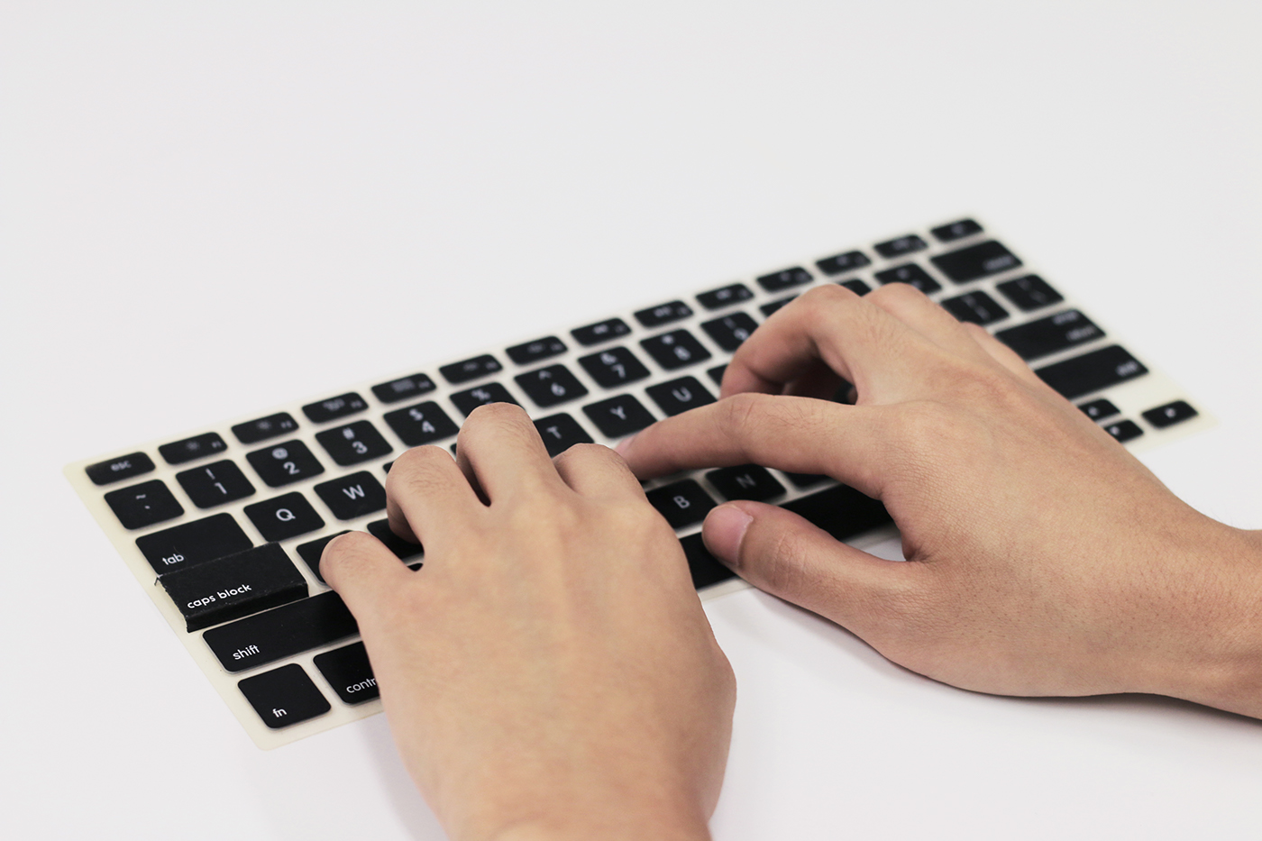
caps block echoes the same quiet rebellion as Mezzanine. with the caps lock key underused (even removed from virtual keyboards,) the act of making it entirely redundant is an ironic yet passive aggressive move by designers and typographers, signalling their support in the new type evolution.


