


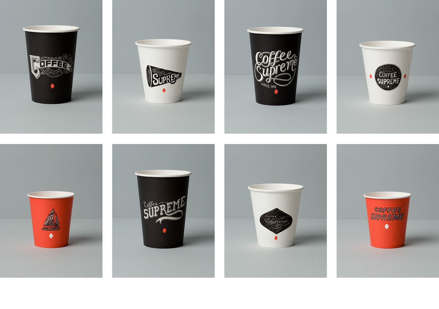

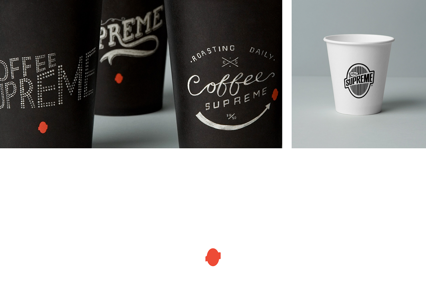
Sixteen different take-away coffee cup designs, each with their own hand-drawn variation of the Coffee Supreme logo, adds a light-hearted personal touch to their customers' daily routine of buying a coffee.
Winner: Dieline Packaging Awards, NZ Best Design Awards
Featured in multiple design coffee table books & design publications.
part of the rebrand of Coffee Supreme by my design studio Hardhat was design of their take-out cups. To communicate some of the company's quirkiness & character as well as the hand-crafted nature of their business, the designs reference old hand-made signage, including 1800s packaging labels and sign-writing, 1930s movie titles and early neon.
There are 16 in total, each with a different illustration lovingly hand-drawn by Team Hardhat in paint, ink, chalk and pencil. The cups come in three different colours from the brand palette, allowing them to be easily distinguished by cafe staff.
There are 16 in total, each with a different illustration lovingly hand-drawn by Team Hardhat in paint, ink, chalk and pencil. The cups come in three different colours from the brand palette, allowing them to be easily distinguished by cafe staff.
©2023 Jenny L Miles. All Rights Reserved.


