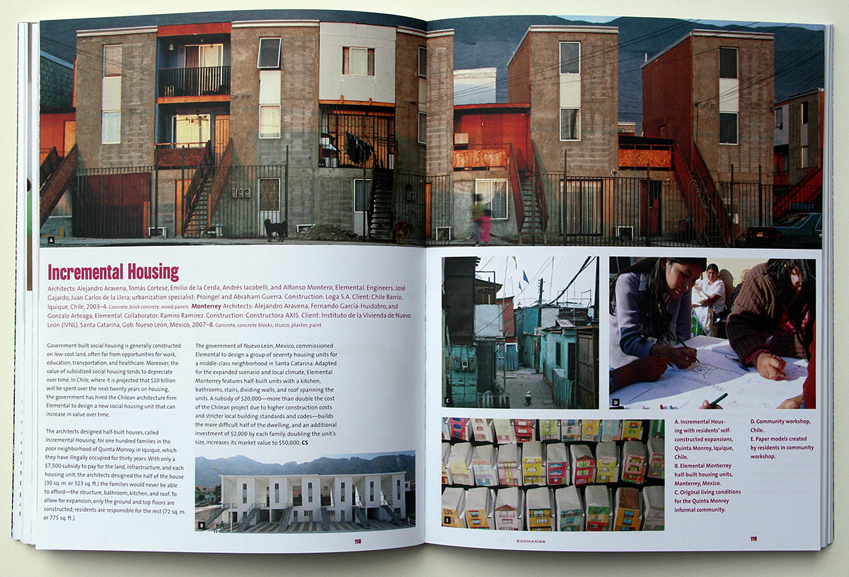
Lured to the city in search of work and greater social mobility or fleeing conflicts and natural disasters, many urban migrants suffer from insecure land tenure, limited access to basic services such as sanitation and clean water, and crowded living conditions. At the same time, these informal cities, full of culture and life, increase opportunities to create solutions to the problems they face.
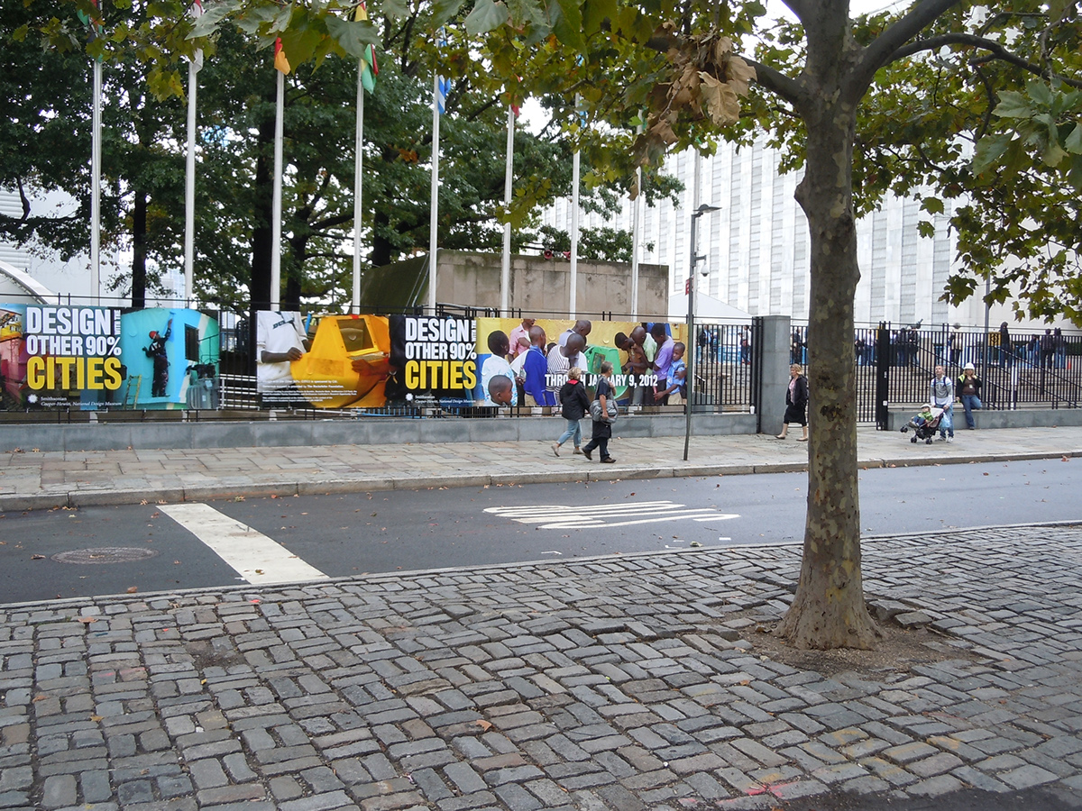
Design with the Other 90%: CITIES features sixty projects, proposals, and solutions that address the complex issues arising from the unprecedented rise of informal settlements in emerging and developing economies. Divided into six themes—Exchange, Reveal, Adapt, Include, Prosper and Access — to help orient the visitor, the exhibition shines the spotlight on communities, designers, architects, and private, civic, and public organizations that are working together to formulate innovative approaches to urban planning, affordable housing, entrepreneurship, nonformal education, public health, and more.
Design with the Other 90%: CITIES features sixty projects, proposals, and solutions that address the complex issues arising from the unprecedented rise of informal settlements in emerging and developing economies. Divided into six themes—Exchange, Reveal, Adapt, Include, Prosper and Access — to help orient the visitor, the exhibition shines the spotlight on communities, designers, architects, and private, civic, and public organizations that are working together to formulate innovative approaches to urban planning, affordable housing, entrepreneurship, nonformal education, public health, and more.

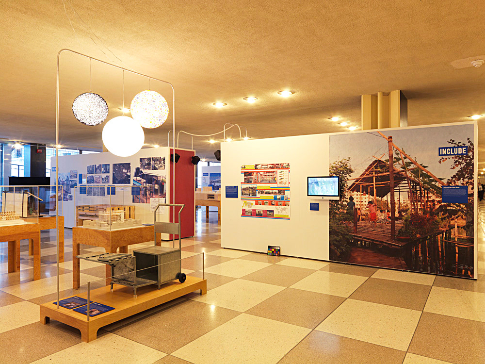
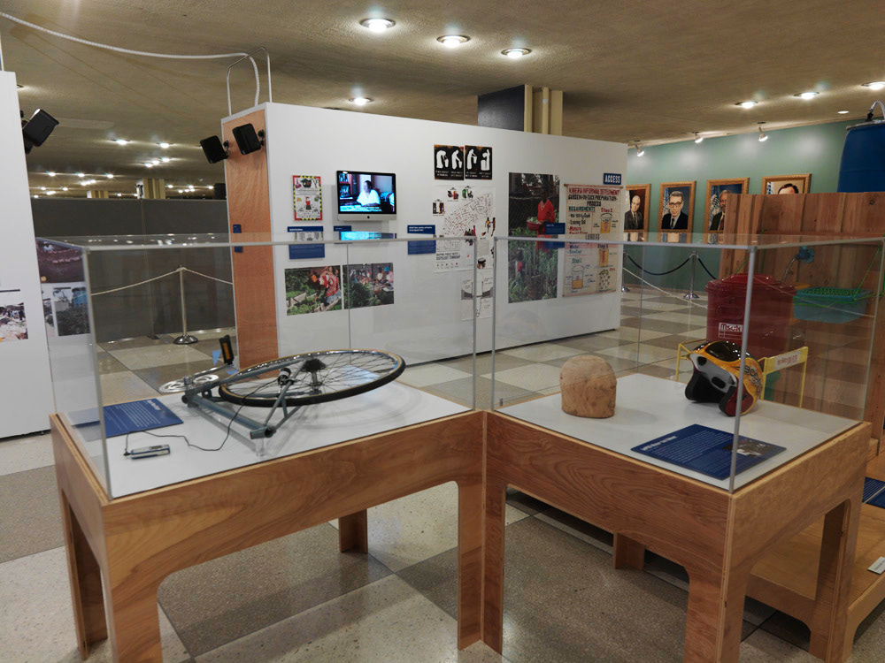
Following the success and built equity of the original Design 90 exhibition, our challenge was to maintain a visual continuity between the two exhibitions that clearly established the independent character of each. An important component of adapting and evolving the visual system was to highlight the CITIES theme as a significant feature of the event, promotional, and merchandising brand.

Working collaboratively with the exhibition designers, Morehead & Morehead, we developed a visual program and materials schedule that presented traditional museum archetypes (didactic panels and object labels) juxtaposed against informal wall graphic postings produced according to resource methods often found in the subject communities: re-purposing and re-use of existing, readily available materials and construction techniques.


Crowd sourcing,consumer and mobile phone photograpy resulted is a vast range of exhibition images assets from which we would need to produce a cohesive and clear hierarchy of image reproductions. In addition the the quality issues of the source photos, we challenged our selves to also address the potential travel for the exhibition graphics and how to make the exhibition graphics practical for low-cost de-install, packing, shipping and re-installation.
.
.


Our solution to address al of these important issues was to create a static datum with the object labels and the the informal imagery mirror the apparent organic organization of subject informal communities. We printed on Spun polyesther which is a recycled and recyclable materal, resistent to sagging, tearing or rough handling. The prints are attached to the walls with simple carpenter staples.


Exhibition catalog uses the same commodity visual language originally developed for the first exhibition graphic program. In the new program, we pushed the