Web design, marketing design, product design — PaySwitch
Payswitch is a financial technology (fintech) platform that lets its users accept payments from dozens of service providers and products all over the country. It enables small store owners to augment their income and bridges the gap between offline, analog and online, electronic payment systems.
My role in this startup was to revamp both the "inside" and "outside" aspects to the service. On the outside, I designed a clean, modern, but welcoming homepage to attract customers and partners. On the inside, I designed the interfaces of application for web, phone, and tablet to be clear, friendly, and non-intimidating. I did the front-end code implementation for both sides, too.
Landing pages
Brand interpretation.
While a different person did the rebrand of the logo, typeface, and color palette, it was on me to flesh out how the brand would translate to an online, electronic, interactive context. The logo was monochromatic, but given that the look had to be a little less corporate, I decided to inject a complementary color to the site design. Also, since there was no budget for licensing Gotham in webfont format, I scouted for a reasonable alternative and settled on Varela Round.
Information architecture & copywriting.
Before they finally settled on a different slogan, I suggested the tagline, "Selling Made Simple" which later became "Selling Simplified". There was a dearth of content at the start, so I had to map out what homepage needed to say before official copy was given. I also translated the testimonials from Filipino to English.

Animation
I incorporated several native, CSS-based animations on the homepage. In the hero area, the updated slogan morphs from one adjective to another.
To also demonstrate how far-reaching the PaySwitch service is, I came up with the idea of showing a map of the Philippines with the PaySwitch map pin icon dropped on different locations. Behind every testimonial is a satisfied customer from a different part of the country, and as each one comes into view, the corresponding location on the map glows.
Animated slogan in the homepage hero area
Animated map and testimonials

Sign Up
The sign up page lets the potential customer compute how much they're going to pay based on their needs.

Social banners


Web App
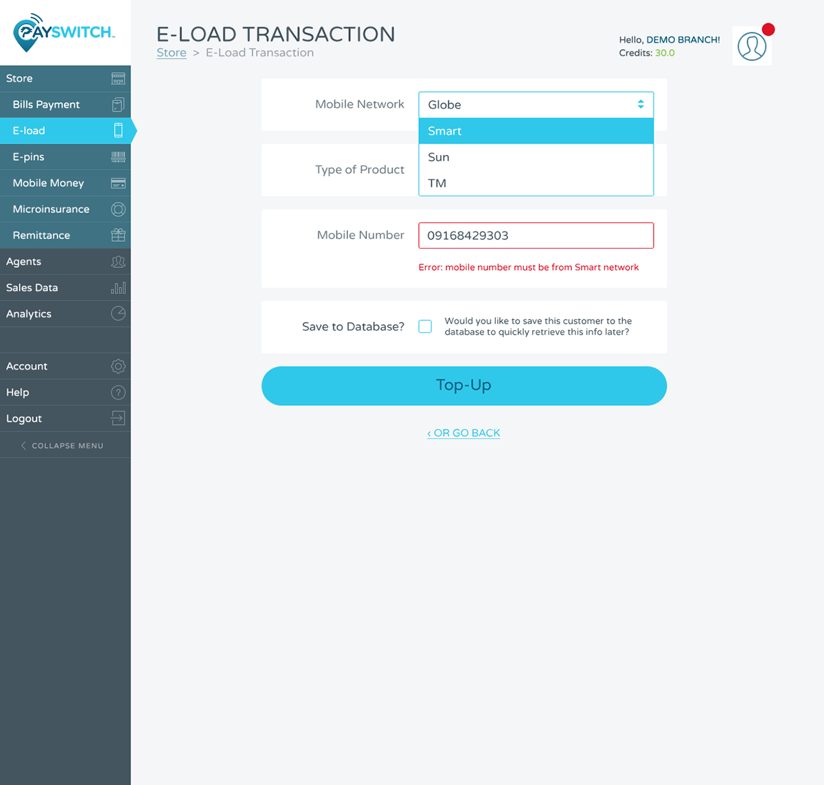
The goal of the web application was to sell to the store owner's customers quickly and efficiently. I opted for large buttons and modern icons for the storefront page to echo the style of a point of sale system.

Transaction page
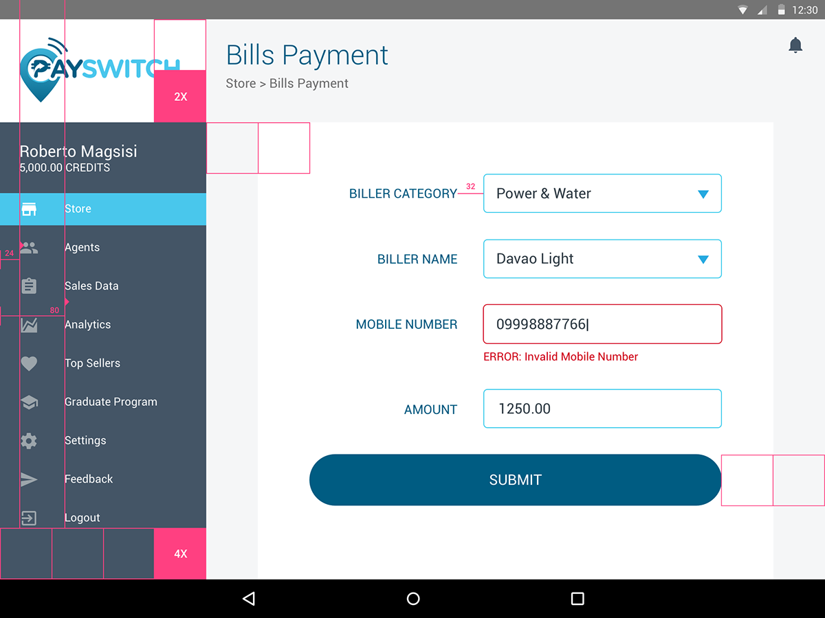
Other transaction types become visible and accessible in the sidebar menu when you do a transaction, just in case you want to switch up.
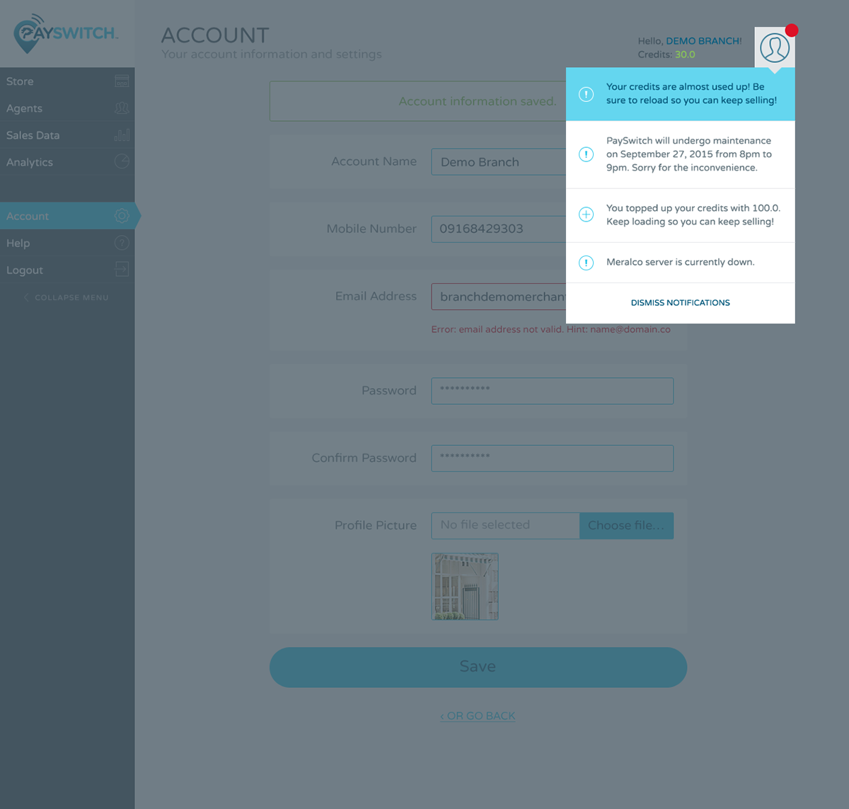
Notifications
Notifications about credits and service status are displayed in a popup at the top right of the page at all times.
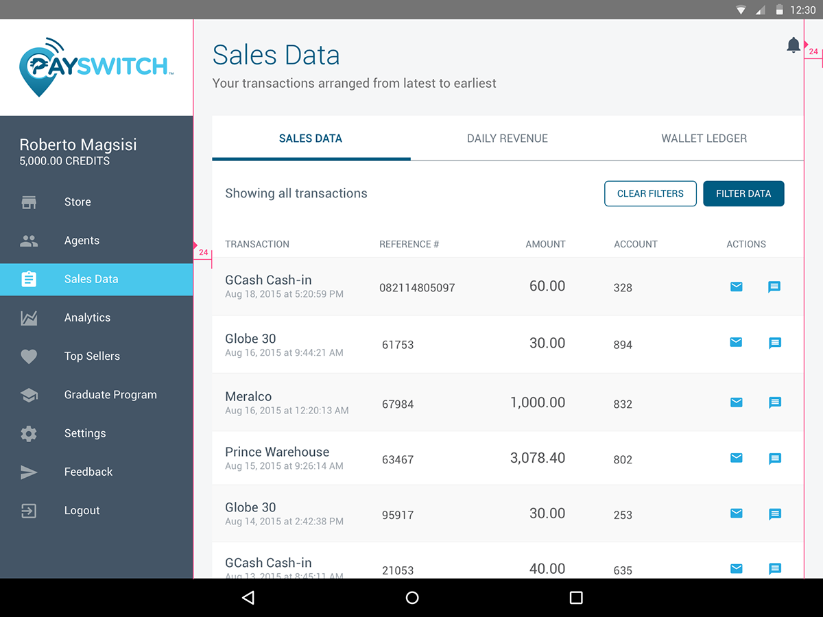
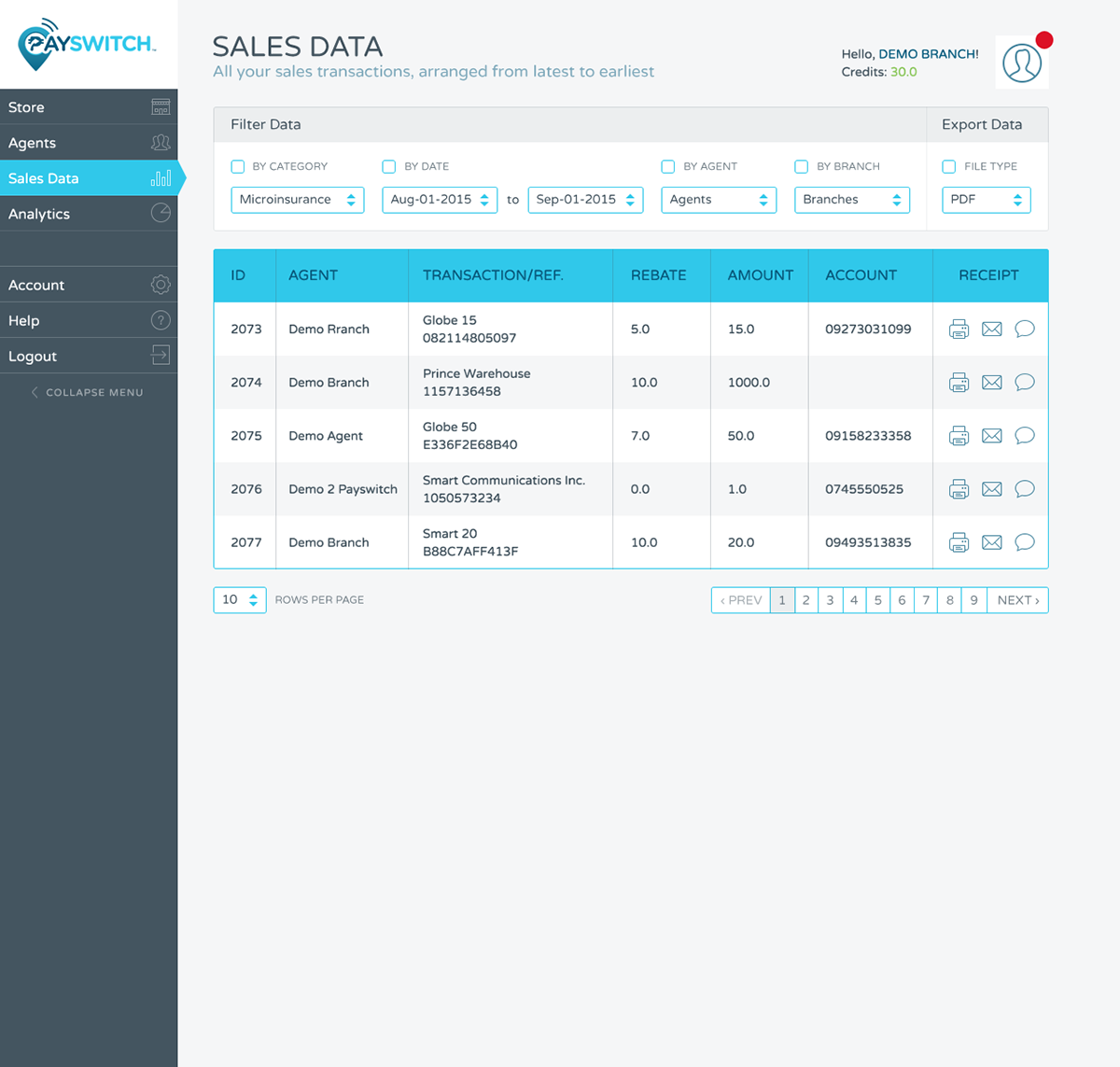
Sales
Quick actions for printing, emailing, and sending receipts come in icon buttons.
Mobile App
The mobile app design is informed by the Panalo app, but with the PS branding applied to it.


Tablet App
The tablet version looks a lot like the web app version, but simplified and optimized according to Material Design specs, from the icons, to the typeface, to the spacings.