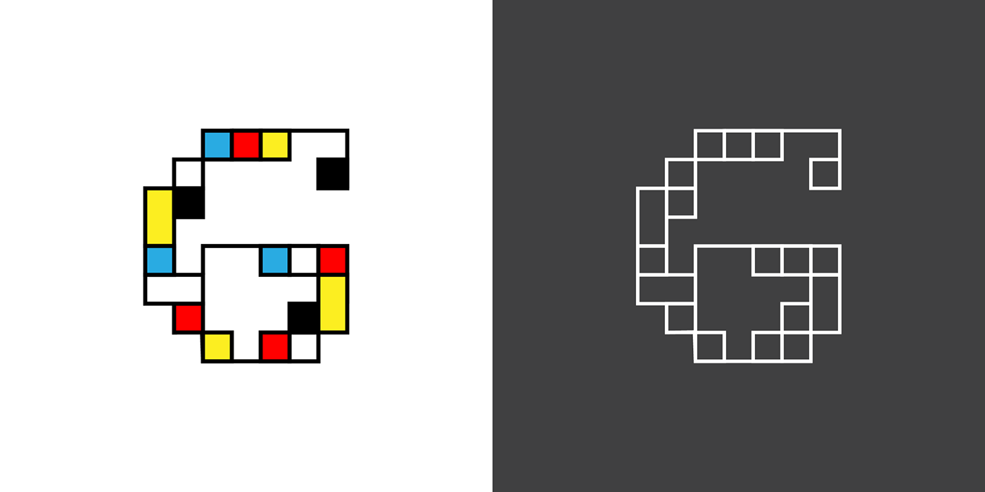
This #36daysoftype #04 alphabet was inspired by the geometric minimalist paintings of Piet Mondrian. I limited myself to squares in two sizes and rectangles that were double the size of the small squares. Colors were limited to red, blue, yellow, black, and white. When I got to D on Instagram, I decided to add an outline version for each letter. Adding the gray squares with the white outline framework of each character created a checkerboard effect on the screen and helped isolate the individual color versions better.
There are endless variations of possible shape and color placements. If I were to start again many of the characters would look very different. The Piet Mondrian poster at the end of the alphabet uses taller characters with some also wider than the original letters.