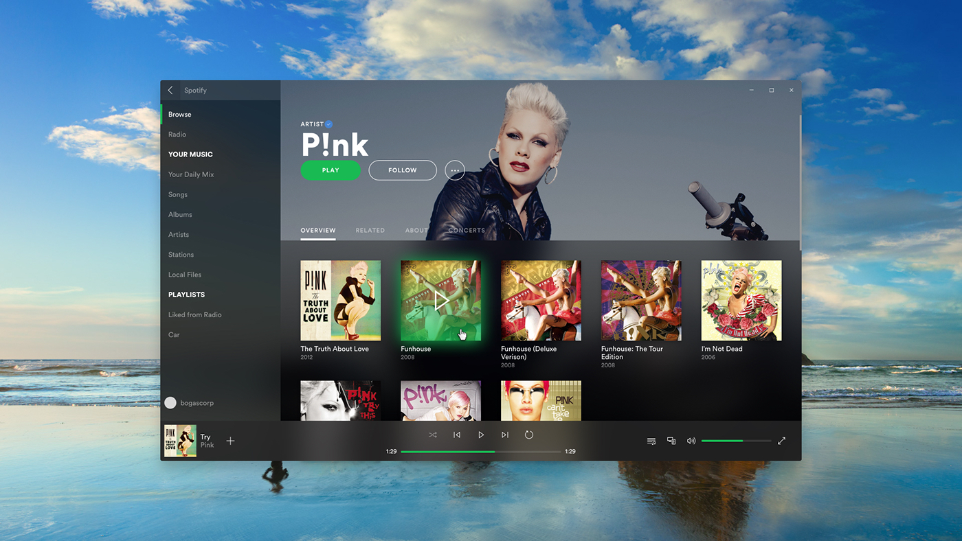
A first ideia of how could Spotify leverage Microsoft's Fluent Design in the desktop app.
The UI is still familiar so it's easily recognisable.
The scroll bars don't always show up, specially with touch screens, so the acrylic on the control bar at the bottom provides visual information that there is more content available.
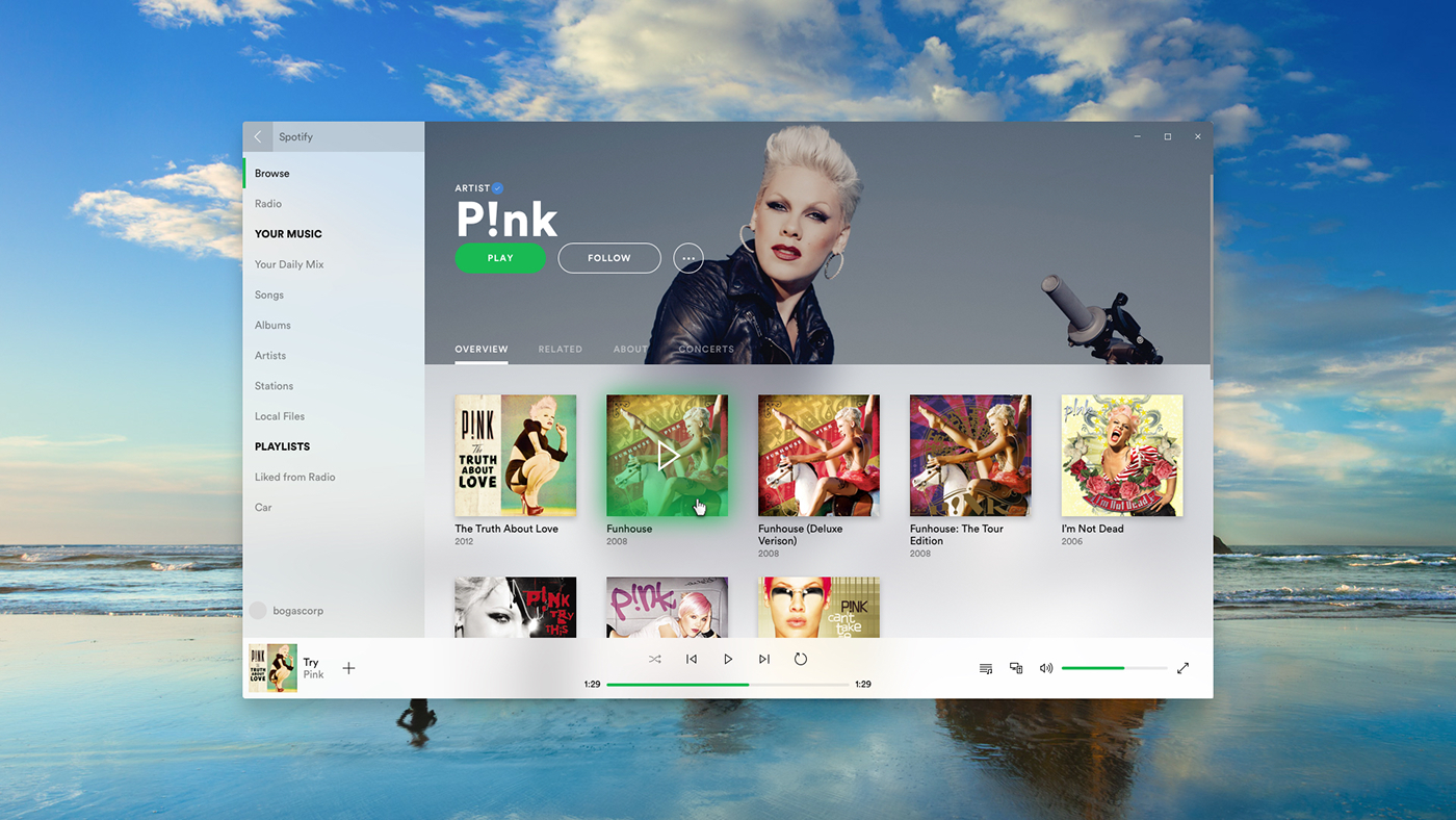
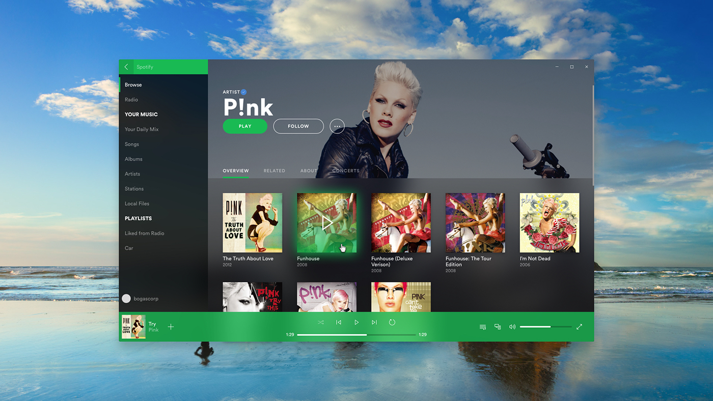
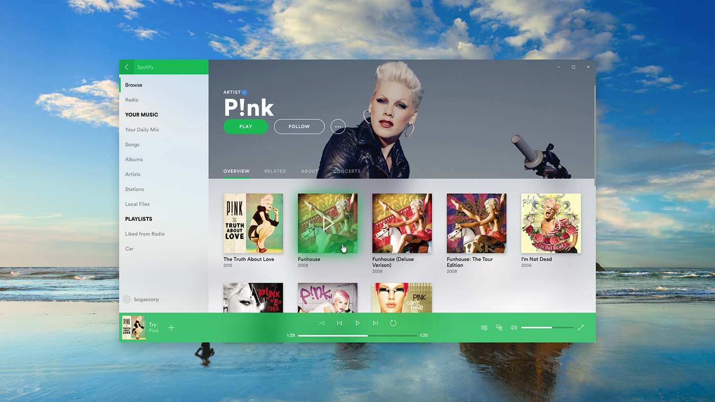
The color variations were a test to see how they would behave. My personal favorites are the full dark and the full light. They showcase the content better and don't steal focus. The light one is specially great for places with lots of natural sunlight.