


Brew York City
Concept | Naming | Logo & Brand Identity | Package Design
Bold. Bitter. Badass.
Fresh. Tart. Funky.
High impact and legibility from a distance was the goal of this no-nonsense beer beverage brand. Big and bold like NYC and its iconic buildings, this type-driven solution features several weights of Block Berthold typeface, minimal graphics, and only the important copy details for true been connoisseurs.
To compliment the minimalist design approach, both the IPA and Sour packaging were created with just 2-color printing, which also has the benefit of reducing the client's costs.

Brew York City IPA logo design.
Beverage Packaging
Shown are logo, bottle label, brand guidelines, and 6-pack carrier designs for IPA and Sour Wheat Ale varieties

IPA 6-pack carrier design with bottles.

IPA front of label and pint glass design.

Several rotated views of IPA label design.


Initial rough exploratory sketches.
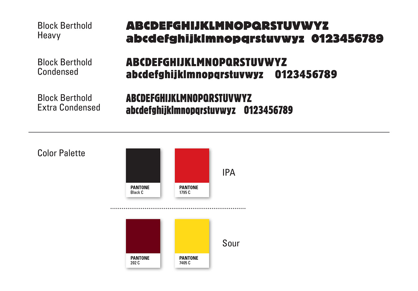
Brand color and typography style sheet.
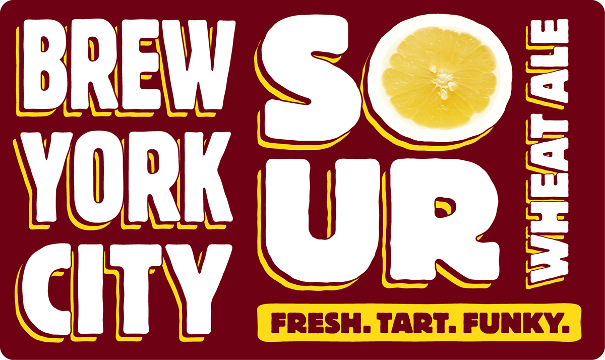
Sour Wheat Ale logo design.

Sour Wheat Ale 6-pack carrier design with bottles.

Sour Wheat Ale front of label and pint glass design.

Several rotated views of Sour Wheat Ale label design.
. . .


