Wooden
Hand-made
Professional
Hungarian
In harmony with nature
Balanced
Free.
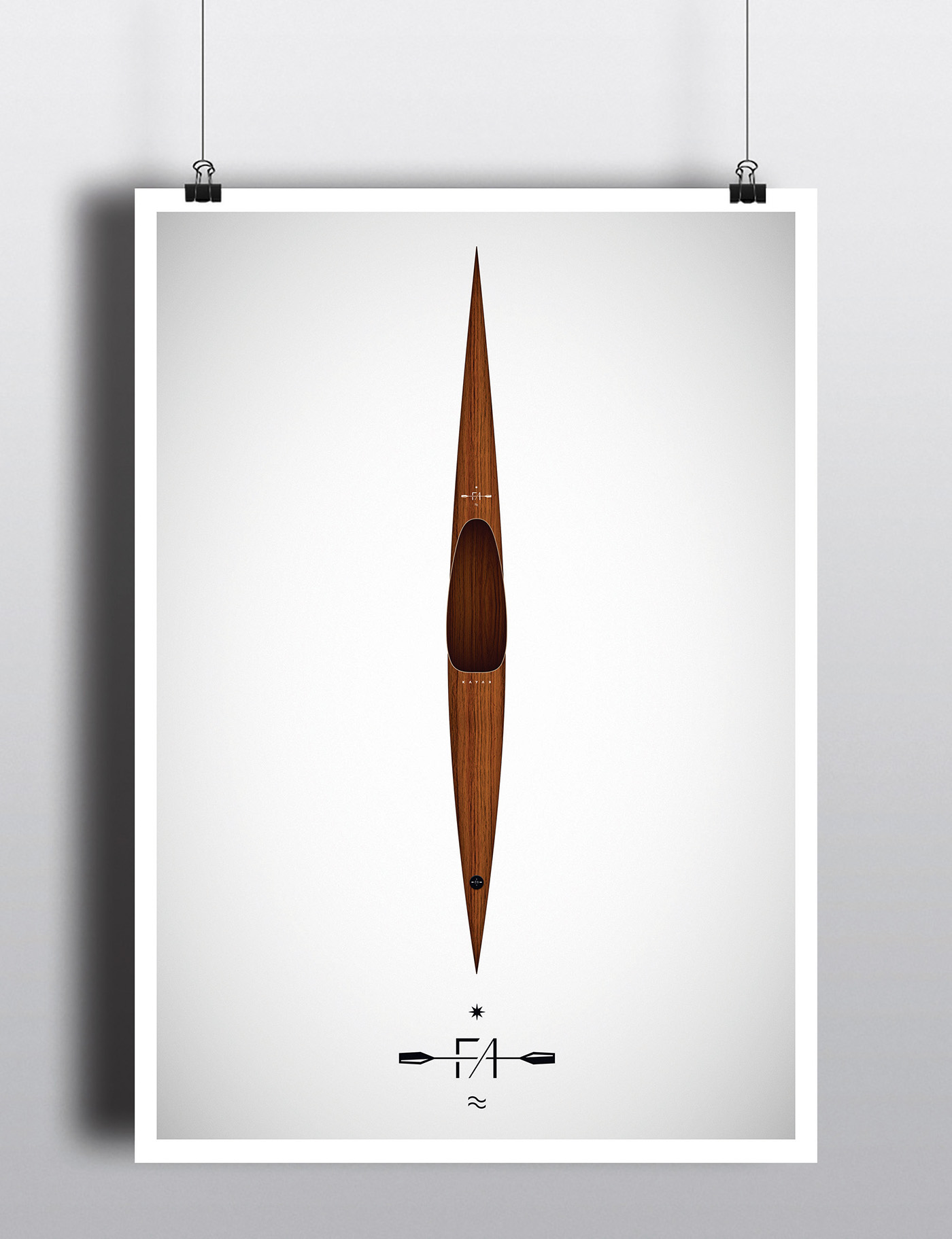
The logo has been created based on these qualities, consisting of two units.
The “FA” (“wooden”) part is a refined composition of the two letters, taking on meaning by the crossing kayak paddle.
The sun or star and the water motives complement this image, altogether creating the leading logo,
which is able to reflect the brand identity per se. The balanced, central-symmetric symbol evokes a feeling of unity
and harmony with nature, yet at the same time the intersection and formation of the letters reflects professionality and
manufactural handcraft. The “KAYAK” lettering is the other unit of the emblem.
The characteristic, minimalist letters and the arrow-like “K” letters facing inwards further strengthen
the symmetry of the symbol, thereby emphasizing its balance, which is a particularly significant momentum of kayaks.
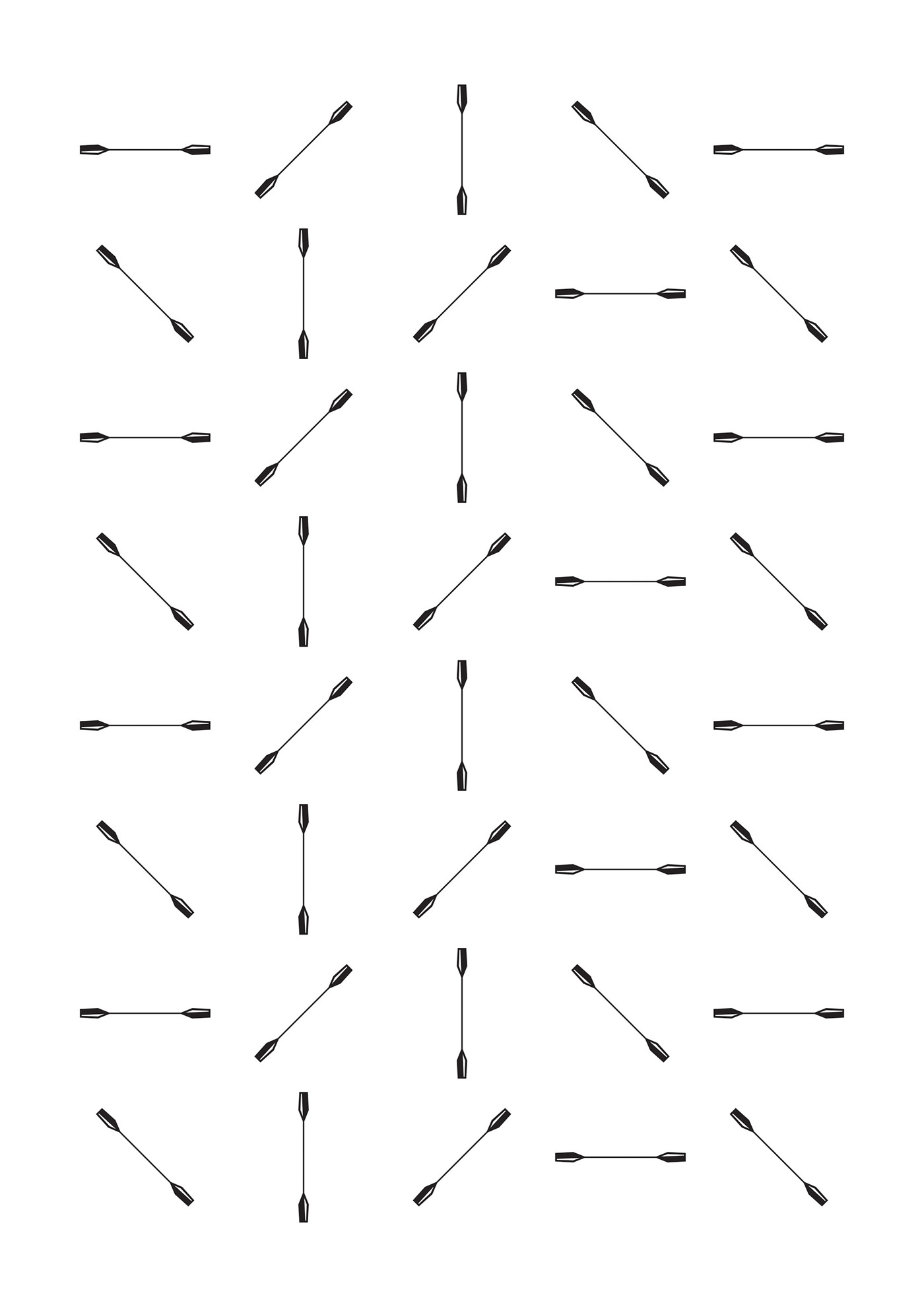
An additional advantage is its compability with a wide range of technical methods (punching, embossing, blow, etc.).
Depending on the application, both units can be used together or separately as well.
Yet another element of the brand image is the slogan: handmade - wooden - Hungarian.
These words verbalize the identity of the brand. The defining colors of the brand are the contrasting black and white.
The logo works both in a positive and negative form. Additional colors may be used for complementation;
nevertheless, black and white always remain the leading colors.