A Windows Desktop Application for PC to PC file sharing
The Ask:
A standalone Windows desktop app capable of running on a Windows 7 platform with standard Windows functionality such as browsing to a file and uploading content to be parsed in a database and displayed in a table. The ability to utilize a standard set of controls featured as show in the original app but laid out in a more user-friendly way.
Functionality must haves:
Filters in real time:
Controlled, controlled group, removes from the list of results
Clicking on a certain item
Drop down action items
2 or 3 columns fields out of 8
Editable drop down for tech logging
User should be able to:
Mark results under different categories
Filters for reordering
Auto filter for control
View historical data.
Platform: Being built on Windows 7
The Original App
Here it is, in all it's glory. 1996 called and wants its app back:)
The good news is the desktop app (in this state) is functional. It does most things the client needs but it is lacking in ease of use, has a ton of wasted space, and is very confusing from an interactive standpoint. The app runs on an earlier version of Windows and can no longer be updated. This is a chance to go big by designing for Windows 7 and up, easing cognitive load on the user, and introducing a simpler, cleaner UI.

The First Pass
Here is v1 of the new solution for the client. Visually it is a lot more readable and a ton of room is opened up by moving the filter menu to the top of the page. This one change allow allows the ability for expanding filters when the user is interacting with the menu, and collapsing the menu to hide it and interact with table content or or other user controls and action menus on the page.

Menus and table interactions
The next screen shows some of the menu interactions such as a slide out menu drawer, menu switcher for different sets of menu functionality (by user type) the selection of an entire table row, a drop down of an individual table cell for editing, and content alerts for items needing immediate attention.
The next screen shows some of the menu interactions such as a slide out menu drawer, menu switcher for different sets of menu functionality (by user type) the selection of an entire table row, a drop down of an individual table cell for editing, and content alerts for items needing immediate attention.

File browsing capability and revisiting those menus/ interactions
This is the same screen showing file browsing capability. This is likely not a style of menu that would be available after discussion but this wasn't known until the client meeting. There will only be one type of file that is available for upload and single file upload will only be supported in this version.

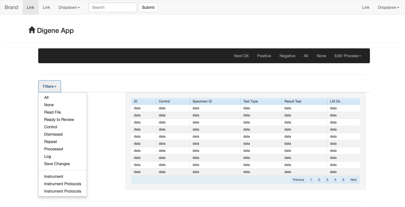
Adding a collapsible/ expandable filter menu
The menus are getting a bit more refined here, along with table interactions. This is more of a realistic idea of how the app would look and behave on Windows 7/ 8. The menu interaction here is a traditional slide out menu that users are a lot more used to.

Refining styles, testing, and validating code
In version 3 styles are starting to become more refined, scripts are being validated by CSS, HTML, and Javascript, and interaction is being built in utilizing these technologies. The filter menus are refined, interaction is over layed rather than pushing content down, the date picker is now one drop down for less clicks, the table data is a lot easier to parse, and the UI is a lot cleaner and easier to use overall.

Putting it all together and switching gears
As I was working with engineering on this project it became easier to translate the HTML and CSS over into bootstrap framework and utilize their library along with J-Query libraries for code implementation. Below is a screenshot as I was putting the code together in Dreamweaver Live View, and browser testing in Google chrome. The final output code is responsive, placeholders are in place for filters are they are being configured by engineering.