Relux
Branding, Art Direction, Graphic Design
This is a branding work for "Relux", an internet service for making reservations at lodging facilities. "Relux" is a combination of the words "relax" and "luxury", as the service carefully selects only high-class lodging facilities for its users.
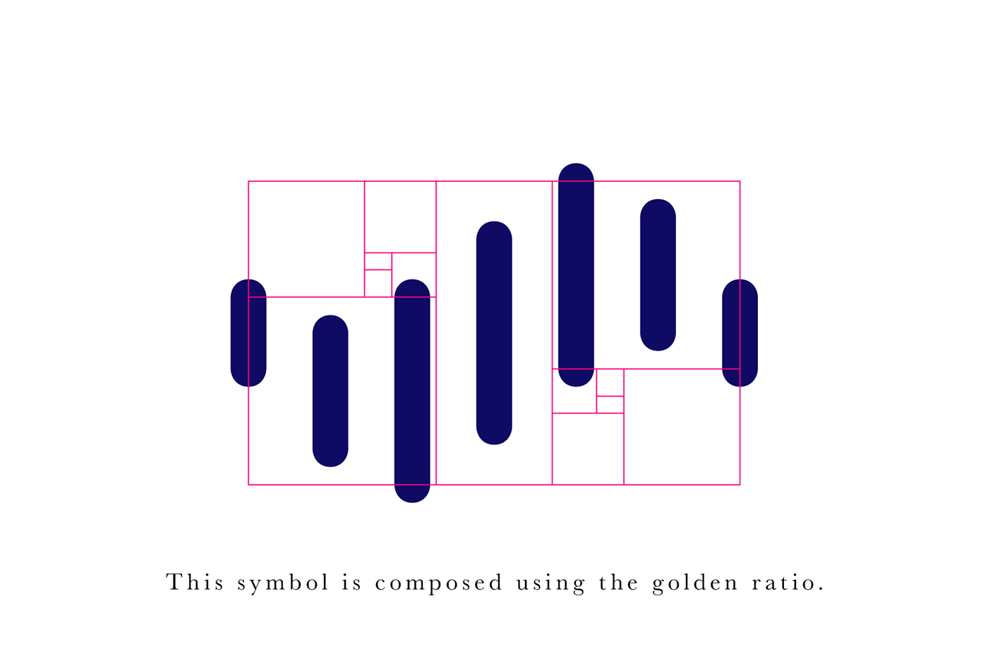
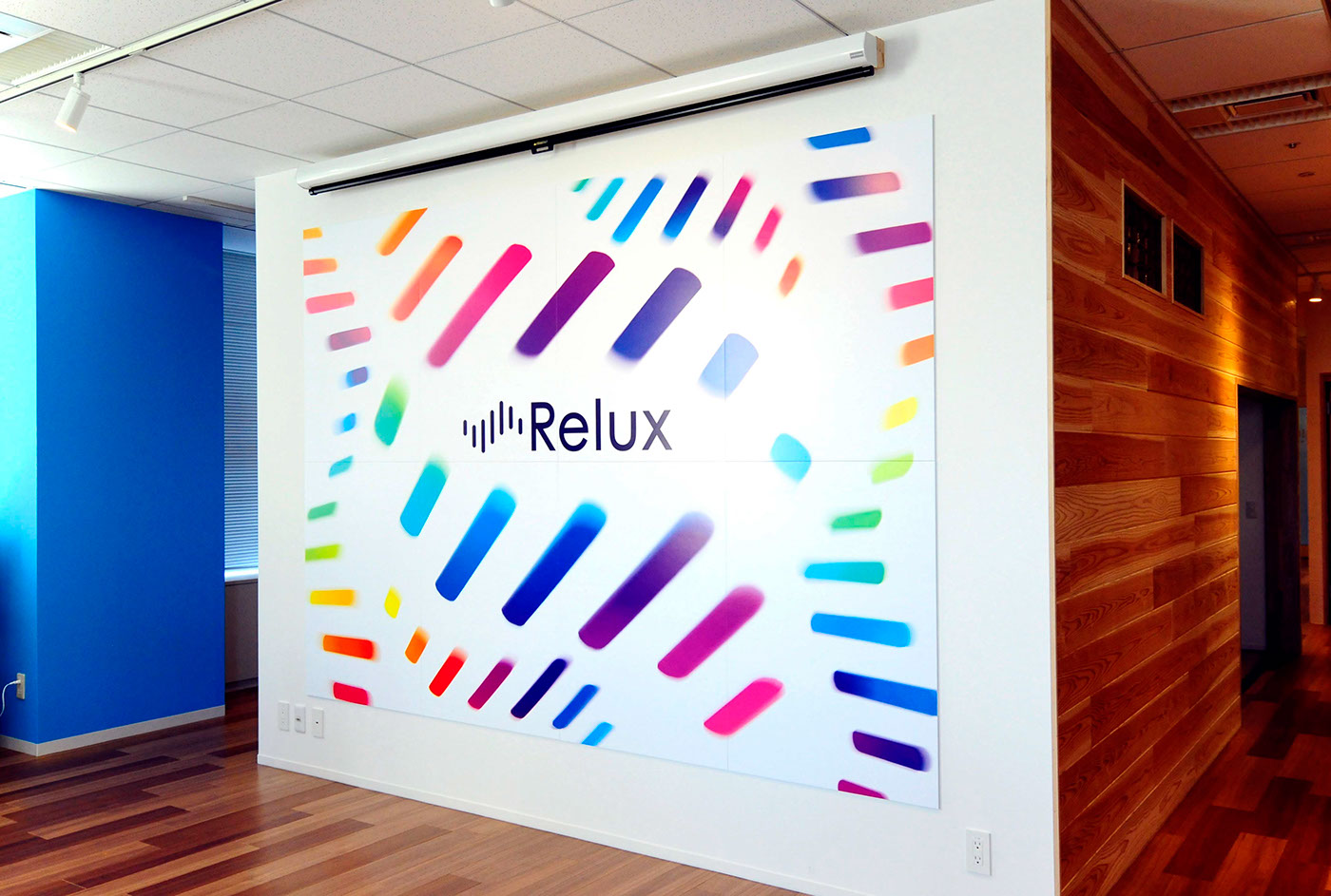
The seven lines in the symbol represent the biorhythm of our feelings such as joy, sadness, or surprise, as well as each of the seven days of the week. This is intended to convey that "Relux" is there for how you feel each and every day. The poster uses this symbol with a various colors to represent our wide range of feelings as human beings and the experience of discovering new lodging on our journeys.
Awards
2017 Biennial of Poster Bolivia - BICeBe 2017 [Selected]
2017 Graphis Design Annual 2018 [Merit Award]


