I found the initial four in an old sketch book and took it from there. The whole project is an exploration of analysis vs. synthesis culminating in total deconstruction. As in taking it apart and putting it back together without really knowing what goes where.
I always loved kufi calligraphy and old school graffiti because you need to basically create a set of rules and stick with it to stay "in style." Of course, the boundaries of the rules are where it's at. Whatever.
Also, repetition changes, ligatures rock, and any sufficiently intelligent idea has the inherent means to inspire new shapes. You decide.
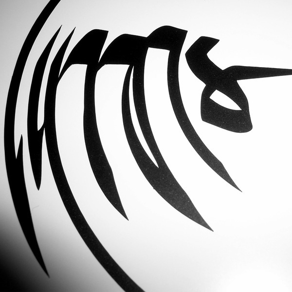
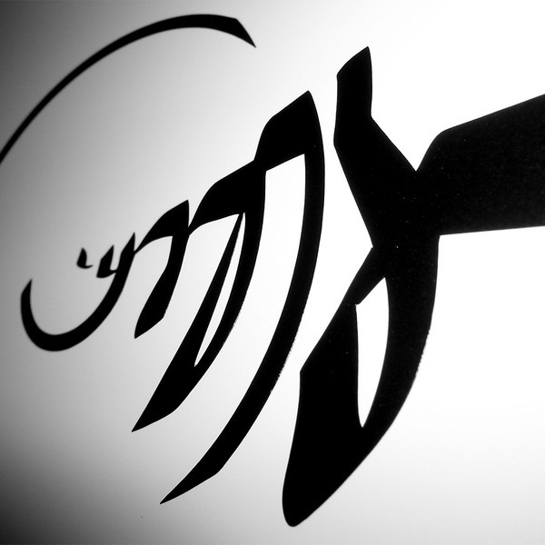
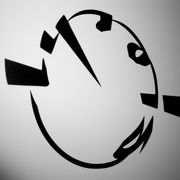
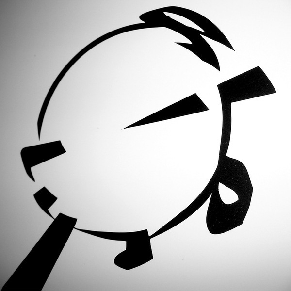
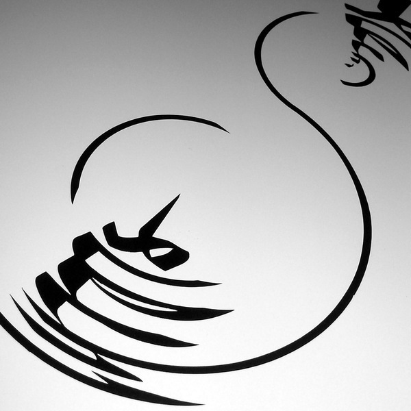
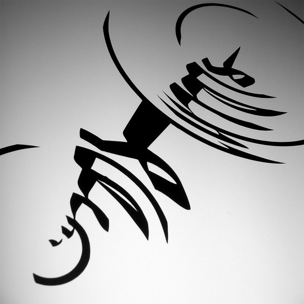
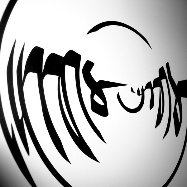
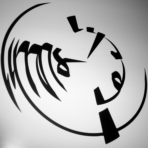
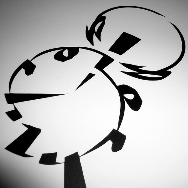
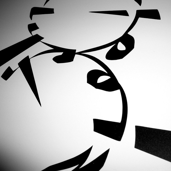
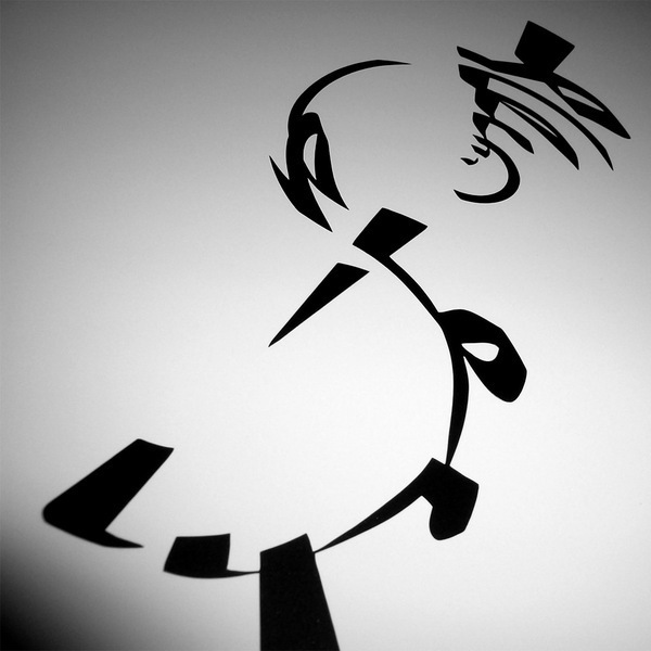
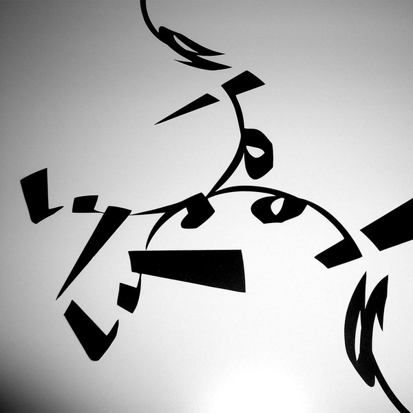
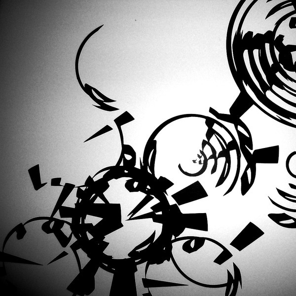
The Polar Typography series is a typographical exploration of an old LYROIS graffiti logotype. It is a series of 13 pieces, with 4 basic versions and derivatives in certain directions. The pieces are signed on the back.
Material:
Matte black vinyl on matte, almost smooth, white aluminum sandwich board.
Dimensions:
10 x 10 x .2 inches or 25 x 25 x 0.5cm.
Material:
Matte black vinyl on matte, almost smooth, white aluminum sandwich board.
Dimensions:
10 x 10 x .2 inches or 25 x 25 x 0.5cm.
The whole she-bang: http://behind.lyrois.com/2010/03/polar-typography-introduction.php
Polar Type #01 -- Fangs & Claws
Polar Type #02 -- Ripple or Carving?
Polar Type #03 -- Chasing Your Own Tail
Polar Type #04 -- Mirror or Magnifying Glass?
Polar Type #05 -- Meandering
Polar Type #06 -- Broadcasting
Polar Type #07 -- Nothing like a Vinyl Record
Polar Type #08 -- Watching the Clock
Polar Type #09 -- Dual-Use
Polar Type #10 -- Meet & Share
Polar Type #11 -- Dotting the i
Polar Type #12 -- Tracing the Invisible
Polar Type #13 -- The Opposite of Type


