Daily UI Challenge
For 100 days, I will be doing one UI prompt per day courtesy of www.dailyui.co. This will help me explore new designs and continually challenge myself to grow and expand my knowledge. I will continue to update this page as I go through the challenges for each day.
Challenge #001 - Sign Up
"Design a sign up page, modal, form, app screen, etc. (It's up to you!)"
I wanted to create a sign in/sign up screen that played off each other. I decided to go with complementary colors to make it vibrant and playful. The playfulness was supposed to be shown with how the two different cards interacted with each other when toggled. However, I'm still learning how to animate my mockups and will hopefully have more fluid animations for future days. It was my first time trying to animate with Principle.


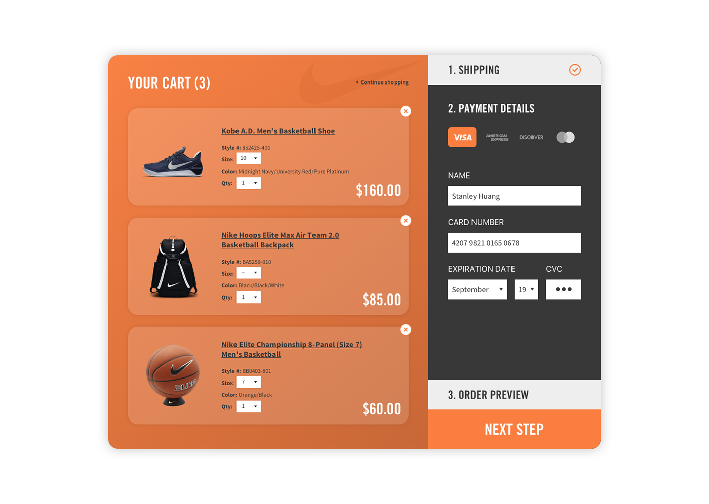
Challenge #002 - Credit Card Checkout
"Design a credit card checkout form or page. Don't forget the important elements such as the numbers, dates, security numbers, etc. (It's up to you!)"
Unlike the first challenge, I wanted to work with an established brand instead of creating a generic page. I checked out a bunch of my favorite brands to see if there was a checkout page that I thought could be better. I landed upon Nike's checkout page and thought to myself that while usable, their checkout process wasn't as forward-thinking as their products. I decided to use their orange (#FA7E3F) as the main color. They currently use it as a secondary color.
Challenge #003 - Landing Page (above the fold)
"What's the main focus? Is it for a book, an album, a mobile app, a product? Consider important landing page elements (call-to-actions, clarity, etc.) (It's up to you!)"
I focused on another big brand in today's challenge. Michael Kors has a variety of products with vibrant colors. I wanted to make an eye-catching landing page that wows the user with strong colors.


Challenge #004 - Calculator
"Design a calculator. Standard, scientific, or specialty calculator for something such as a mortgage? Is it for a phone, a tablet, a web app? (It's up to you!)"
Does figuring out the bill when you're with a big party confuse you too? When I saw the prompt for today's challenge, I knew I wanted to make a tip calculator for smartphones. All fields that can be adjusted are kept near the thumb for easy access with one hand. The tip amount come in standard tipping amounts and the party size goes up to nine. Both fields can be changed by sliding it left or right or by tapping the desired number.

Challenge #005 - App Icon
"Design an app icon. What best represents the brand or product? Or is it incredibly unique? Does it look great at a distance and does it stand out when put on your home screen alongside other apps?"
I decided to design an icon for a fictional app called Goalfish that helps you keep track of your tasks so you can achieve your goals.

Challenge #006 - User Profile
"Design a user profile and be mindful of the most important data, names, imagery, placement, etc. Is it for a serious profile? A social profile? (It's up to you!)"
Spotify's profile page is a little lacking. Sure, you can see someone's public playlists and recently played artists. But, you have no incentive to really follow anyone. There's not a lot of interaction between someone's profile page and the user. I wanted to marry the idea of social aspect of Instagram with Spotify for this challenge. The user would be given the option to list out favorite songs in an Instagram-like grid to show off in their profile page. Other people will get a sense of what kind of music a person likes right away. Other tabs will include public playlists that the user have made and a list of songs recently listened to (this can be optional for those who want to listen in private).

Challenge #007 - Settings
"Design settings for something. Is it for security or privacy settings? Game settings? What is it and what's important? (It's up to you!)"
I decided to redesign the iPhone's text size page in Settings. I wanted to experiment with an animation that responds as you slide it. This was my first animation with Flinto which I found a lot more user friendly than Principle (the software I used for my previous animations).
Challenge #008 - 404 Page
"Design a 404 page. Does it suit the brand's style? Is it user-friendly? (It's up to you!)"
How many times have you landed on a 404 page and it's just telling you that the page doesn't exist. As a user, I just end up more frustrated than anything. I wanted to use a cinemagraph to give the user something interesting to stumble upon. On the left is a list of links that might be able to help the user out instead of telling them to just go back. Even though this is a UI project, I still wanted to think about the user's experience with this page and how they would actually respond to it.
Challenge #009 - Music Player
"Design a music player. Consider the controls, placements, imagery such as the artist or album cover, etc. (It's up to you!)"
Often times, I want to sing along to a song but don't know all the lyrics. Spotify used to play lyrics as the song played, but has since gotten rid of that feature. I knew I wanted to incorporate that in my music player. As the song plays, each line is highlighted along with the future four and past four lines fading in and out.

Challenge #010 - Social Share
"Design a social share button/icon and be mindful of the size, imagery, placement, and purpose for sharing. (As always, it's up to you!)"
I wanted the focus to be on the animation for this challenge. This was more of a practice trying to get used to Flinto and seeing what I can do with it. It was a good practice and I'm learning new things about the tool.
Challenge #011 - Flash Message (Error/Success)
"Design a Flash Message with both the outcome for an error and success. Is it for a sign up form? A download/upload message? (As always, it's up to you!)"
I wanted to have a little fun with this and create something light-hearted. First thing that came to my mind was Lego and their vibrant colors and amusing characters. I also love The Lego Movie and thought of the song "Everything Is Awesome" as a good message on a success card.

Challenge #012 - E-Commerce Shop (Single Item)
"Design an e-commerce shop. Is it simple for a local business or a large online retailer? Is it for clothing, shoes, handmade soap, or something else? Consider the brand, the products offered, product views, product options, desired actions (conversions, product views, etc.) and the users! (As always, it's up to you!)"
I decided to try something fun and quirky again with a Super Mario themed shop. Instead of breaking open random bricks, I would imagine Mario and friends shopping for items on a smartphone in the 21st century. The idea of a "Buy Now" button instead of having a "Add to Cart/Bag" option was inspired from the Mario games. Games like Mario Party allowed you to purchase single items at a time and Super Mario Bros. lets you hold one item.

Challenge #013 - Direct Messaging
"Design a Direct Messaging app, profile, or chatbox. Consider the parties involved in the messages, images, placement, and context of the messages. Are the messages for social purposes? Customer support? (As always, it's up to you!)"
I wanted to use this as practice to get a central color theme and consistent spacing. Most of my previous challenges relied on colors that went well together. This challenge, I wanted to have a distinctive color, but also make use of secondary and tertiary colors.

Challenge #014 - Countdown Timer
"Design a Countdown Timer. Is it for an app? An interface for an oven? A sport related countdown? A launch countdown for NASA? (As always, it's up to you!)"
I wanted to create a visual cue to go with timer ticking down. As the shape goes down, the user gets a feeling of "time is running out!".
Challenge #015 - On/Off Switch
"Design an On/Off Switch. Consider what's being turned on/off and how it should be done. (As always, it's up to you!)"
I played off the concept of on and off being opposite. Day and night. Spring and winter. I wanted the toggle to activate an animation that will show these opposites.
Challenge #016 - Pop-Up/Overlay
"Design a Pop-Up/Overlay. Is it a web sign-up form that pops up? Is it an ad overlay? (As always, it's up to you!)"
Users should feel excited about signing up for something. Many products give a bland confirmation screen after a user signs up. I wanted to create a modal that reinforces the user's excitement to help them look forward to using a new service. Emojis are extremely popular and the yellow gives a fun pop to it.

Challenge #017 - Email Receipt
"Design an Email Receipt. What was purchased? On what date? Consider other elements such as a customer support info, a tracking number, pictures, related items, etc. (As always, it's up to you!)"
I was checking my emails for a receipt that I could work on. I found a movie receipt that had information all over the place. The payment information was all the way at the bottom and the movie/theater information didn't have a clear hierarchy. I wanted to be very intentional in how I laid out all the information.
P.S. Congratulations Moonlight for winning Best Picture!

Challenge #018 - Analytics Chart
"Design an analytics chart. Is it to be used for web or app analytics, a health monitor, e-commerce analytics? Consider filters, chart types, and the core features/statistics the user would need most. (As always, it's up to you!)"
I designed a chart to track my daily UI challenge statistics. The most important information I wanted displayed are the views and the likes on each post. Users can sort the chart by current week, last week, and all time.

Challenge #019 - Leaderboard
"Design a leaderboard. Is it for gaming, sports, politics, or something else? Consider the important statistics to show, percentages, points, profile pictures, etc. (As always, it's up to you!)"
I wanted to design a leaderboard that showed the minimum amount of information. In this design, I only wanted to show who the player is and how much they scored per game (it would change depending on which category you're looking at). If I am trying to find out who leads the NBA in scoring, I only want to see who the player is and how much they score. Their assist averages are extra information I am not actively seeking.

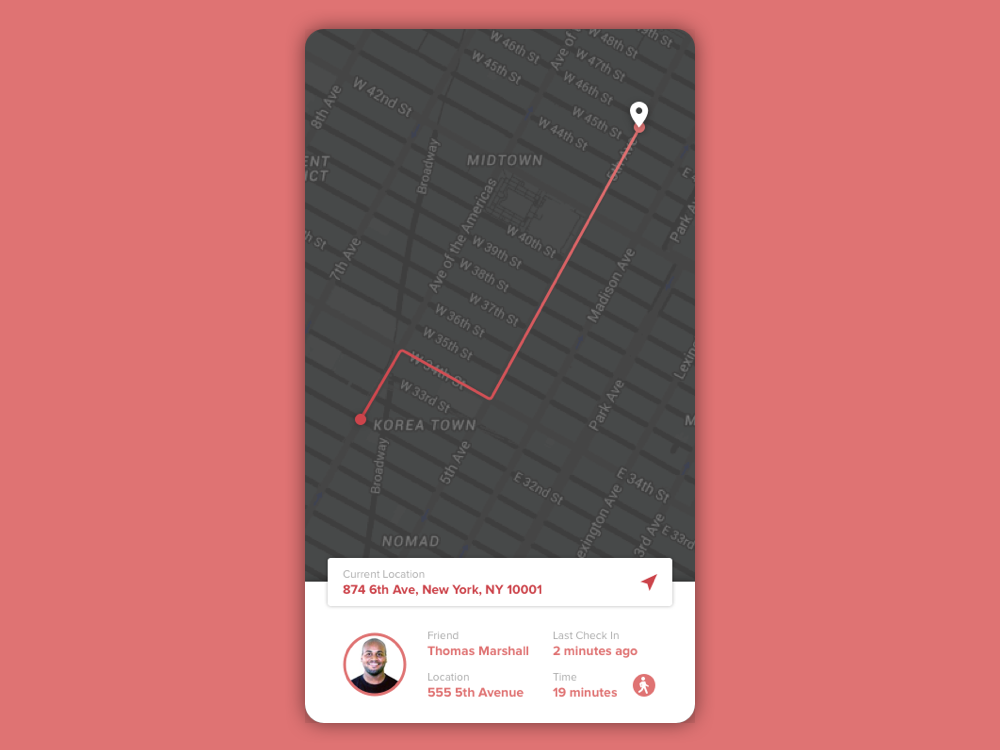
Challenge #020 - Location Tracker
"Design a location tracker. Consider the icon, placement, and purpose of location. Mapping something? Is it a tracking beacon? Is the NSA tracking you? ok, maybe they are ;) (As always, it's up to you!)"
I often have a problem trying to figure out where my friend who I am meeting up with is. Sometimes they'll give me the cross streets or sometimes they'll name things they see nearby. I designed a location tracker to help you find your friend in one easy go. Both parties would connect on the app and one person would ping their location. The map will lay out a route to the ping from the other phone.
Challenge #021 - Home Monitoring Dashboard
"Design a home monitoring dashboard. Be creative! What would make a dashboard visually appealing and fun to use, while also being mindful of the data? Try to make it a realistic exercise as if it were your own dashboard... one that you need to refer to daily. What is the most relevant data and what's the most appropriate placement for it? (As always, it's up to you!)"
Dashboards can often times be overwhelming. I wanted to create something that is simple and that anyone, young or old, can pick up fairly quickly. As seen in the mockup, all controls in each tab can be controlled by swiping through the rooms and by sliding the slider. All tasks can be done with just your thumb.

Challenge #022 - Search
"Design something search related. It could be a search bar, an advanced search window, a search function, etc. (As always, it's up to you!)"
The biggest complaint I have against the otherwise amazing Google search bar is that I can't search image or video right away from Google's homepage without going to another link. I wanted to give users these options without having to click another link or even search first. By holding down on the search button, users are given the option to search images, videos, or shopping.
Challenge #023 - Onboarding
"Design something onboarding related. Are you recruiting people for an organization? To sign up for a new website? A mobile app? (As always, it's up to you!)"
I decided to revisit a project I did for ProtoHack back in November. We weren't able to design the onboarding screens during the competition but we did come up with some one-liners that went with our app name "YouGive". The onboarding screens give a short yet informative and colorful idea of what the app is and how to use it. The "skip" option is put on the top right so that it's a bit out of reach and would hopefully encourage users to give each screen a read.

Challenge #024 - Boarding Pass
"Design a boarding pass. Consider the origin, the destination, gates, seats, the airline, etc. (As always, it's up
to you!)"
to you!)"
Missing your flight can get stressful so I added a countdown clock on the top of the screen to alert users on the day of. Users can choose to receive push notifications when departure time is an hour away, 30-minutes away, etc.

Challenge #025 - TV App
"Design an app for a smart TV. What type of app is it? What are the features/controls? Does it have a carousel selection feature? What it is? (As always, it's up to you!)"
Designing for a smart TV was a first for me. I found a great read about designing for television and learned a few things along the way like 18px is the smallest readable size. The featured series below would ideally display recommended shows/movies/songs/etc. based on what the user watches/listens to.

Challenge #026 - Subscribe
"Design a subscribe form, button, widget, etc. What type of information are you looking to capture from the user? Their name and email? Their zip code? Something else? (As always, it's up to you!)"
I wanted to play off subscribing for a newsletter by using an envelope. By displaying it in a 3D space, I could use both sides to represent the form and confirmation.
Challenge #027 - Dropdown
"Design a dropdown element. Is it a menu dropdown? Or a tip that's dropped down during a tutorial? (As always, it's up to you!)"
I wanted to explore new ways to display a dropdown. I was inspired by how Pantone swatch books fan out. Going off a Pantone swatch book, I thought it would be cool to incorporate that idea to change the color scheme of a website/navigation bar. The color swatches show the primary color and the background color.
Challenge #028 - Contact Us
"Design a Contact Us page or form. Is it for customer support? A purchase inquiry? To schedule an appointment? Think about a scenario and the most important feature it would require. (As always, it's up to you!)"
I wanted to create a clean page that would be easy to use on mobile. The email and twitter options will bring you to your native mail app and Twitter app, respectively. These options are what the owner of the site would ideally want the user to click. With that in mind, I placed the buttons at the bottom where it is completely and comfortably accessible to the user's thumb.

Challenge #029 - Map
"Design a map. Not one of those old school paper ones though. Ok, that might actually be kinda neat too. ;) What type of features should it have? Should its color scheme compliment the brand the map is designed for? (As always, it's up to you!)"
Description

Challenge #030 - Pricing
"Design something related to pricing. Is it a pricing table? A restaurant menu with pricing? (As always, it's up to you!)"
Description
Challenge #031 - File Upload
"Design a file upload element. Is it the loading screen and icon? A progress element? Are folders being uploaded by flying across the screen like Ghostbusters? ;) (As always, it's up to you!)"
Description

Challenge #032 - Crowdfunding Campaign
"Design a crowdfunding campaign. Keep in mind the purpose... raising funds. It's important to make it compelling if you're seeking money. So what's really important? The numbers of contributors, the total raised, campaign details and highlights? Also consider size, imagery, placement, slogans, etc. (As always, it's up to you!)"
Description

Challenge #033 - Customize Product
"Design something related to customizing a product. It could be a custom t-shirt, shoes, etc. (As always, it's up to you!)"
Description