


CONTINUING EDUCATION
2016 Seminar Promotion
2016 Seminar Promotion
Primary Goal: Increase attendance at client's continuing education seminars
Secondary Goal: Explore and test design solutions to guide direction of updated branding initiative
Spring Campaign
This new campaign leveraged a condensed direct mail campaign and expanded social media and web presence to increase awareness of Standard Process Northern California's (SPNC) Continuing Education seminars.
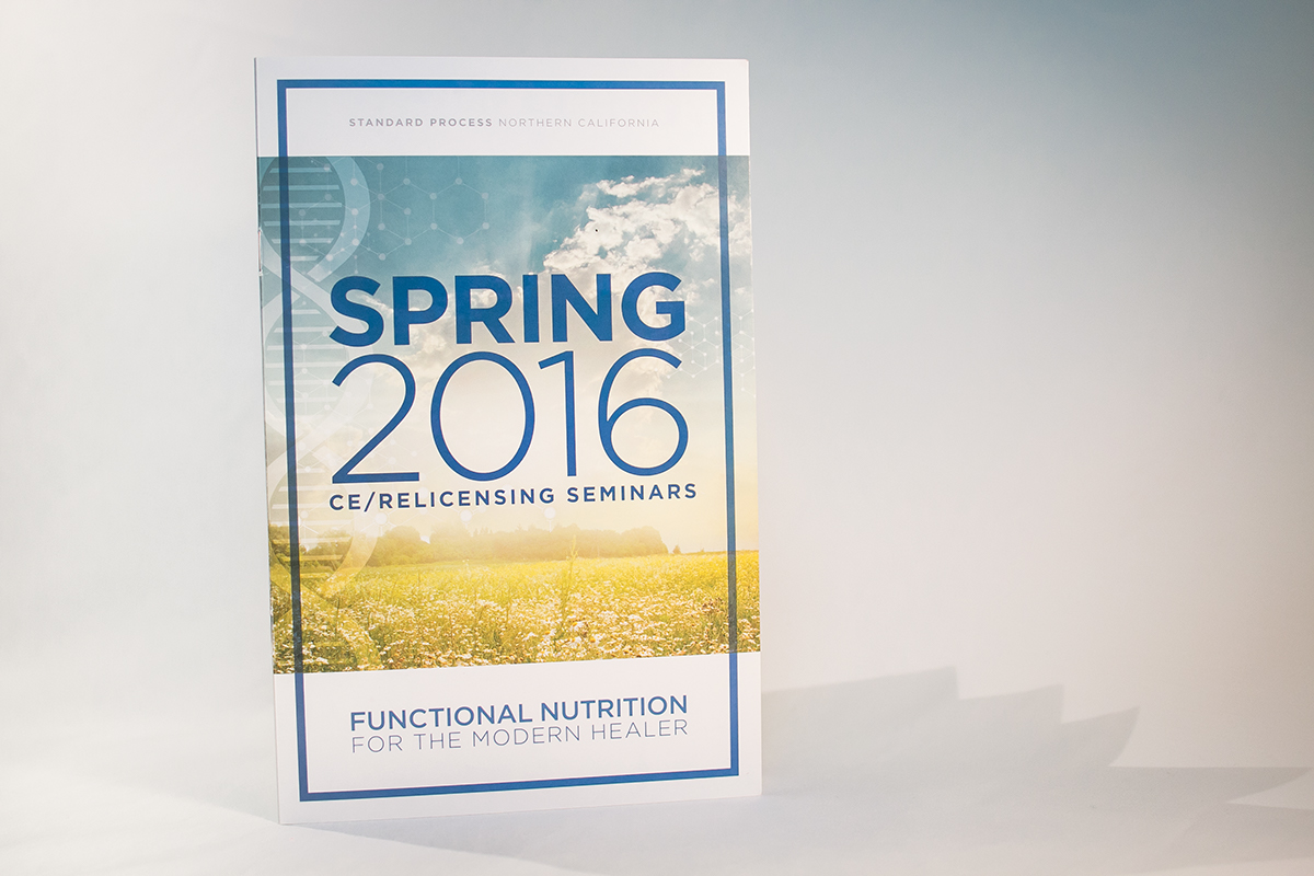
Spring Promotional Brochure


I recommended an expanded promotional campaign via the company's Facebook page for the spring campaign. For each seminar, I created Facebook events and scheduled simple, monthly posts. Each post was targeted to a precise set of demographics specified by the company, and limited to geographic locations serviced by SPNC sales representatives.


Summer Campaign
Small changes were implemented into the summer campaign. Feedback indicated that the spring brochure was easy to overlook in the mail and didn't contain enough information about the seminars to capture readers' interest. I resized the brochure to provide additional real estate for content and selected a heavier paper stock to differentiate the brochure from standard direct mail items.
The pre-existing calendar was too small for readers to quickly find the date and type of seminar they wanted, so I enlarged and simplified the calendar, adding in custom icons to identify specific seminar types. I also added in a small box with the Continuing Education Credits (CEUs) nearby to keep all relevant information within the same "quick reference" layout.


Social media promotion included Facebook events and posts timed to promote each seminar 4-6 weeks prior to the event. During the summer campaign, I tested additional Facebook ad layouts, such as the carousel layout used with the reproductive health series below.


Fall 2016 Campaign
By the time the fall campaign launched, our team had found a production rhythm that worked remarkably well to produce all of the printed and digital promotional materials by deadline. After testing a larger, heavier brochure for the summer campaign, we discovered that recipients preferred the 8.5x5.5" size by a fair margin. I kept elements from the summer brochure that received positive feedback, such as the "quick reference" section.
For the fall brochure, I leveraged photography I'd taken at SPNC events during the summer seminar series.


Social media for the fall campaign was warm and vibrant and featured simple, elegant layouts and clean typography. Posts (1:1 layouts) were scheduled to go live 6 weeks before each event date. Facebook events (banner layouts) were scheduled to go live 4 weeks before each event.


Web carousels (below) were scheduled to go live the day the brochure was expected to hit mailboxes.


