


JCR Rebrand
2015
Assignment
Update the identity of a family-owned real estate development company founded in 1975. The founder had recently passed away and the current leadership (his son, daughter and management team, with input from his widow) wanted a fresh, contemporary image for the company.
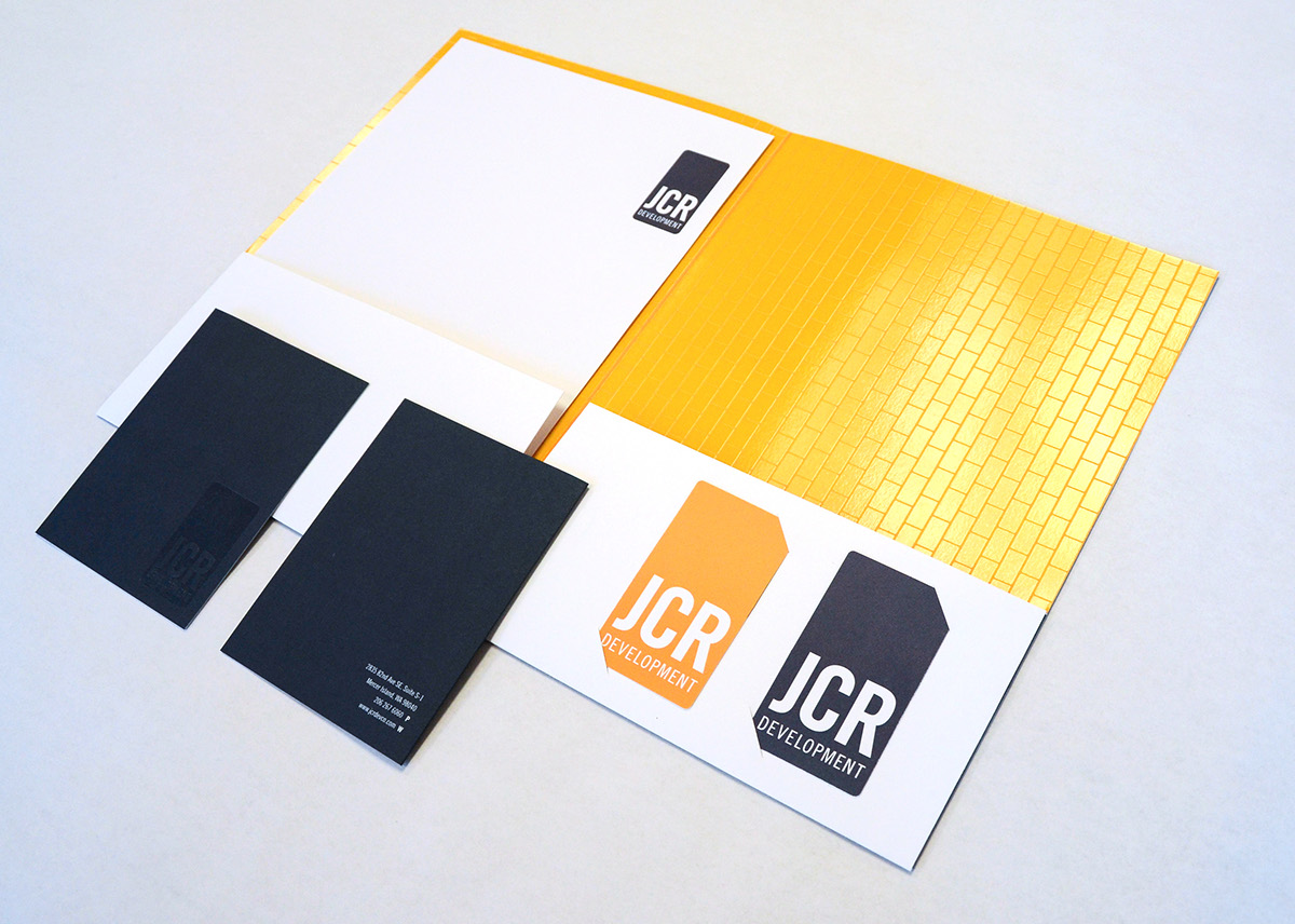
The new identity would be primarily used on the client’s letterhead package and migrate to their digital communications.

Original brand collateral from the mid-1970s.
Goal
Simplicity + Color + Legacy.
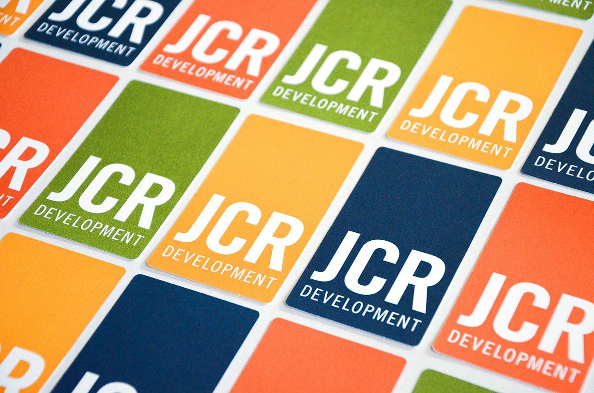
Several concepts were presented to the client; the one that resonated the most used a simple, clean layout and business cards with multiple colors on the back. Colors were chosen to work with deep blue, a legacy color from the original identity. The new logo references the original logo with a reinterpretated and reoriented badge shape.


Results
Our immediate clients were pleased, as was their Mom. Step forward into a new future for the company without abandoning the past.
This project won a Graphis Gold award in the Creative Services category.


