Seven non-profit organisations, seven worthy projects, seven professional designers and seven renewed visual identities. This is the closing balance of Design Pro Bono 2015/16. In the charity program launched by Hellodesign in 2015, graphic designers have, as a sign of their dedication to the noble cause, undertook to reshape the visual identities of organisations chosen through an open competition. The intention behind the initiative was that a modern, professional and appealing visual image would enhance the communication of the organisations, attracting more followers and supporters, and ensuring more effective operation.
Additionally to the design work, the organisations received - thanks to our printer and paper merchant supporters - starter packs containing business cards, headed papers and envelopes. The following designers were responsible for the re-designs: Anna Farkas for Nyitott Könyv Olvasókör Egyesület (Open Book Reading Circle Association), Zoltán Csordás for Erdei Iskola Egyesület (Sylvan School Association), Graphasel Design Stúdió for Fertőzug Egyesület (Fertőzug Association), Zsombor Kiss for Őrállók Alapítvány (“Őrállók” Foundation), Ákos Polgárdi for Siófoki Állatvédők (Animal Rescue Siófok), Annamária Tiszka for Pangea Egyesület (Pangea Association), and Márton Borzák for Vox Mirabilis Kamarakórus (Vox Mirabilis Chamber Choir). As a result of the voluntary contributions in design, organisation and implementation work, each winner organisation received a prize worth 1 million HUF.
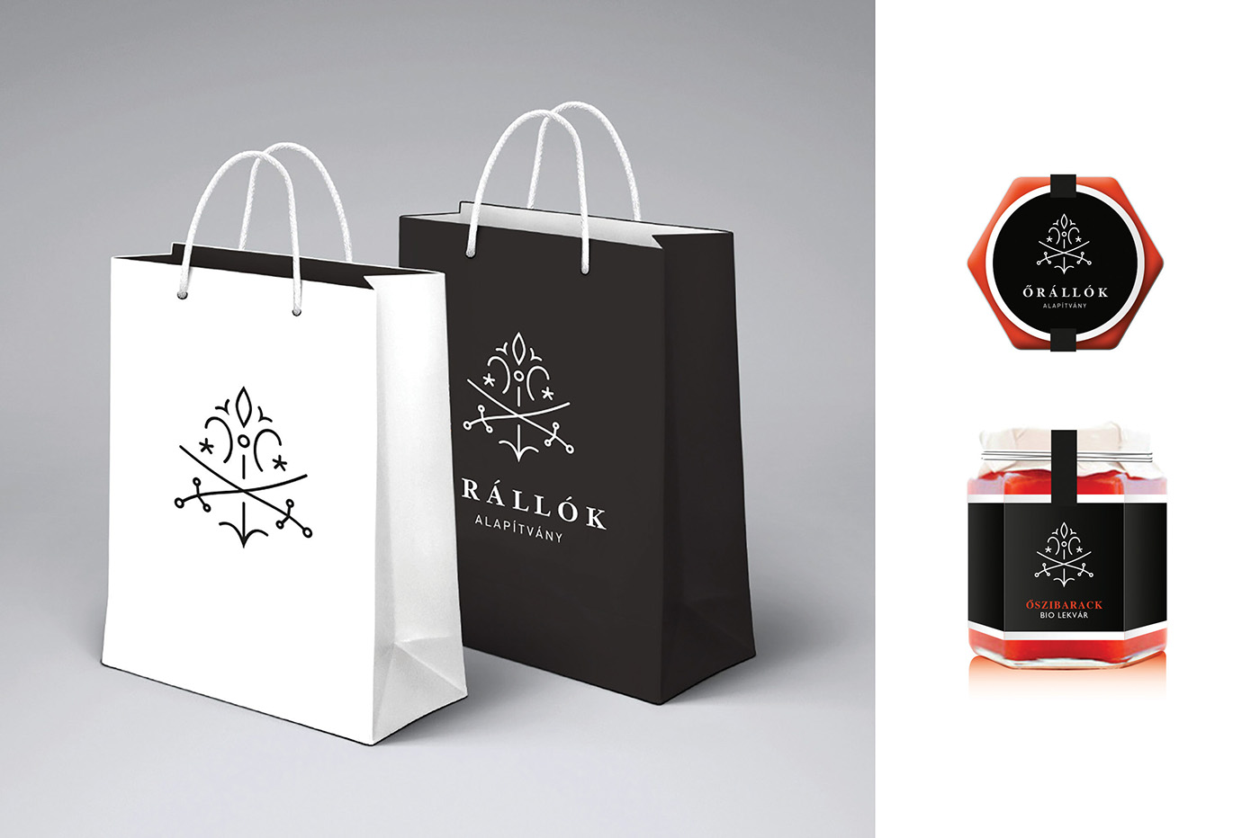
Őrállók (Watchmen) Foundation's mission and objective is to protect and preserve our cultural heritage and traditions to the younger generations of the future. Because of the diverse range of activities and programs it was important to create a universal sign, which may be suitable for the individual divisions - ranging from children's camps to the production of local traditional handicrafts and so on.
It was also a customer demand to show the saber and botanical ornamentations from the previous logo. Accordingly, the basic motif of the new design is the saber and the lily, whose minimalist vein were put back with additional elements. Thus, the logo develops into a signal concentrate formed in an additive system, which refers to the origin, but overall represents a clean, modern design. The elements of the logo are intended to symbolize harmony found between nature and man, while the overall composition with a tree or a bush form, symbolizes continuity. The use of color is based on the contrast of black and white, to underline the clear and obvious intent, simplicity, strength, and help diverse usability.
https://www.hellodesign.org/project-blog/design-pro-bono-watchmen-foundation?rq=alap%C3%ADtvány