

I was invited to re-design the ID Cards of the Samsung salespeople that work at retail stores all over the country.
The briefing's goals were to make a more legible and clean layout, highlighting the employer's name and creating a difference between CE (household appliances) and IM (mobile devices) departments.
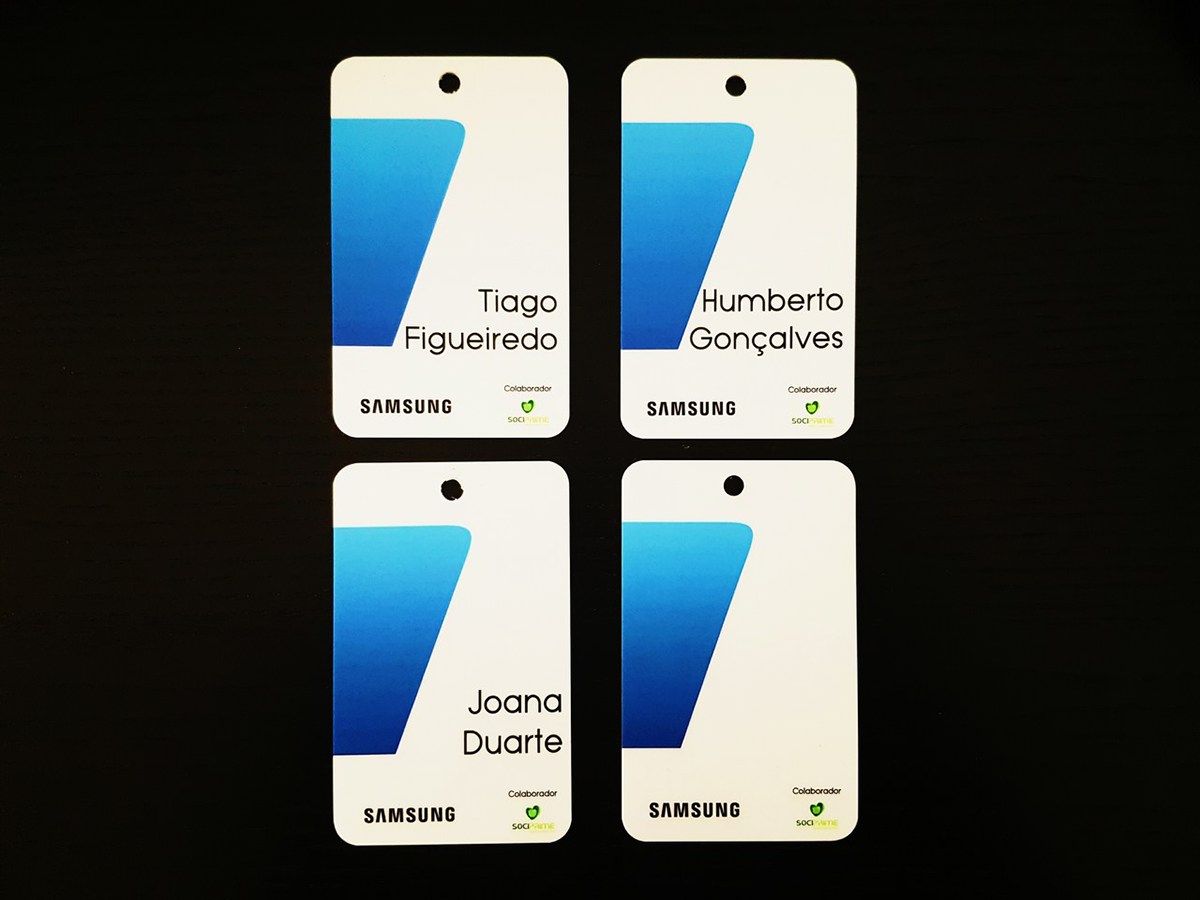
For IM department, the idea was not only focusing on the briefing's most important points, but also giving prominence to the newest mobile products: the Samsung Galaxy S7 and S7 Edge.
The layout features a reversed seven (7) with a blue gradient that includes the most used blue shades by Samsung in their advertising and marketing campaigns.

For CE department, the layout was meant to be cleaner. So using the same gradient as before, an arch was created in order to transmit confidence and harmony, without having any specific product in mind.


The final product was printed in a PVC format, so it doesn't wear off sooner that other materials.

Also, some layouts were printed without any names.
This is meant for seasonal reinforcements that won't be permanent on the main team.

The feedback was 100% positive, which made me extremely proud of my work.
All the salespeople were really happy with the new layout and more resistant material.

Thank you! Please leave your appreciation ♥


