


Fieldays Exhibitor
responsive online news journal.
responsive online news journal.
Fieldays Exhibitor is a print-based news journal created by Wintec staff and students across displines. This paper focuses on delivering the latest news and information from Fieldays - the biggest yearly agriculture event in the Southern Hemisphere for all the exhibitors and participants.
Fieldays Exhibitor is hitting into its nine years anniverssary. This event newspaper has been a truthful and honest news journal for the Fieldays since 1994. While this print-based publication gets stronger and bigger both in size and contents every year, it's also facing the challenge from online media that is able to provide constant update to feed the audience's appetite for the latest news. As a result, they needed a new platform to engage their audience to provide them with the most current news from the event.
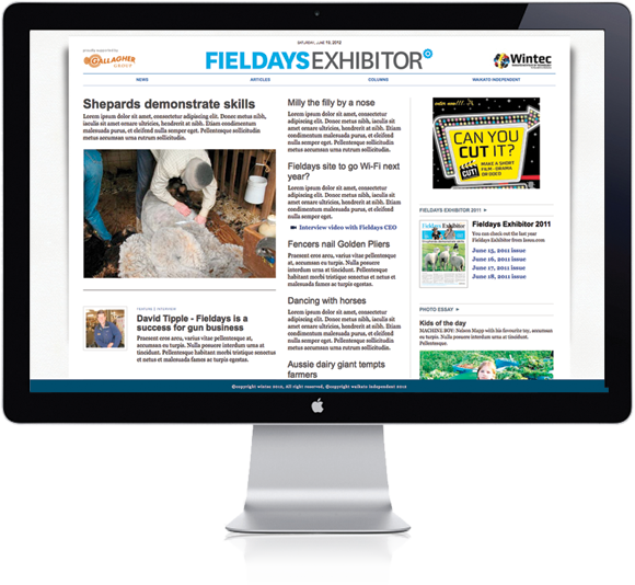
This project required a good website that would easily fulfill the need for their audiences - to be a web platform for easy news browsing purposes, and this is the ideal solution to engage audiences in the event as well as whoever is interested in agriculture development.
On the other hand, by only having a good website won't fully achieve the best outcome for this project. As a result, the team set a much higher goal - a solution that not just work for web browser on your laptop or desktop, but a solution that will perform equally good on the tablet or smartphone, thus a responsive website that will work on all platforms.
Mark Liu, a design lecturer in Wintec as well as owner of Mark & Co worked hand in hand with Simon Nicholls, also a design lecturer in Wintec to accomplish this mission - Mark served as the art director and usability and user experience leader for this project while Simon focused on web development and was a wordpress guru, and Nikita Smith, design student who worked as an intern web designer and administrator. Together they worked with Wintec's journalism and photography staff and students, who were the stakeholders and content providers as well as backend users of the end product.
You can check out this website at: http://www.waikatoindependent.co.nz/fieldays
Fieldays Exhibitor is hitting into its nine years anniverssary. This event newspaper has been a truthful and honest news journal for the Fieldays since 1994. While this print-based publication gets stronger and bigger both in size and contents every year, it's also facing the challenge from online media that is able to provide constant update to feed the audience's appetite for the latest news. As a result, they needed a new platform to engage their audience to provide them with the most current news from the event.
This project required a good website that would easily fulfill the need for their audiences - to be a web platform for easy news browsing purposes, and this is the ideal solution to engage audiences in the event as well as whoever is interested in agriculture development.
On the other hand, by only having a good website won't fully achieve the best outcome for this project. As a result, the team set a much higher goal - a solution that not just work for web browser on your laptop or desktop, but a solution that will perform equally good on the tablet or smartphone, thus a responsive website that will work on all platforms.
Mark Liu, a design lecturer in Wintec as well as owner of Mark & Co worked hand in hand with Simon Nicholls, also a design lecturer in Wintec to accomplish this mission - Mark served as the art director and usability and user experience leader for this project while Simon focused on web development and was a wordpress guru, and Nikita Smith, design student who worked as an intern web designer and administrator. Together they worked with Wintec's journalism and photography staff and students, who were the stakeholders and content providers as well as backend users of the end product.
You can check out this website at: http://www.waikatoindependent.co.nz/fieldays


Responsive web design
This was one of the features that was suggested by the design duo that had blown clients away.
For once the design duo had not only created something that was what the clients initially wanted, but they created something that the clients actually really needed. To create a website that is fulfilling the need and face up the challenges from competitors is exciting, but they believed that if they wanted to be visionary web designers they would need to look beyond the present and create a a solution that will assist client to face the future challenges - as a result, a cross platform idea is born.
While they wanted to extend the project into tablet and smartphone platform, they also understood that time was not on their side. As a result, instead of creating a website plus apps for iPhone or Android, thy created a responsive web solution, in brief, one stone many birds. They concentrated on creating one solution that would flow through all devices, so they would have more time to spend on crafting the best user interface, thus providing better user experience for the users.


Living interface and reading psychology
To create a cross platform design is not just simply making your page / website shrink or shuttle in different devices. Instead you need to study how readers react toward different platforms.
The first challenge was to introduce users / readers who were used to the print format to web format. By trying to recreate a close look and feel of a print version into web the transition was made easy. Of course, it didn't mean literally copying the look a newspaper onto website, but to understand the unique look and feel of a newspaper and to recreate them in web terms.
Another challenge was to attract new users / readers who own devices such as iPhone or iPad. In order to achieve this target, the duo researched into how users interact with the devices and custom-built the interface that will suited the reading habits of users of iPhone and iPads.
In many ways, they have achieved a "living" interface or multiple interfaces according to what today's technology can offer.


