

The purpose of this project was to formalize the existing elements of the Mada brand and to build upon them in order to develop a coherent and recognizable visual identity.

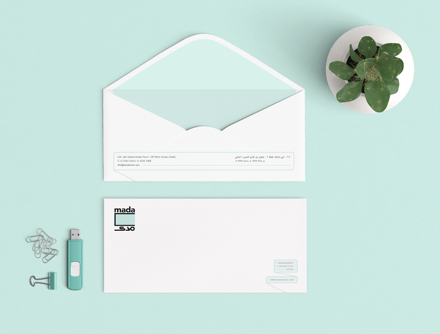


The logo, the illustrations (both created by Andeel) as well as the blue-green brand color, which were already synonymous with Mada - and thus have brand equity - were kept at the core of the visual identity.


Using those elements as a base, an extended visual language was developed in order to extend the Mada look to collaterals and templates. This serves to solidify the Mada brand and increase brand recognition.


