

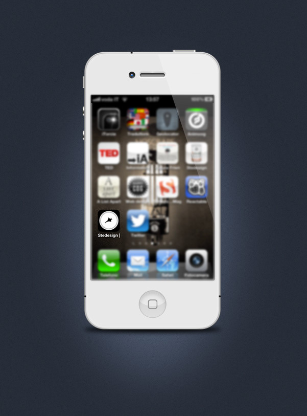
This is my new Portfolio, I started working with Mobile First approach from a width of 320px and then I’ve used progressive enhancement for optimize the website for tablets and desktops PC with media queries.


"The absence of support for @media queries is in fact the first @media query."
Bryan Rieger
Bryan Rieger

"Losing 80% of your screen space forces you to focus. You need to make sure that what stays on the screen is the most important set of features for your customers and your business."
Luke Wroblewski
Luke Wroblewski

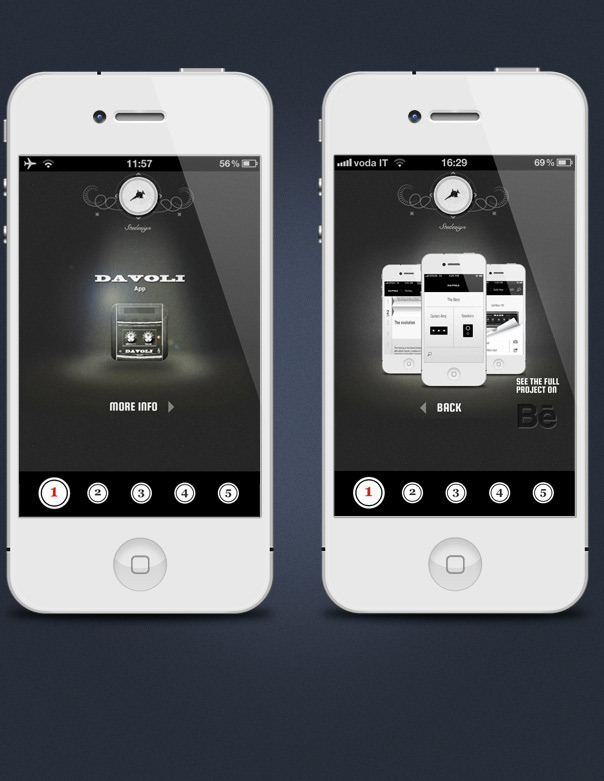


This website is build with HTML5 Css3 and @mediaqueries


