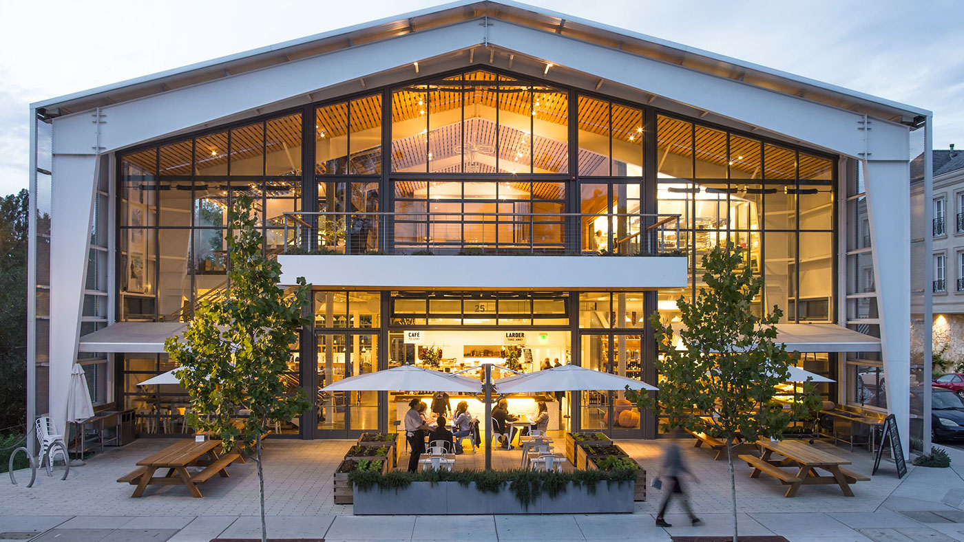
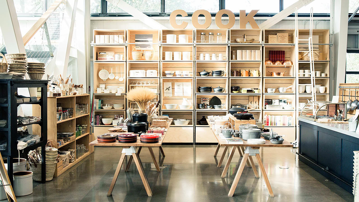
SHED is a place to be experienced. The food, curated goods, events and workshops come together in what can only be described as a modern grange. The challenge before us was to convey the SHED experience at every brand touchpoint.
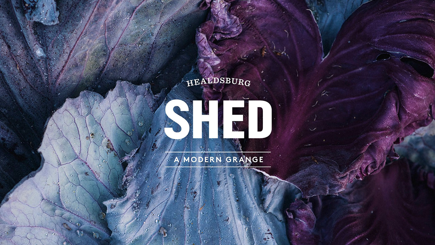
SHED is many things. That’s what makes it interesting, but what can also dilute its brand message. Our task was to create clarity around their story and visual expression.
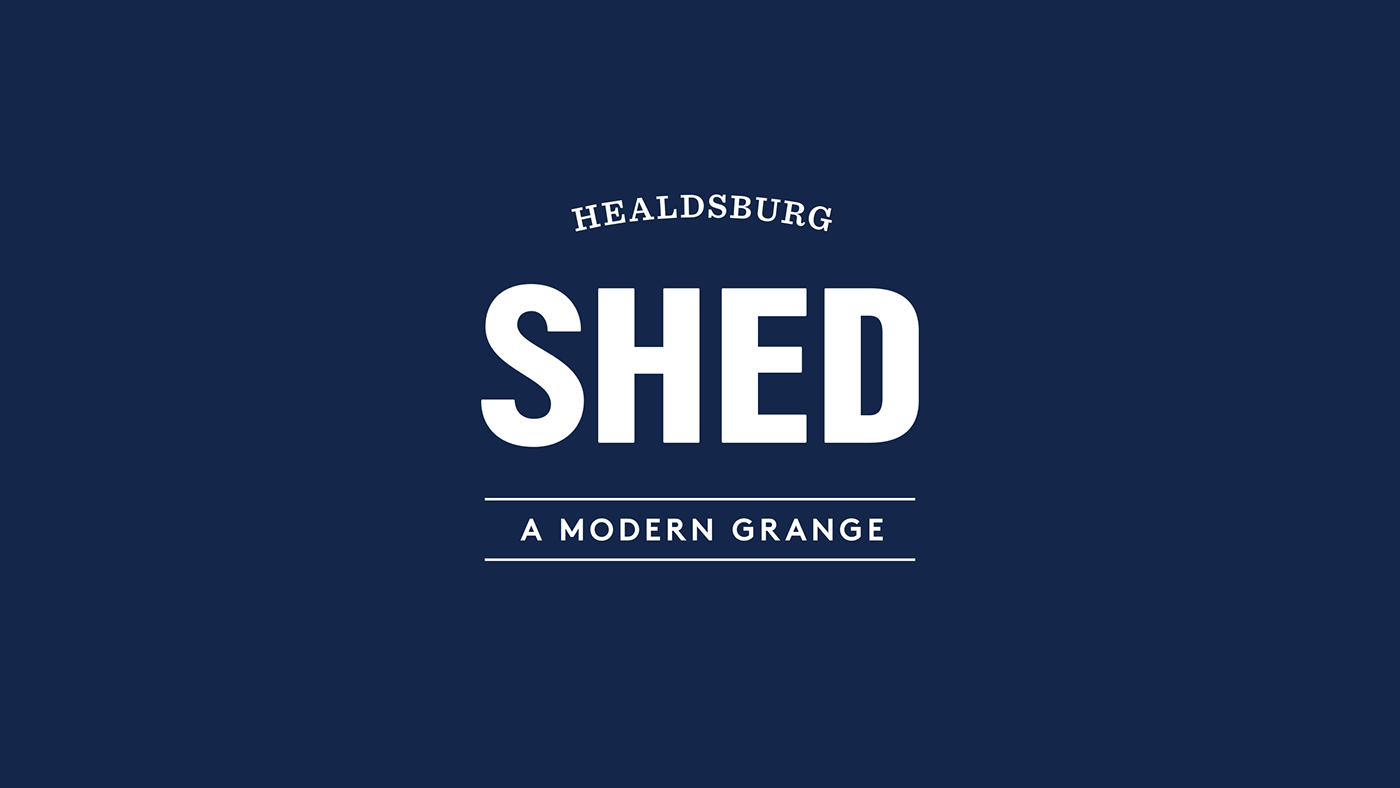

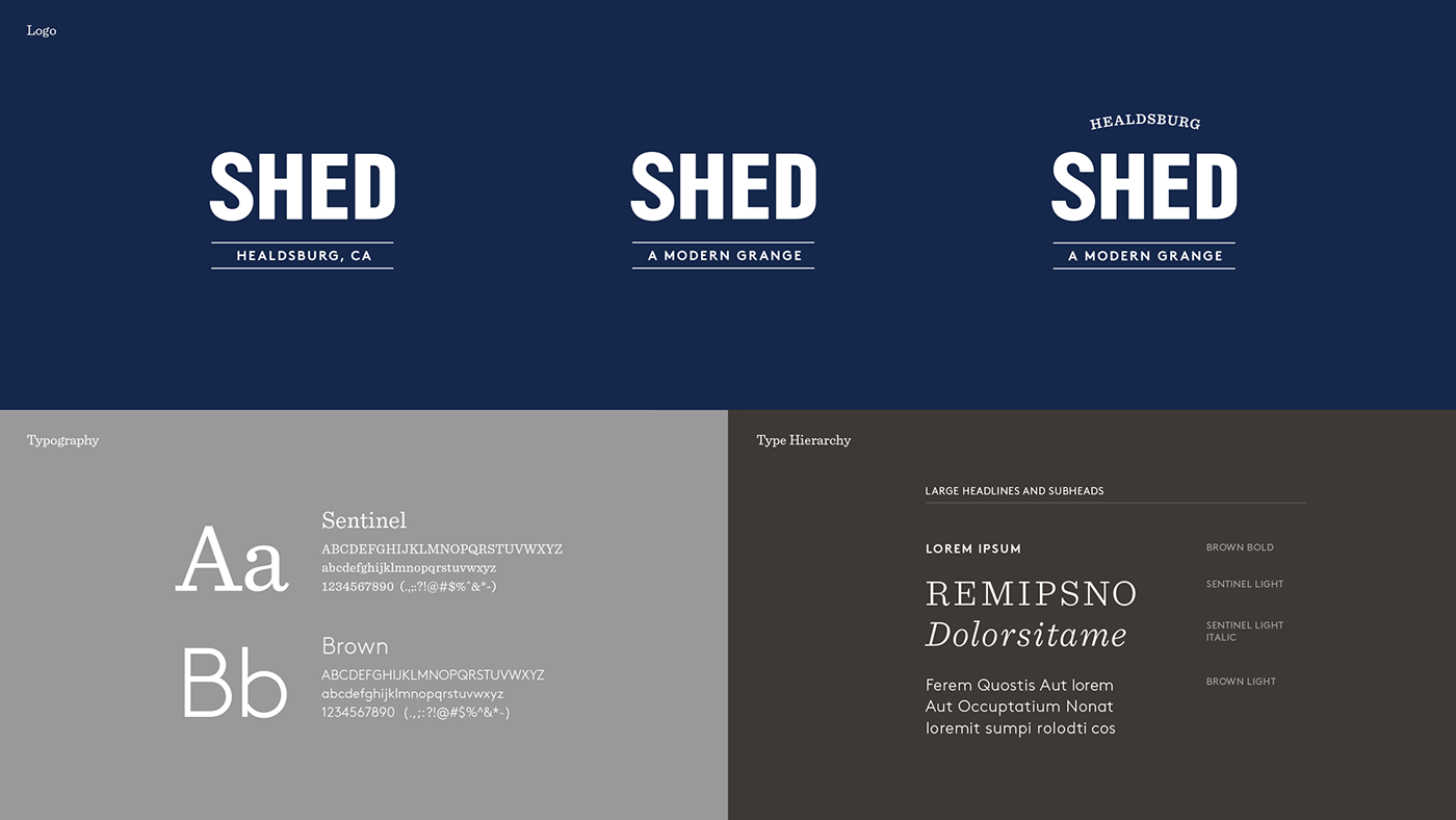
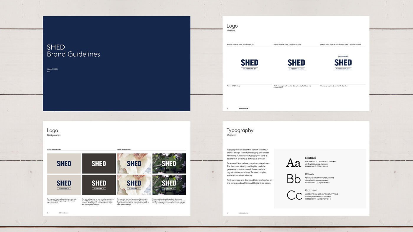
We redrew the SHED logotype for improved legibility, crafted a new color palette, and identified a modern typeface that would scale well across print and digital platforms.
SHED’s packaging was designed to be a natural extension of the clean, modern aesthetic felt throughout the space.
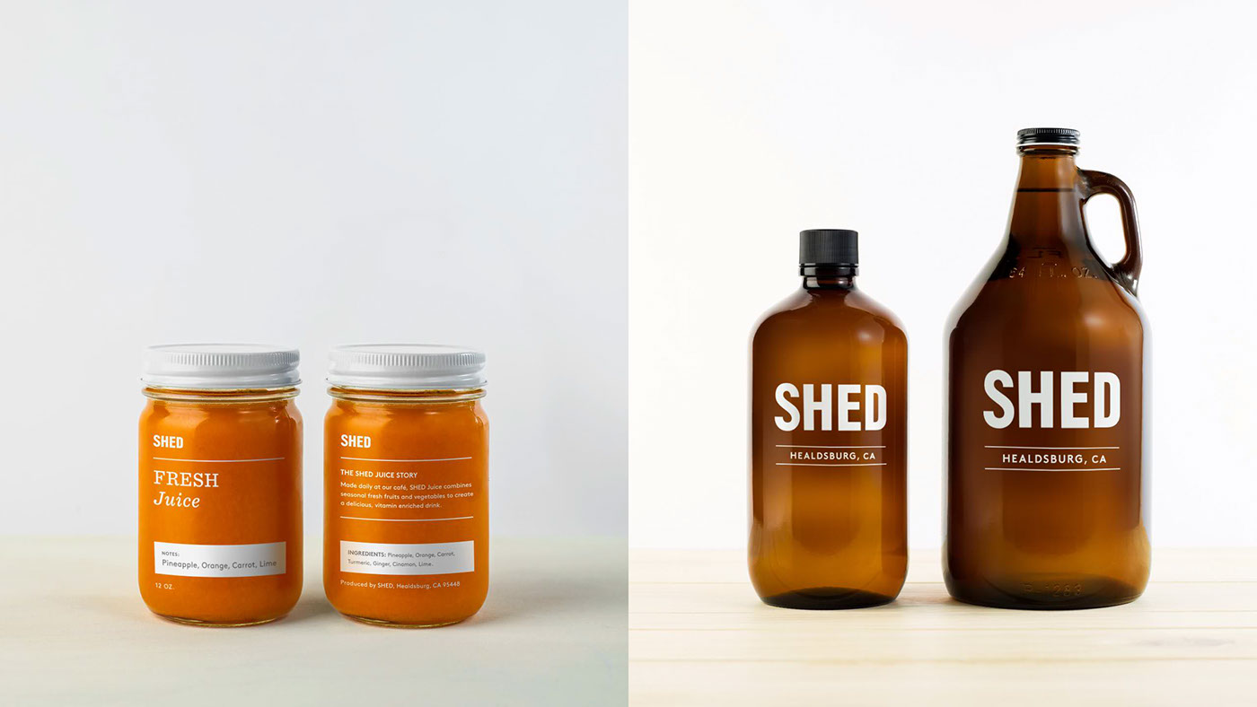
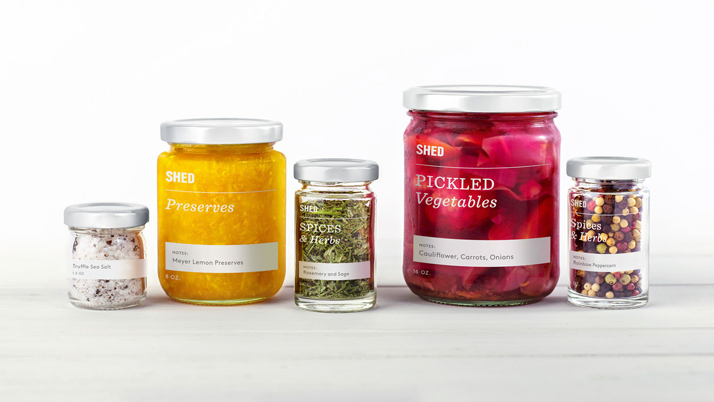
The proprietary packaging system was designed to accommodate the range of fresh, preserved and household goods available at SHED.


The new site reflects the brand’s look and feel, with a simplified “eat, shop, gather” user-pathing aligning with the in-store experience.


