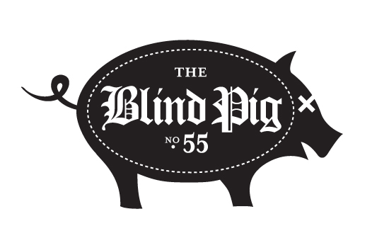
The Blind Pig was a barbecue joint that ceased operations in 2011. I envisioned it being cut from wood and hung like a pub sign in England might be hung.
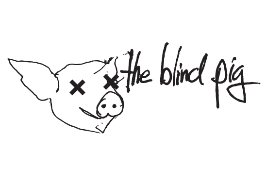
Here's another take on The Blind Pig. I wanted to try something grittier that might be more in line with the messiness of eating some ribs. The image and type are both hand-drawn.
For the uninitiated, this logo is based on the golden rectangle. The possibilities would have been infinite.

Evermind is a product that allows users to keep tabs on their independent loved ones (elderly or otherwise) by signalling which household appliances are being used and when.

MotoModa is a mobile boutique in Nashville. They moved in another direction.
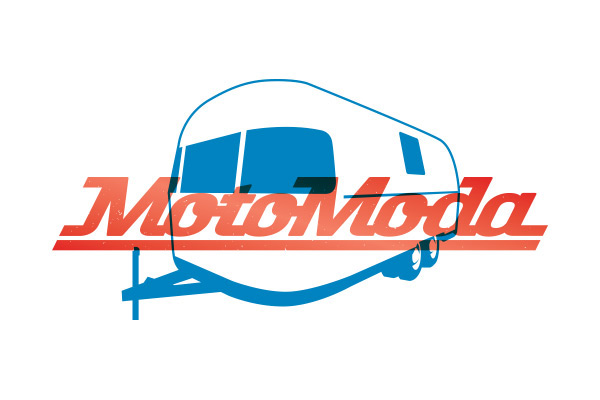
Color Version of the MotoModa logo. This is a highly-modified version fo Knockout.

Here's another rejected MotoModa option. It's a custom type treatment.

Ally Business Brokers
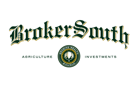
BrokerSouth is an agriculture investment firm in the Deep South. I approached this design as though it was made for a letterhead or glass door.
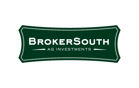
Here's another take on BrokerSouth. It's more modern, but it's also supposed to have the feel of a denim label that one might see on a farmer in the fields. I feel it's at once modern and blue-collar.
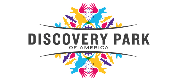
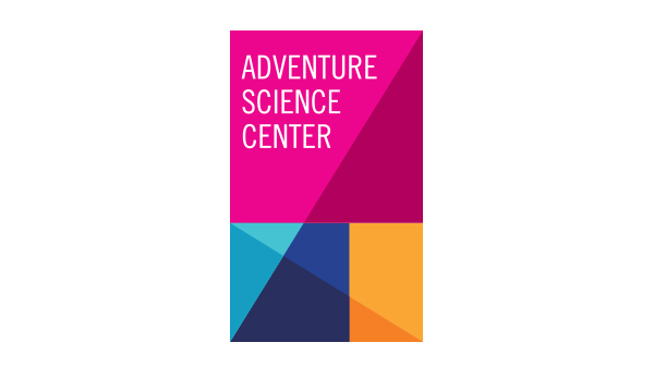
This was a proposed logo for the Discovery Park of America in Union City, Tennessee. It will feature exhibitions from across the science spectrum, and they wanted me to see what sort of logo might incorporate everything their museum will incorporate. I did my best not to make it a cluttered mess.

Detail of the kaleidoscope background of the Discovery park logo.
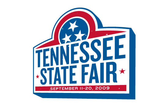
The Tennessee State Fair was rebranding a few years ago, and this was submitted as spec work. Truth be told, I don't know if they ever even saw it.


I always liked the straightforwardness of logo for this building materials supplier. Unable to see any symbolism of using a fastener as their logo, they got a bit hung up on the fact that they sell more rebar than the do bolts.

To their credit, H3GM is a law firm that is willing to take some risks, visually. They weren't quite brave enough to go for a color palette like this, though.


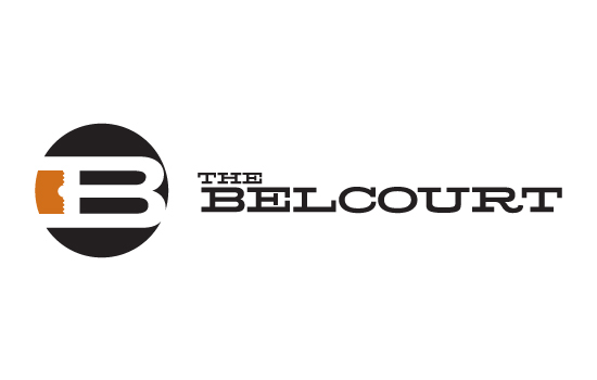
The Belcourt is an independent movie theatre in Nashville. They eventually went with a logo that I also designed, but I always preferred this one more.

Have you ever tried to include a DNA helix in a logo without it looking terrible? That was really my only objective with this one.

The "S" is obvious. The "W" is less so.


