


London Calling
Re-imagining the 2012 London Olympics identity
Re-imagining the 2012 London Olympics identity
Design Objective: Create a logo and application system that captured both the spirit of the Olympics and the national identity of London in anticipation of the 2012 Summer Games.
The movement and vitality of the logo is symbolic of the athlete always striving for greater heights, subtly echoing the symbol of the Olympic flame in shape and color. The typeface Gotham was chosen for its roundness to complement the Olympic rings and also to pay homage to the iconic letter forms of the London Underground signage, originally designed by Edward Johnston in 1916. The identity of the host city comes alive in the use of Union Jack flag, used in perspective to give the feeling of all roads leading to one, whether it be lanes on the track or in the pool.
The movement and vitality of the logo is symbolic of the athlete always striving for greater heights, subtly echoing the symbol of the Olympic flame in shape and color. The typeface Gotham was chosen for its roundness to complement the Olympic rings and also to pay homage to the iconic letter forms of the London Underground signage, originally designed by Edward Johnston in 1916. The identity of the host city comes alive in the use of Union Jack flag, used in perspective to give the feeling of all roads leading to one, whether it be lanes on the track or in the pool.

Business Card Identity System

Comprehensive Style Guide

Style Guide Table of Contents

Logo Specification Guide
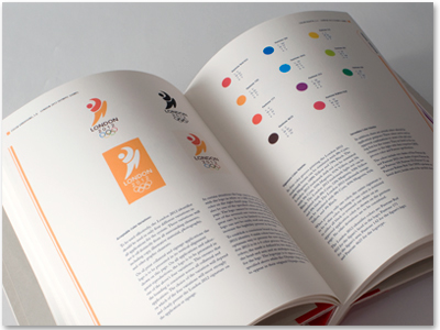
Color Palette & Application of Color in the Logo.

Iconography For Each Sport

Individual Event Tickets

Environmental Signage & Applications
Special thanks to Neil Sasaki for his help in photographing this project, among others.


