
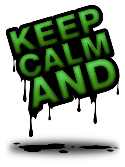
KCA - Keep Calm And... - Poster
My personal version of famous poster series "Keep calm and carry on"
My personal version of famous poster series "Keep calm and carry on"
• Tutorial included •
Hi guys! Here I am with another project! This time I've created a posters from a famous series "Keep calm and carry on". This is my personal version about it! The original idea came up in my mind instantly: Isaw a picture that inspired me, I choose the sentence and I started play with Photoshop. I made this just for fun but after created this poster I thought "I could do a tutorial about this!....NO....I HAVE to do a tutorial about this!" So, let's get started and see how I have created this poster! :-) Let's rock guys!
This time it's different from the others because I have no sketch to start with. It isn't simple than, it isn't harder than...it's only matter of fun! Start play with photoshop and something special came out!!
In the following images I'll show you step-by-step how to create this poster. Let's start!
First Part - Layer Style
In the firs part I'll create the base text for my poster. I just wanna show that you can do this with layer style so it's extremely simple. I start with simple text with green gradient on it...

Than I duplicate this layer and I add a heavy stroke...

After that I cover the wholes between the letters to create this effect...

Finally I add a black inner glow to add more depth...

Second Part - Add Details
In this second part will add a bunch of detail that improve my illustration. I start with melted effect in the letters...

Then I add others melted materials on the ground to create depth and realism...

To add more realism and depth I add a shadow on the ground...
Third Part - Textures & Shadows
Now it's time to create something special. I used to do this with texture. I think that use of texture is an amazing improvement for every kind of artworks because it allows you, combine with blending modes, to give that special touch to your illustration. It gives great realism too.
In the first place I put dirty texture on my letters with "multiply" blending mode...

Now I add a bunch of shadows between letters (in the same method that I used in this tutorial http://www.behance.net/my23/frame/4588021)...


After that I make some colors (Vibe actually) and levels adjustment to give more dramatic mood...

Again, texture is the best way to give special effect. In this case I use scratchy metal texture to give this kinda of effect on the letters...


Finally I add a simple gradient background to give depth. In the following images I'll show you some details an the final composition.


| Final Poster |

Now I'll show you some uses that you could do of your personal poster...


And now some gadgets that you could create...


Here we are! So, I hope you enjoyed this tutorial and I hope that it will help you to create your own poster! If yes, don't forget to "push the badge" and share all over the world :-)
Thanks for watching.
All the best,
Tobia.
Poster, iPad skin, iPhone cover and much more are available for purchase at


