
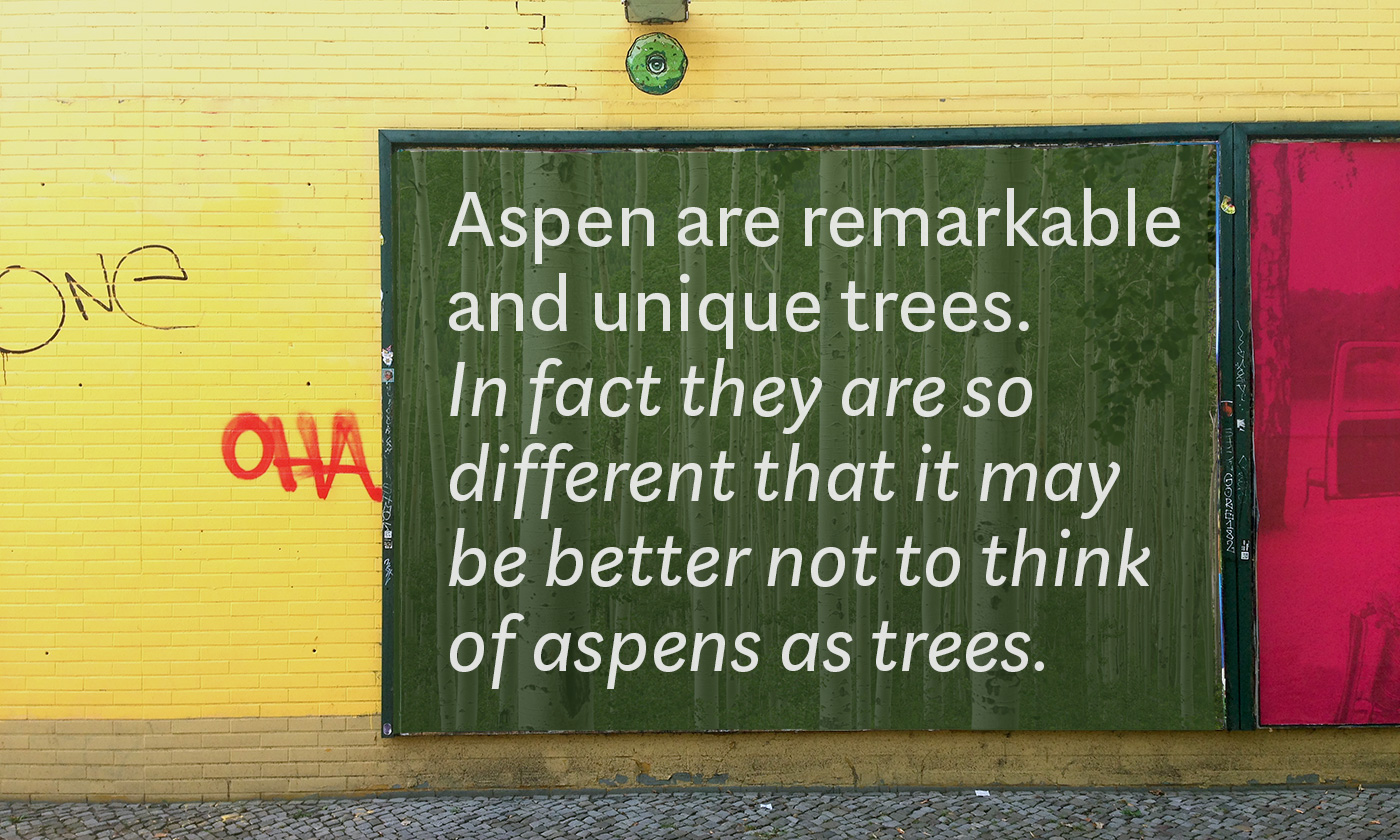
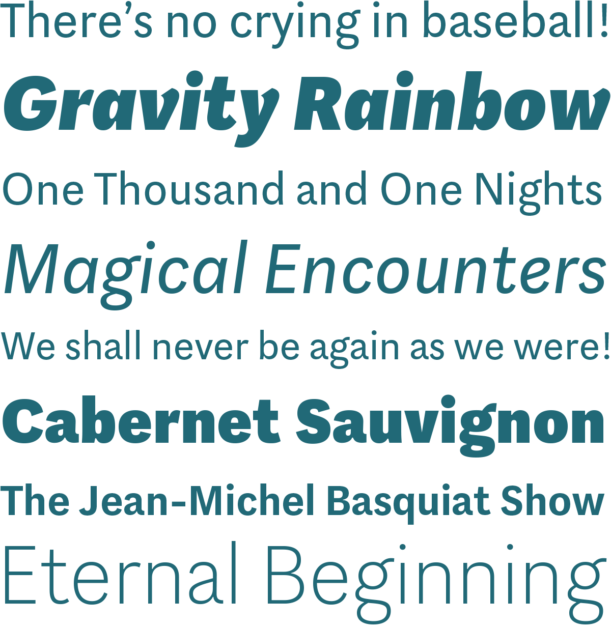
Aspen is a refreshing and resilient typeface for text of any kind. Functional but not faceless, Aspen derives a very distinctive character from an unusual pedigree. It is loosely influenced by early American and European grotesques, but with more warmth and improved legibility. And where these historical models were rigid and bulky, Aspen’s curves have a gentle sway that makes for very comfortable reading. Relatively generous ascenders and descenders allow the typeface to feel spacious even when set with tight leading. These amiable qualities are matched with a lively italic based on cursive writing. The family consists of nine weights, and is intended for both text and display usage.


Want to see more? Keep in touch by clicking the Follow button.
To see more of this refreshing and resilient typeface visit LudwigType
Also don’t miss this entertaining minisite.
To see more of this refreshing and resilient typeface visit LudwigType
Also don’t miss this entertaining minisite.
