About our rebranding
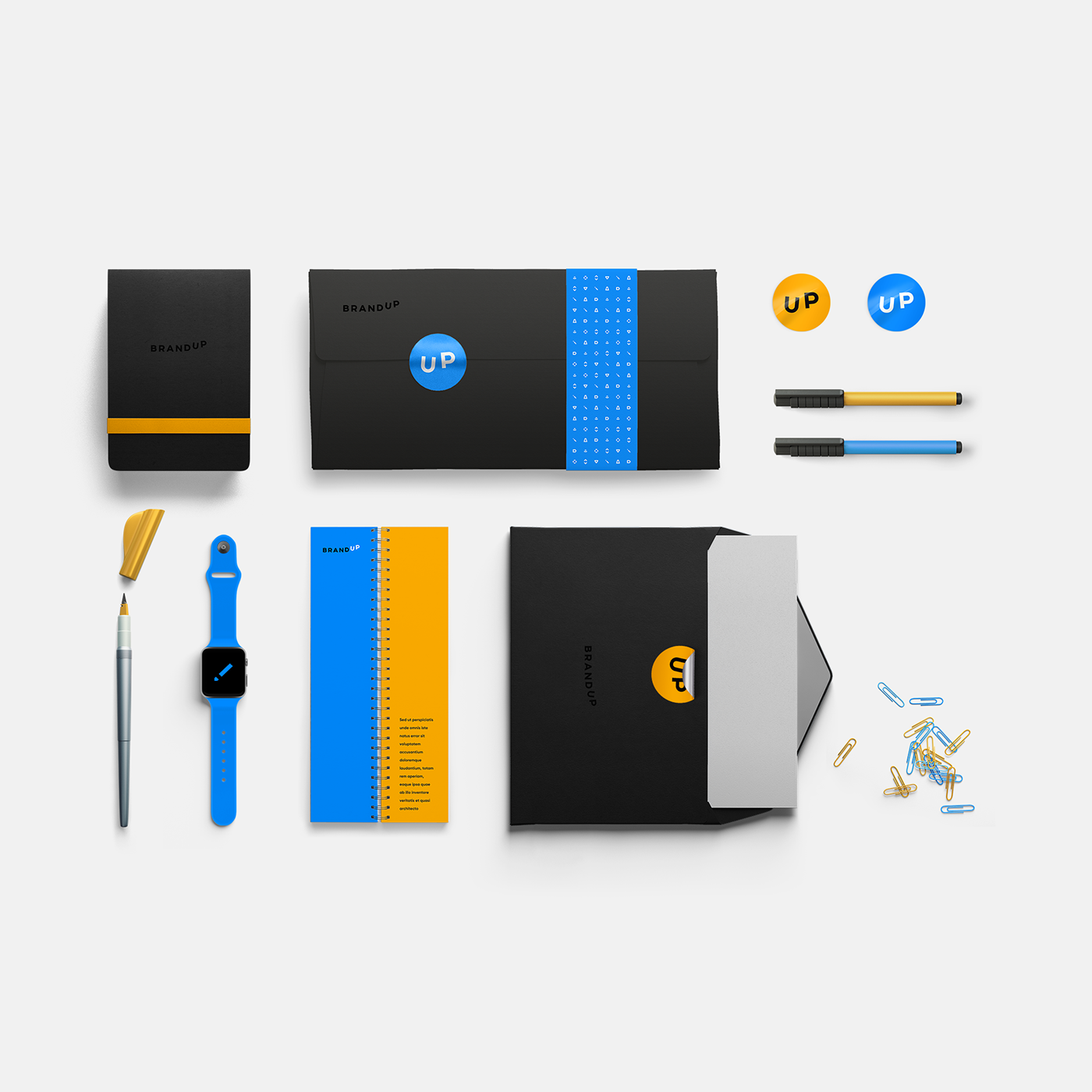
As a logo we designed a custom compact, font solution with only the brand name. It was designed in the simplest form and is based on the pedantic attention to details that have a particular meaning and emotional charge, reflecting the valuable characteristics of the company. Stylized "U" & "P" letters becomes the incarnation of the lightness and mastery - reflecting an progressive style of the company, striving for leadership. This stylized “UP” becomes the main focal point of the logo.
We selected a vibrant yellow and sky blue as the main brand colors, it is supported by grey and black for text blocks and additional accents.
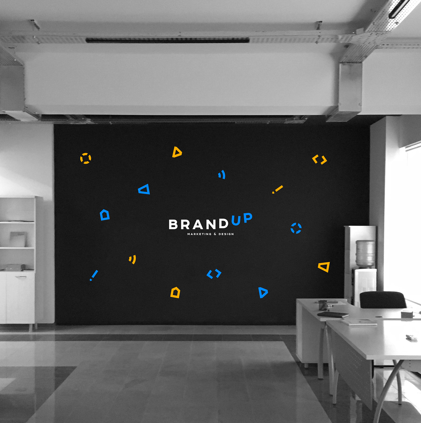
We also developed a series of icons that allow for easy differentiation of the services, and were illustrated in a style that speaks of the values of the company.
We selected a vibrant yellow and sky blue as the main brand colors, it is supported by grey and black for text blocks and additional accents.
We also developed a series of icons that allow for easy differentiation of the services, and were illustrated in a style that speaks of the values of the company.