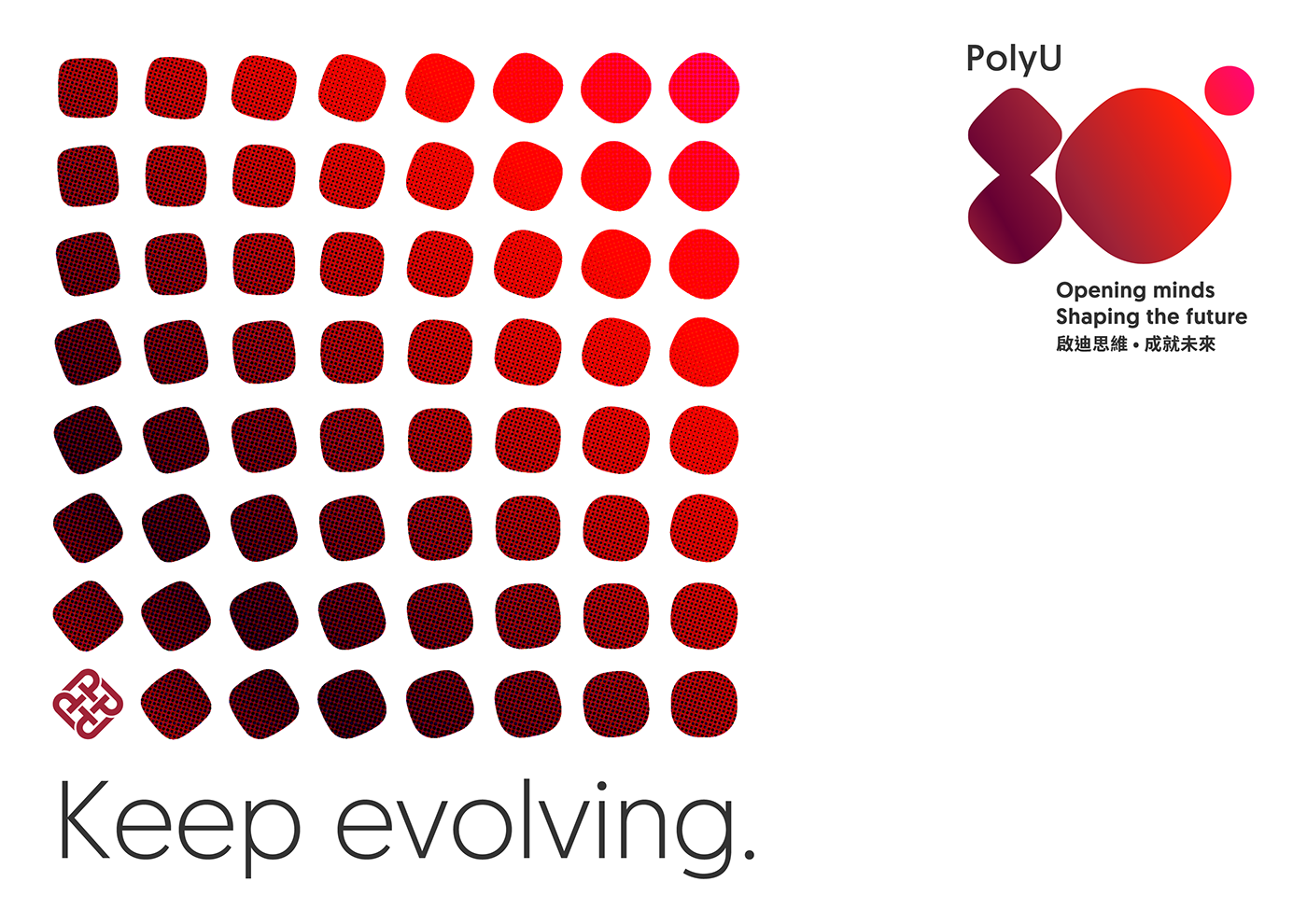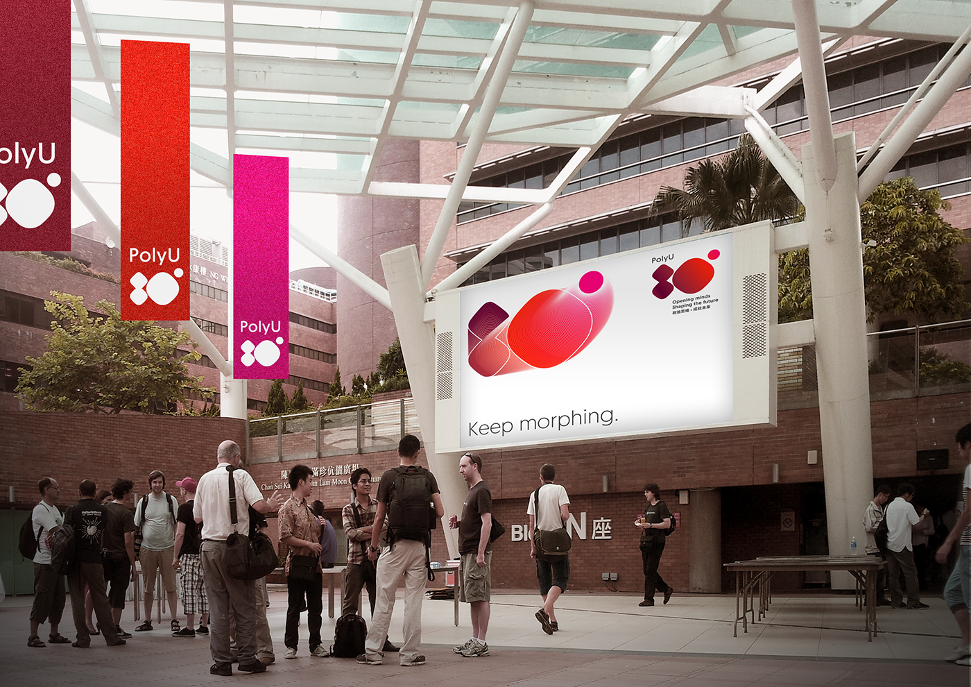
Keep morphing, keep evolving, shape the future.
Being the logo for 80th anniversary of PolyU, a university abundant of legacies yet never stop advancing and enriching, it should encapsulate the spirit of PolyU’s forwardness and boldness towards the future of professional education, applied research and dedicated contribution to the society.
To visualise the forwardness, the logo consists of 4 shapes varying from the round cornered square on the top left, which is rooted from the silhouette of PolyU’s emblem; the squircle at the centre, a hybrid form of square and circle; to the perfect circle on the top right. Together the 4 shapes in the sequence from left to right, depict the metamorphosis throughout the 80 years of PolyU, shaping PolyU evolvement in the past, present and future.

The bold and vivid colour hues applied to the 4 shapes in the logo, a gradient of PolyU’s Red to neon magenta, helps constructing an abstract yet strong representation of the typography ‘80th’ by further joining the 4 shapes into one cohesive piece. It is the spectrum that colours the legacies and tomorrows of PolyU that keeps itself morphing, evolving, and shaping the future.
Various lock-up options and colour styles show the flexibility of the logo design. The word ‘PolyU’, and the university emblem in some of the options are always on the top left where the ‘metamorphosis’ path starts, symbolising the root of the university. The theme tag line is always on the bottom right for striking visual balance to the logo as a whole.


