Oh baby, by MALVI
Oh Baby, one of the most successful baby product e-shops in Greece, required a re-branding so we were assigned the task of designing a new visual identity. The brief required that the brand should establish a clear and unique image, one that would reflect the company's philosophy and its position in a rather competitive industry.
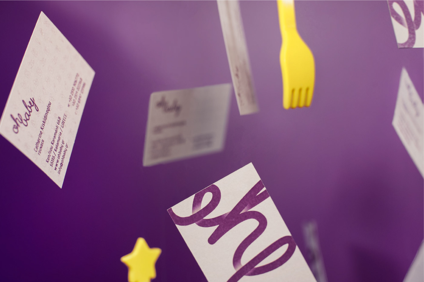
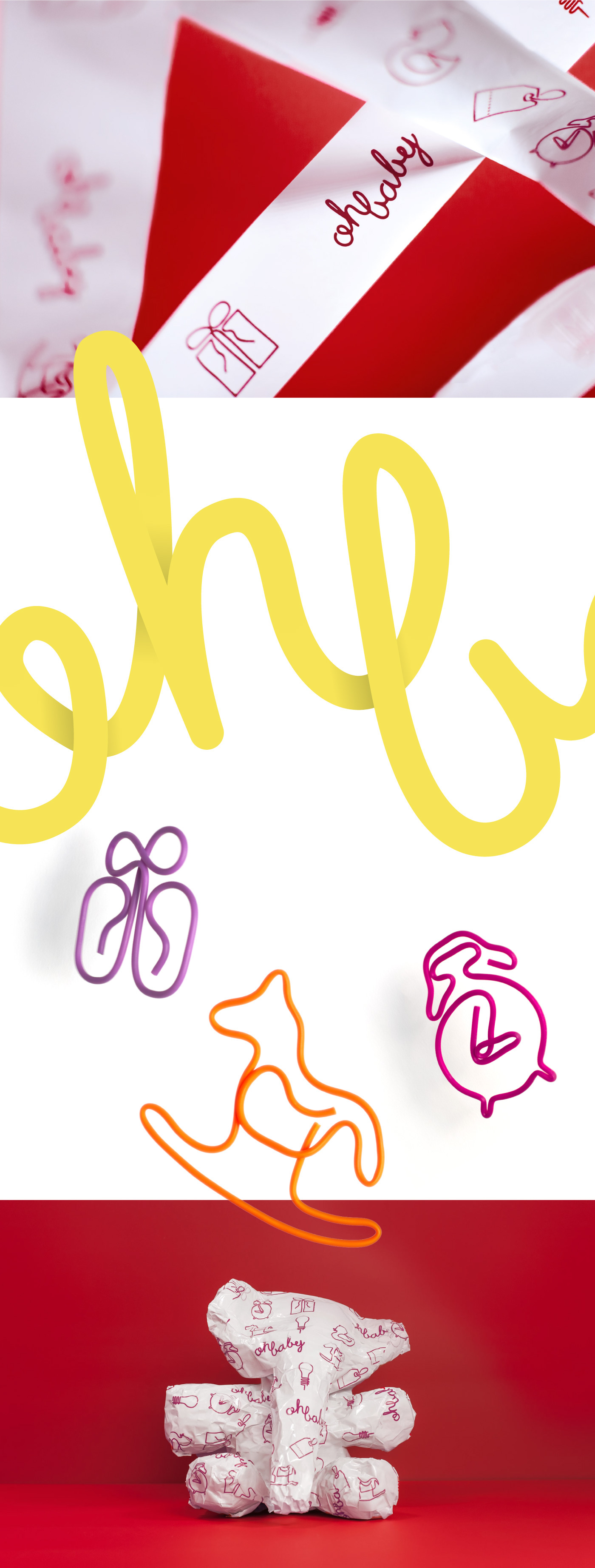
Rebranding a company in a market that is so saturated was a challenge. We therefore decided to shape a brand identity that reflects the client's personal touch and enthusiasm, which is what has earned the company its current market status. We begun the process by drawing inspiration from the client’s appreciation for retro neon signs. The final wordmark is a result of one continuous stroke. The typographic hand-written treatment, that is in line with the neon sign philosophy, provides a sense of uniqueness and familiarity, emphasizing the company’s differentiation and client-focused approach.
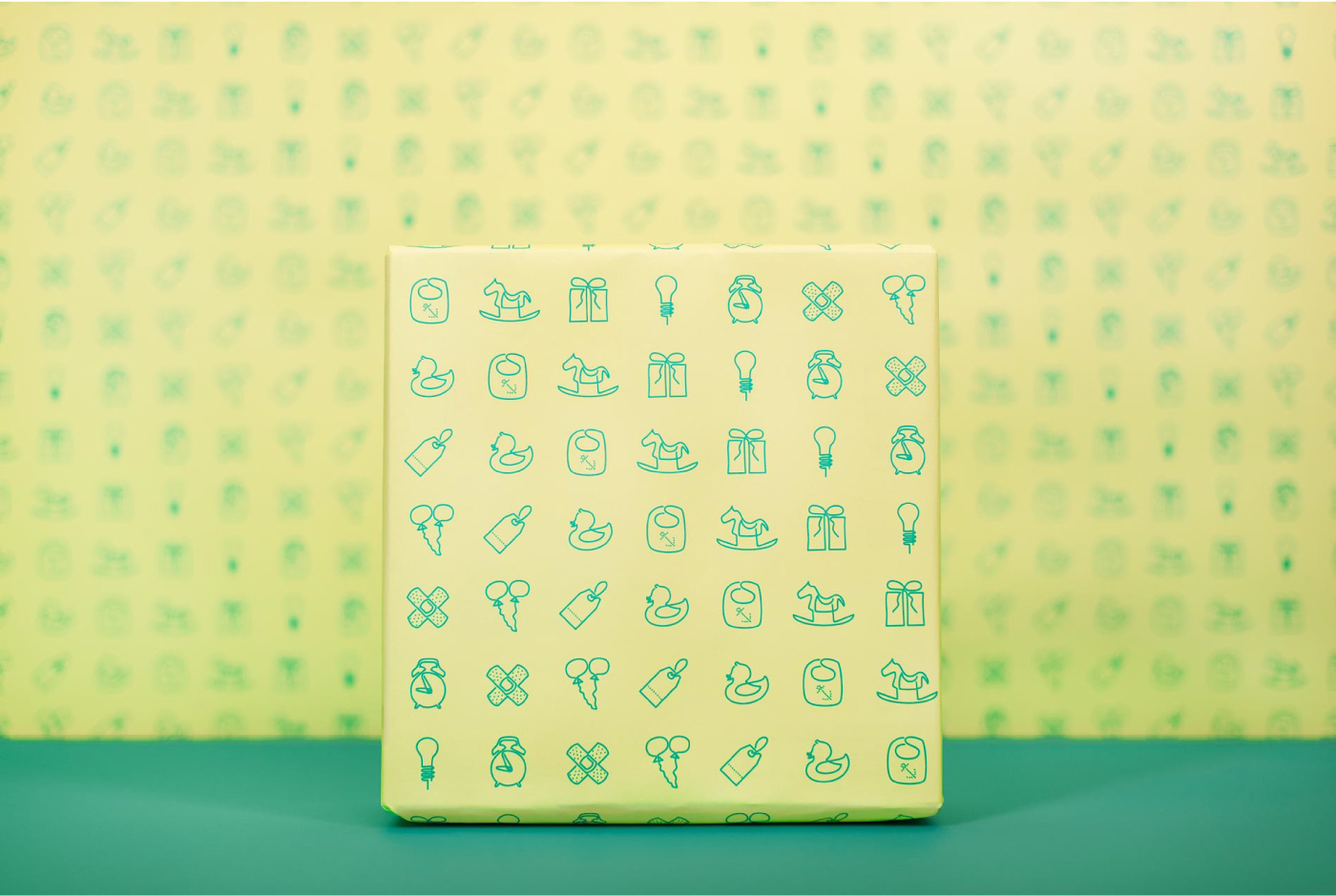
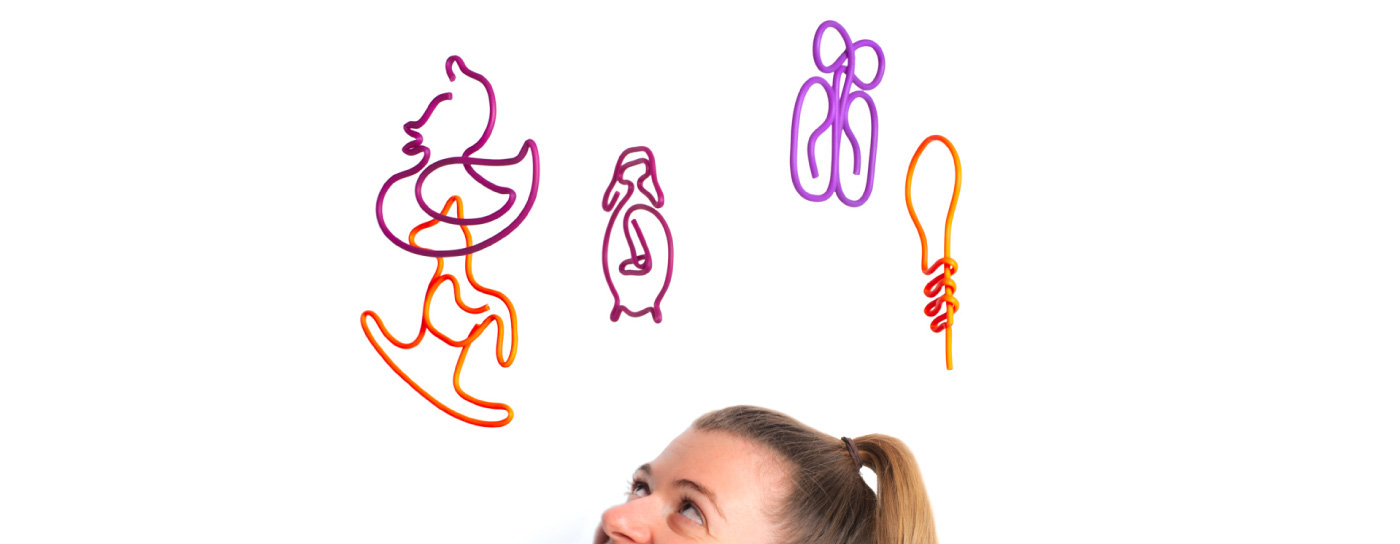
Exploring three-dimensional forms and shapes created from a continuous line, we created a set of symbols which follow the concept of simple child drawings of objects. They are used individually as brand elements and to represent the store’s product categories, or combined to form patterns. Bright colour combinations and patterns are employed across all applications. The colours that were chosen are interchangeable so as to accommodate all current needs, and also to provide a flexible tool for answering any needs that might come up in the future.