Visualization for Wired UK (proposal)
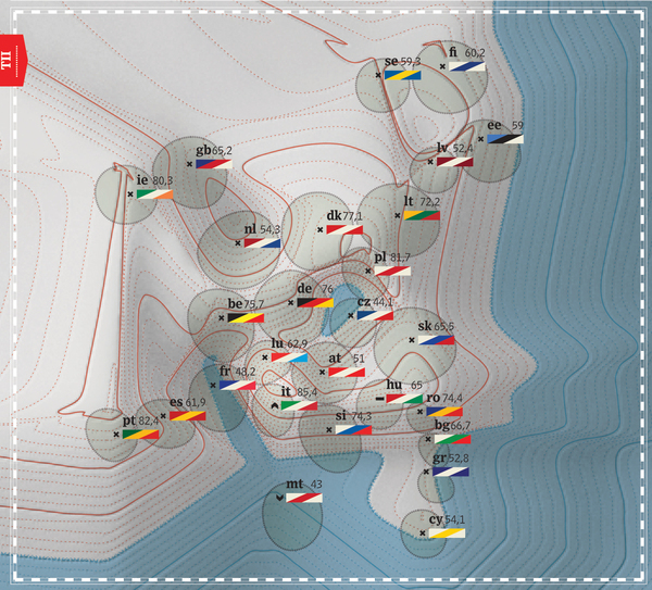
This project is a joint-venture between statistics and design with the aim of investigating the perceived impact and the diffusion of mobile phones and the Internet, within the EU27 countries. Have communication technologies improved social life? Business? The ability to be informed? Are those people not using internet or mobile phones missing opportunities? In which European countries is the use of communication technologies higher? To answer these questions we used two EU Commission surveys from 2008: "Information society as seen by EU citizens"and "Benchmarking indicator: Developments of broadband". After performing multivariate statistical analysis, we then visualized them into the map below.
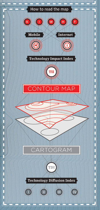
The visualization was obtained by overlapping a Contour Map, which makes use of the isobar of traditional cartography to represent the Impact Index; and a Cartogram used to visualize the Diffusion Index. The combination of these two elements forms a new geography of Europe, one that keeps its proportions but changes its morphology. New mountain chains arise and unseen depressions appear, to reshape the European landscape according to the diffusion and impact of communication technologies. Following the path, from bottom to top, the different geographies of Europe demonstrate how the individual parts of the Impact Index affect the final result.
Year: 2009
Client: Wired UK
Format: 41x27 Print
Credits
Developed by Density Design
Scientific supervisors: Paolo Ciuccarelli, Marco Fattore
Creative Direction: Donato Ricci
Art Direction: Luca Masud
Designer: Mario Porpora
3D Development: Lorenzo Fernandez
Code Development: Giorgio Caviglia, Michele Mauri
This project is a joint-venture between statistics and design with the aim of investigating the perceived impact and the diffusion of mobile phones and the Internet, within the EU27 countries. Have communication technologies improved social life? Business? The ability to be informed? Are those people not using internet or mobile phones missing opportunities? In which European countries is the use of communication technologies higher? To answer these questions we used two EU Commission surveys from 2008: "Information society as seen by EU citizens"and "Benchmarking indicator: Developments of broadband". After performing multivariate statistical analysis, we then visualized them into the map below.
The visualization was obtained by overlapping a Contour Map, which makes use of the isobar of traditional cartography to represent the Impact Index; and a Cartogram used to visualize the Diffusion Index. The combination of these two elements forms a new geography of Europe, one that keeps its proportions but changes its morphology. New mountain chains arise and unseen depressions appear, to reshape the European landscape according to the diffusion and impact of communication technologies. Following the path, from bottom to top, the different geographies of Europe demonstrate how the individual parts of the Impact Index affect the final result.
Year: 2009
Client: Wired UK
Format: 41x27 Print
Credits
Developed by Density Design
Scientific supervisors: Paolo Ciuccarelli, Marco Fattore
Creative Direction: Donato Ricci
Art Direction: Luca Masud
Designer: Mario Porpora
3D Development: Lorenzo Fernandez
Code Development: Giorgio Caviglia, Michele Mauri