


Homepage layout, desktop and mobile. Since the GovCon Website is the primary communication vehicle of the conference, careful attention was paid to a balance of information, hierarchy, branding, and performance.

Mobile layouts for GovCon site. Here, a careful balance was struck by employing responsive images and layouts to ensure mobile users received the full site experience. This is especially critical, since there was no printed program, which necessitated an easy-to-access layout that was highly-performant in bandwidth-challenged conference areas.

Print design-here as posters-was used for promotions around the Washington, DC area. Here, to add levity, well-known Washington area historical figures were combined with the Druplicon to give a lighthearted slant to a technology conference.

The same illustrations as for the posters were adapted to a postcard, which was used to promote GovCon at events both in and outside of the Washington, DC area. Oftentimes, these were distributed with stickers at professional events. A special shoutout to J.M. Flagg, whose iconic illustration from vintage Army recruiting posters served as inspiration for “Drupal Sam.”

GovCon 2016 logo design. For various media, size, and output requirements, the logo required multiple variants, especially for reversed versions. Another challenge to overcome was simplifying the patterning for use in vector on the Web, to keep file sizes manageable.

Branding and identity was carried over in the iconography, here referencing markings on US paper currency. Custom typographic modifications were required to ensure individual glyphs fit within the circular areas, and were still recognizable at small sizes. Due to the abstract nature of track themes, visual symbols were avoided this year.

To help make registration desk staff work easier, the attendee badges were produced ahead of time, on custom laminated stock for durability. In addition, the backs are used to display the Natcher Center layout, so that attendees can easily find their way to various events.

Since GovCon focuses on digital content, print materials are kept to a minimum. Here, the sole handout given to attendees accomplishes multiple tasks, giving an overview, a high-level schedule, welcoming event information, and scavenger hunt board.

To extend the brand, and make communication tasks easier for team members, custom e-mail templates that are easy to edit were used throughout the conference, especially for late-breaking changes and updates.

Twitter was the primary social media communication tool for GovCon 2016, and here, the brand is extended through the custom profile artwork, as well as tweet badges to raise awareness for the event.

Due to the number of off-site events run during GovCon, EventBrite was used to manage ticketing for these. Here, the GovCon branding and identity is extended through the third-party system, which also helps users who come to these events via third-party searches.

In collaboration with Natcher Center staff, a general presentation loop was created, that displayed in all event rooms before and after events. For ease of editing, it uses standard system fonts.

To help guide attendees, easel signage was employed. Here, the sign layout is shown as flat, and with a silhouette to give the relative size and position of the signage.

Roll-up displays were introduced to GovCon this year. Here, the free-standing variants for certain areas are shown, together with a mockup of the registration area. These displays offered greater flexibility in programming, reinforcing GovCon’s presence where little had been previously.

Another first for GovCon was custom T-shirts. Here, the conference partnered with Soul and Ink Crew to produce shirts on site. The backs were screened prior to the conference, but user-selected fronts were produced on site during the conference.

Giveaway items help to raise awareness, and this year, GovCon used custom stickers well before the event, as well as high-quality bags given to all attendees. In an effort to care for the environment, a careful eye was given to items that would be of low impact and actual use for attendees.

To secure team buy-in for the branding and identity early in the process, style tiles were employed to show elements both separate and integrated. This format allows quick and efficient review.
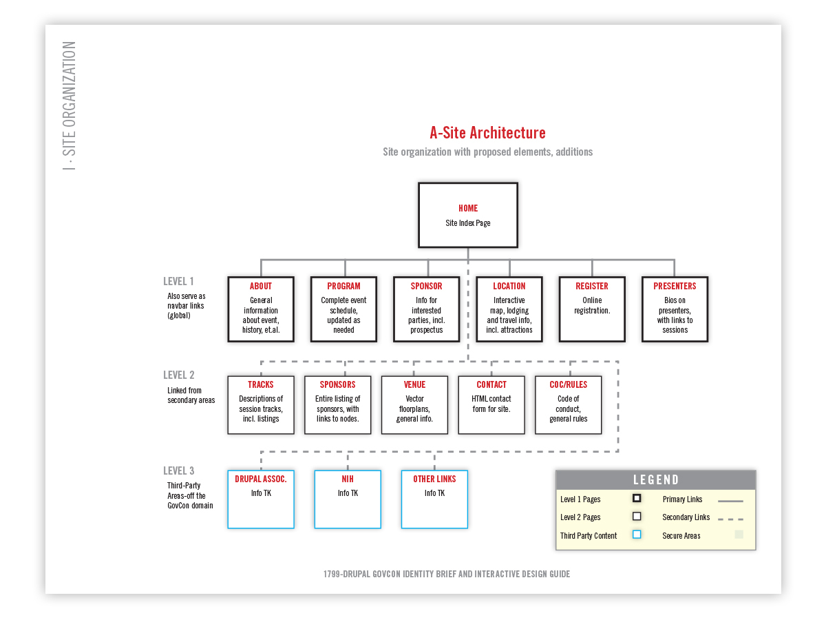
Information Architecture is a critical element of Web design and content strategy. Here, the initial layout for the GovCon 2016 site is shown.
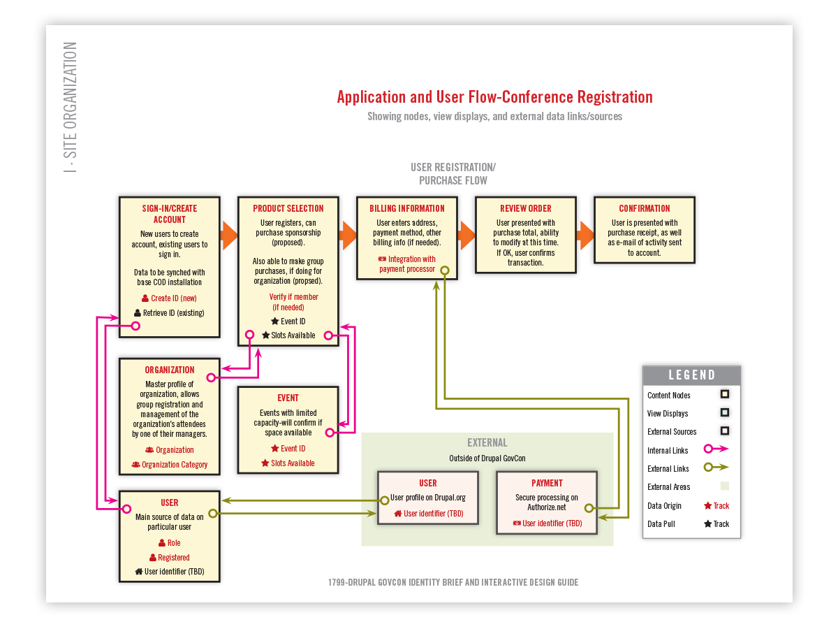
Mapping user and data flows takes a bit of time, but are of great help in demonstrating how user flow and the underlying processes interact. Another benefit is being able to boost collaboration between developers, designers, and managers and help to anticipate challenges before they become issues.

Wireframes are an essential part of the Web design process. Here, desktop and mobile layouts for the homepage, and schedule help both to plan and visualize content strategy for different use cases and devices.

To help attendees navigate the Natcher Center, custom floorplan illustrations were created, branded to the event. As a first, exhibitor areas were also included for this year.


