


BAD TASTE Recordings
Redesigning the Identity of a music label
Redesigning the Identity of a music label
Bad Taste Recordings has been a household name to fans of DnB music for some years now. Emerging from the legendary Bad Company UK formation that forever changed the way Drum & Bass sounds like back at the beginning of the millenium, the label still aims to constantly redefine the sound of this genre today and has been appreciated as an influential trademark throughout the scene.
Everything started with a sketch for a logo that I deemed perfect for the name and use. But even though there was very little of what you could call a Corporate Identity before the redesign, changing the looks of a name that is established in a rather underground scene is a risky task, specially when the whole feeling of it will be turned by 180° like we aimed to do in this project. Formerly a dark & grungy look with a grafitti-style logo, the looks of the label would become a clean, light, minimalistic design with a hint of japanese aesthetics.
After refining and reducing the compositions for weeks and months and some intense concept sessions with the label manager in London, the launch could be celebrated as a full success. Despite the radical change and the rather small, sworn in target audience the redesign was very well received and raised positive attention throughout the scene - giving the label a look worthy of it's tight, technical and futuristic sound and a look that will be recognized throughout its various forms and uses from webdesign to packaging and apparel printing.

Everything is derived from the basic logo design, crafted as an acronym of the name displayed in a single stroke, using negative space to write out all 3 letters. After balancing the weights, the logo proved to be aesthetically pleasing on a huge scale as well as recognizable and readable even in its tiniest uses, like a favicon and miniscule prints on flyers.

The main target was redesigning the labels housebags. As fewer and fewer labels release vinyl, it was an important aspect to design good looking sleeves and put further collectible value to this sadly dying medium. Yet as production costs are high for a small label, it's mostly impossible to print custom covers for each release, so a unified cover had to be created for regular releases, as well as a template for further designs and albums.

As the records will hold titles and informations directly on their stickers, the design of the sleeve aimes to emphasize the punched out whole on the backside, as this is where the only information other than branding will be displayed. The stickers where crafted to have a subtle but appealing animation effect while spinning on a turntable.
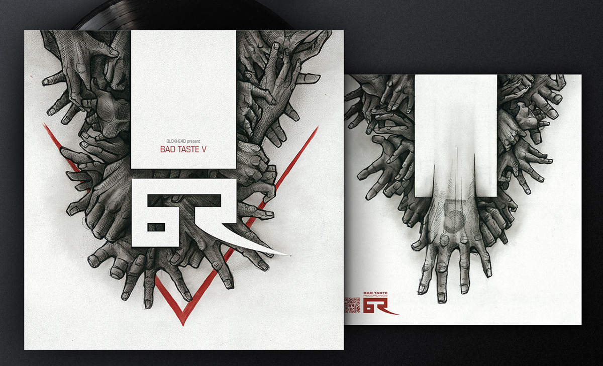
For larger releases like the labels own compilation albums, the base motive of the sleeve is iterated und used in connection with other artwork. With the Bad Taste Vol.5 album, we mixed up the general house sleeve design and mixed it with a hand drawn artwork painted with oil on fiberboard. Giving us two exclusive originals of the vinyl cover.

Trademark style Wallpapers.

Wallpaper with a heavier look, inverted colors.

The heavy change is strongly apparent when the new look is displayed side to side with the old trademark sign.
Wallpapers were crafted as a tribute to the old look, which has been the identity of the label for a long time.

Usage on the new apparel line.
Redesigning the Website www.badtasterecordings.com
As a marketplace and main public profile of the label, the website needed to accomodate to the new look as well as fullfill various needs - mainly giving room for the new, image-savvy presentation of Bad Taste, as well as making it easy to host podcasts and previews of tracks. It was conceived as a minimalistic, AJAX-driven site with a direct integration of the labels soundcloud account, making it possible to browse the page without stopping the music and removing the need to host mp3s or use custom players. Using a webshop by Databeats that is custom-fitted to record labels needs, a common design had to be implemented in two different systems to make the transition as smooth as possible, despite the technical restrictions.

Front page / Release list.

Soundcloud implementation.

Behind the scene: some of the initial sketches.
Hope you enjoyed - stay tuned for more insights on this project!
And grab some free Wallpapers on your way out ;)


