

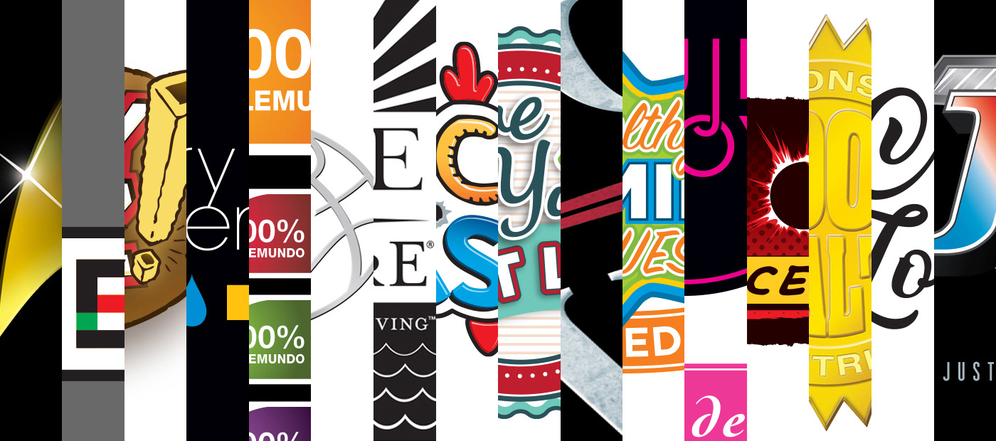
Logo Designs
Logo Design | Typography | Digital Illustration | Brand Identity
Distinct, innovative, and memorable.
I've had the opportunity to develop and design logos for a wide range of industries, and targeting a wide range of consumer demographics. For each project, I attempt to uncover a brand's distinct differentiation, and create an innovative, relevant, and memorable solution that will visually define that brand and its values.
Styles are always project-specific and therefore range from clean and corporate... to playful and bold... to hand-drawn... to rough and gritty... to fresh and modern.
Here is a small collection of some of those logo designs, showing a range of solutions and styles. Projects include NBC’s Heroes TV show fan club, Helping Hands, Barnes & Noble, Rugby XV, CBS Star Trek motion picture, One With Nature, US Nutrition, Telemundo, Creative Care, Topps Bazooka, Magic Johnson Enterprises, Foxwoods Resort Casino, Hasbro’s Lazer Tag, Golden Fluff’s Crispy Fryz, Nature's Bounty (NBTY), Zoo Games, Juilliard School, City Interactive, Best Signal Wireless, Artuition, and Warner Bros. & DC Comics’ Justice League of America motion picture.
. . .
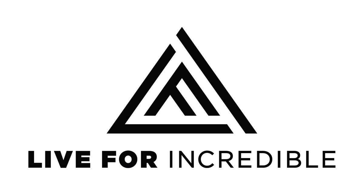
Live for Incredible (LFI) Wellness Travel
Logo & Visual Strategy
A luxury travel and concierge service, helping high performers make the most out of their valuable time away from work. LFI coordinates tailored experiences in the most awe-inspiring regions of the world. They target individuals looking to practice healthy habits, taste authentic local cuisine, discover sustainable efforts, and travel with purpose to lead a better lifestyle.
A few years into their business, LFI decided their current look was not communicating their values. I was tasked with creating a more fitting visual identity, new logo, and brand guidelines to help distinguish their brand and better reach the intended audience. After reviewing LFI’s manifesto and researching competitors, I helped them define their brand, and put together a visual strategy document, outlining tone of voice, color palette, photography and graphics style. It was important to move away from their previous DIY, crafty look into something that was cleaner, higher-end, and more modern.


Logo Features
I created a minimalist one-color logo that features the company’s initials in a simple shape that hints at both a series of mountain peaks and also abstract arrows pointing upwards. My aim was to portray LFI’s strong belief in positive choices and experiences, personal growth, wellness, and achievement. The core of LFI is travel, so I felt it was important to always pair the logo with beautiful photography to elicit an emotional response and SHOW what LFI can do. This also serves to promote specific destinations and adventures.
For versatility, I create both black and white versions, as well as the primary horizontal and secondary stacked alternate. With the new logo already in place, a new website and collateral materials are planned to follow. Shown are the LFI logo variations, as well as photographic styles and usage examples.


Some sketches for the client's initial direction.


Exploration following the client's initial direction and sketch selection.


New sketches following the client's revised, new direction.


Graphic and font exploration, followed by logo refinement for the client's new direction.

Final logos: Primary horizontal, secondary stacked alternate, and standalone LFI mountain logomark.


. . .

NBC – Heroes TV show Official Fan Club
When NBC tasked us with creating a logo for their hit TV show Heroes, I immediately began research by watching the entire first season of the series, and reading up on as much info as I could find. The logo would largely be used on badges for VIP fans to attend special events and exclusive experiences, but also on NBC's website, marketing collateral, and branded merchandise, such as hats, t-shirts, and patches.
I came up with a solution that married their already distinct primary Heroes identity with a half-tone dot pattern background and hand-drawn lettering style (using the creator's actual handwriting) reminiscent of comic books. NBC selected my design and expressed that it was a really fitting, on-target solution that die-hard fans would love and easily identify with.


. . .

Topps – Signature Basketball card series
To differentiate from many of the overly bold, masculine, ubiquitous trading card brands, the goal of this project was to design a cleaner, more elegant sports logo to reflect the higher price point of this high-end Topps Signature Basketball series. The design also needed to be a simple 1C solution, as it would be primarily featured as a foil-stamped logo on each card in the series.
I created a minimalist, stripped-down basketball graphic with a shape that hinted at movement and energy, and enlisted a script typeface that was refined, but not too soft for an NBA brand. My solution was selected, and shown here is the standalone logo (above) and usage on several sample cards and the series packaging (below).
I created a minimalist, stripped-down basketball graphic with a shape that hinted at movement and energy, and enlisted a script typeface that was refined, but not too soft for an NBA brand. My solution was selected, and shown here is the standalone logo (above) and usage on several sample cards and the series packaging (below).
To see many of my sports trading cards designs for MLB, NBA, NFL, UFC, etc. within this portfolio, please click here.


. . .

Topps – Bazooka bubble gum Logo and Packaging
Topps is an international marketer of entertainment products—collectible trading cards, sticker collections, strategy games, and distinctive confectionery products with Bazooka bubble gum at the forefront. Bazooka began in Brooklyn, NY shortly after WWII, and since 1953, Topps has been wrapping the gum with Bazooka Joe and his gang comics.
When Topps Bazooka tasked us with redesigning their iconic logo and packaging, I paid extra attention to their history, and recognized the brand as a vital part of pop culture. My goal was to create a playful new identity that stays true to Bazooka’s rich, all-American heritage. To leverage existing brand equity, I incorporated Bazooka Joe into the logo itself, and turned things inside out by highlighting the legendary comics as a main background element on the package design. I was thrilled when Topps selected my logo and packaging solution.
To see the full project, including branding and packaging within this portfolio, please click here.

. . .

The Cross of Love
Primary logo for a jewelry company that creates luxury pieces inspired by love and religion.
. . .

CBS – Starfleet Academy logo for Star Trek motion picture
When J.J. Abrams and CBS began their movie reboot of the iconic Star Trek series, they tasked us with designing a logo for Starfleet Academy, the fictional school where recruited officer corps are trained. The mark would be used in the movies themselves (most notably on the academy's uniforms and campus merchandise), as well as in the real-world CBS Star Trek style guide for actual branded merchandise and apparel.
I came up with a solution that featured a more modern version of their iconic, delta-shaped graphic as a framing device for the copy. I chose two complementary main typefaces—a classic, rectilinear sans-serif (very fitting for the sci-fi genre) and a collegiate slab serif (often associated with universities and academies).
Shown are the two variations I created to cover a variety of uses—the primary logo on full black background (above), and the secondary badge version for embroidered patches and items without black backgrounds (below). Though I couldn't locate it in the movie, it was rewarding enough to know that my logo was selected by CBS and J.J. Abrams.

. . .

Telemundo – Mujer de Hoy (Woman of the Day) home decor brand
Telemundo is the second largest provider of Spanish-language content nationwide with programming syndicated worldwide to more than 100 countries in over 35 languages. They broadcast programs and original content aimed at Hispanic and Latin American audiences, consisting of telenovelas, sports, reality television, news programming, and films.
I created logo solutions for Telemundo's stylish home decor brand Mujer de Hoy, primarily targeting Hispanic women. As the client was unsure about the creative approach they wanted to take, I presented them with two very different options—the sexy, playful, modern, circular logo shown at top, and the more conservative, elegant versions below.

. . .

City Interactive – Combat Wings logo and package design
Victory hangs in the air. Grab it with both hands!
City Interactive is an international developer of computer and video games for various platforms, including PlayStation 3, PlayStation 4, Xbox 360, Xbox One, Nintendo DS and Wii. With a presence in more than 40 markets on four continents, they are one of the world's fastest growing interactive entertainment companies.
I was tasked with creating the logo and package design for their World War II flight simulation and aerial shooter game, Combat Wings. This intense, arcade-style combat game features the realistic, stunning graphics, and outstanding special affects—great for the casual gamer, as well as the World War II history buff.
I designed their logo with a classic typeface, metal texture, and graphics reminiscent of American military gear. The front packaging displays one of their realistically modeled planes, and two dramatic night and day battle scenes. The back features game summary copy, two breathtaking scenes, and four overview highlights, all within a metal encasing framework evocative of sturdy, military construction.


. . .

Rugby XV apparel and equipment
Tough Game. Tough Gear.
At the forefront of supplies for men’s, women’s, and youth rugby clubs, Rugby XV is dedicated to the spirit and traditions of the game around the world. Rugby XV tasked us with designing their primary company logo, referencing the simplicity of the Nike logo and the rough attitude of the rugby sport.
I created a hand-drawn solution that shows grit and directness, featuring the company name in the unmistakable rugby ball shape. I chose a solid, one-color solution for versatility. The color can easily be changed to meet all applications and individual team colors.


Initial rough exploratory sketches.
. . .

Foxwoods Resort Casino – Foxwoods Poker Classic
As the largest resort casino in North America, Foxwoods offers a vast array of gaming in six casinos. I created the logo for the Foxwoods Poker Classic, a major poker event, which attracts the top professional and amateur players. Below are two additional logo design projects for Foxwoods.
. . .

Foxwoods Resort Casino – The Ultimate Race Book
Logo for facility at Foxwoods, where race fans can follow all of their favorite tracks while keeping up with the games. Play the ponies. Handicap the hounds. Hit the jai alai trifecta. You can do it all at The Ultimate Race Book.
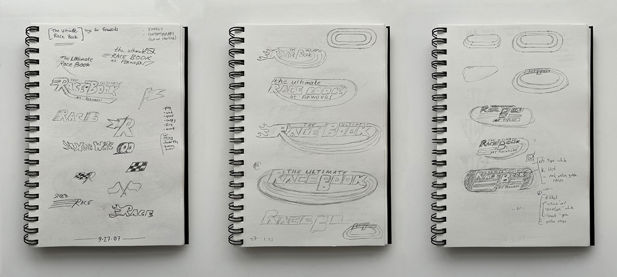
Initial rough exploratory sketches.
. . .

Foxwoods Resort Casino – World Poker Finals
Logo for the World Poker Finals, one of the premiere tournament events on the world poker scene. The tournament is open to the public, giving anyone the opportunity to mix it up with top pros and amateurs alike.
. . .

Warner Bros. & DC Comics, Inc. – Justice League of America (JLA) 2009 motion picture
The buzz surrounding this movie was massive. With a planned release of 2009, Justice League of America was slated to star Jessica Biel as Wonder Woman, Tyrese Gibson as Green Lantern, and to be directed by George Miller. The clients loved my solution, which featured a simple, beveled metallic finish, and red, white and blue JLA letterforms set against a black background.
Unfortunately, an industry-wide writer's strike, followed by additional development and casting issues put this 2009 movie version indefinitely on hold.

Initial rough exploratory sketches.
. . .

Magic Johnson Enterprises
Magic Johnson Enterprises serves as a catalyst for fostering community and economic empowerment by providing access to high-quality entertainment, products and services that answer the demands of multicultural communities.
When the philanthropist and former basketball star tasked us with designing the primary logo for his company, my goal was to create a design that was grand and iconic, like Magic and his legacy. Largely a typographic solution, I used the bold Champion typeface, and featured the distinct silhouette of Earvin “Magic” Johnson himself.
. . .

Juilliard School – Quintessence
Founded in 1905, The Juilliard School is a world leader in performing arts education. The school’s mission is to provide the highest caliber of artistic education for gifted musicians, dancers, and actors from around the world. I created the above logo for Quintessence, a traveling group of five creative performance disciplines, each represented by the five colored circles.
. . .

artuition
Primary logo for a marketing agency that values creativity and big ideas. Shown above is the standard horizontal logo. Below are secondary versions for use in vertical or square formats. The bottom left logomark is used as a graphic icon for when the company name is not required.

. . .

US Nutrition – Live Your Best Life
Valassis is one of the largest coupon distributors/processors in the world. RedPlum is their consumer-facing brand, and their newspaper inserts and direct mailings reach more than 100 million consumers a week. I designed the Live Your Best Life logo for a Red Plum 2016 free-standing insert (FSI) event.
. . .

Hasbro – Lazer Tag
Creating the World's Best Play Experiences
Hasbro—the third largest toy maker in the world—is a global play and entertainment company. From toys and games to television, movies, digital gaming and consumer products, they offer a variety of ways for audiences to experience its iconic brands.
When tasked with revitalizing their classic 1986 Lazer Tag brand for the modern market, we needed to come up with an entirely new look. The directive was a more intense design, taking into account a more modern, technologically savvy military style.
My solution for this interactive battle game was a darker, edgier logo, featuring a tech-looking rectilinear typeface that’s been cut with a laser, red gunsight reticle with crosshairs to further focus the consumer’s attention, and a bit of digital distressing to the entire logo, displayed as dripping pixels.

Initial rough exploratory sketches.
. . .

One With Nature
Primary logo for a boutique fitness center that offers comprehensive fitness and wellness programs, along with an individualized nutrition consulting service to help you achieve your fitness goals and create a happier, healthier lifestyle. Their brand promises to cultivate the mind, body and soul connection.
. . .

Telemundo Seal of Approval
Telemundo is the second largest provider of Spanish-language content nationwide with programming syndicated worldwide to more than 100 countries in over 35 languages. They broadcast programs and original content aimed at Hispanic and Latino American audiences, consisting of telenovelas, sports, reality television, news programming, and films.
Telemundo requested a seal of approval mark that would instantly let consumers know they were viewing a Telemundo-endorsed product. I created a simple, bold graphic that was selected by the client, and is easily adaptable to all of the colors outlined in their style guide.
Shown above are eight of the final twelve color variations for use on dark or light backgrounds. Shown below are selected pages from Telemundo’s style guide, displaying logo usage on various packaging applications.


. . .

Helping Hands and Shop Rite – Breakfast On Us
Helping Hands is a non-profit organization committed to supporting the local community through charitable contributions to worthy causes. Their mission is to serve others and help meet their needs with products, time, and direct monetary giving.
I designed their logo for Breakfast On Us, a charitable event program in cooperation with Shop Rite grocery stores, which offers vouchers for perishable item donations to families in need.
. . .

New York City Dept of Health and Mental Hygiene – NYC Condom logo and packaging
Proposed logo and packaging for 2010 NYC Condom wrapper design contest, featuring a nighttime sunset skyline—the perfect time for when love is in the air.
. . .

citi seeds
Concept, primary logo, branding system, and package design for a product line that provides lawn and garden care solutions, primarily targeting consumers in an urban environment. Shown above is the primary logo.
. . .

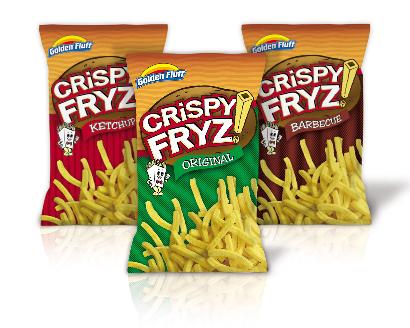
Golden Fluff – Crispy Fryz logo and packaging
Since 1983, Golden Fluff has been leading the way in the niche kosher snack market. I designed the logo, branding system and package design for Crispy Fryz, a crunchy potato snack brand that's an alternative to the basic chip.
I art directed one of our illustrators for the potato and product illustration within the logo. For the three flavor varieties (Original, Barbecue, and Ketchup) the project features 4C common printing, plus individual black, white and spot plate variations for flavor swap-outs.

. . .

Barnes & Noble – Flash Kids
Tools parents trust, activities kids love!
I designed the primary logo for Flash Kids, a children's educational product line. Developed by educators, Flash Kids offers serious learning tools with a lively, lighthearted feel. Their products cover essential math, reading, and language arts skills in a way that makes learning quick, easy, and fun.
. . .

US Nutrition – Healthy Family Values
Valassis is one of the largest coupon distributors/processors in the world. RedPlum is their consumer-facing brand, and their newspaper inserts and direct mailings reach more than 100 million consumers a week. For US Nutrition’s portfolio of products, I designed the logo and inside magazine spreads for this Red Plum free-standing insert (FSI) coupon event for spring 2015.

. . .

Best Signal Wireless
Primary logo for cell phone accessory manufacturer.
. . .

Zoo Games – Chicken Blaster for Nintendo Wii system
It's time to put those crazy chickens in their place!
Things have gone completely haywire for our humble poultry-farming friend! Crazy chickens have infiltrated his once anonymous and boring life—and now all of his chickens are going mad! I designed the primary logo for this Nintendo Wii shooting game that promises a wild, wacky, and fun experience for gamers.
To keep with the playful nature of this product, I used a typeface and coloring that hints at chicken legs and feet. And for the white logo holding device, I added the signature red comb and wattle found on a chicken's head.

. . .

Creative Care Adult Family Homes
Creative Care Adult Family Homes sets the standard for quality in the home health care industry. They provide highly-personalized, cost-effective medical care that enables patients to live in a family home environment.
When they requested a clean, straightforward logo to fit with their brand, I accomplished this with very legible typography, and simple, unmistakable graphics that convey the comfort of home.
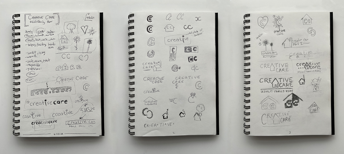

Initial rough exploratory sketches.
. . .

Nature's Bounty (NBTY) – Scientific Advisory Council (SAC)
NBTY has enriched the lives of consumers around the world by introducing innovative products and solutions to the health and wellness marketplace for more than 40 years.
In 2015, they announced the creation of the Scientific Advisory Council (SAC)—comprised of the most respected medical and nutrition experts in the field—to tackle major world problems, such as obesity and starvation. The council represents expertise in a variety of disciplines, including Nutrition Epidemiology, Alternative Medicine & Herbs, Food Science, and Sports Nutrition.
I created two logo solutions for SAC. The first (above) visually displays the converging disciplines, by way of overprinted red, yellow, and blue SAC letterforms, working together to form one graphic symbol that resembles the letter S. Shown are the S logomark icon and the primary horizontal logo.
The second solution (below) uses illustrations to convey the three core focal points of the council—nutrition, science, and community.

. . .


