UPS Reframed.
Agency: FutureBrand
Agency: FutureBrand
By 2002, UPS had evolved from the package delivery service identified by Paul Rand’s classic 1961 logo to a vast organization whose expertise in delivery now encompassed logistics synchronized on a global scale. UPS’ visual communications had in turn grown unwieldly, and FutureBrand’s task was to re-synchronize the UPS brand. UPS had outgrown the package, but retained the valuable equity of Brown as well as the dependability and quality inherent in the shield mark.

I was part of a small team that explored the continued viability of the UPS shield and designed the final brand mark. Its primary qualities are luminosity and warmth (in an effect similar to chiaroscuro in painting) and precision in its rendering.
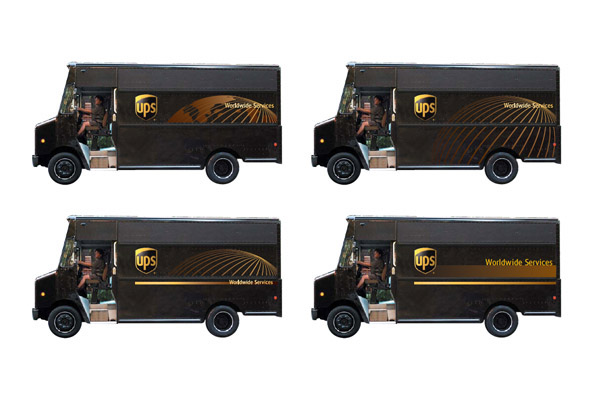
Design exploration for the package car. The globe was a holdover from the previous iteration of the car; it was ultimately jettisoned to allow a clean staging of the new tagline: "Synchronizing the world of commerce"

Car, delivery man, package. The classic customer touch points
Synchronized

Commemorative “message map” and lapel pin giveaway for UPS employees

“Message map” unfolded

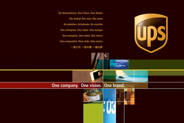
Corporate launch brochure for UPS management (cover)
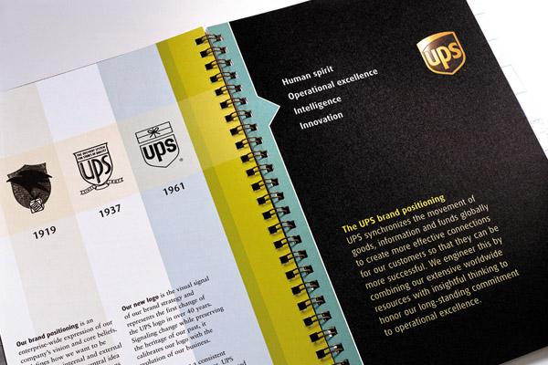
Corporate launch brochure for UPS management (interior)

Corporate launch brochure for UPS management (interior)

The collateral system: from promotional to corporate


I designed the package series to represent the "default setting" of the collateral system

Homepage welcome graphic
