


The problem
The Swedish national public broadcaster, SVT, lacked a unified typographic voice. The many different fonts in use did not reflect the broadcasters values, programming and audiences.
The Swedish national public broadcaster, SVT, lacked a unified typographic voice. The many different fonts in use did not reflect the broadcasters values, programming and audiences.
Our ambition
Together with SVT we decided to develop a complete typeface family from scratch. A face unique to them, that felt inclusive, credible, accessible and beautiful.
Together with SVT we decided to develop a complete typeface family from scratch. A face unique to them, that felt inclusive, credible, accessible and beautiful.
Our process
Every character and every umlaut was painstakingly drawn with the intention to create something out of the ordinary. Not just in matter of legibility for screen and print, but also in finding a unique visual look and personality.
Every character and every umlaut was painstakingly drawn with the intention to create something out of the ordinary. Not just in matter of legibility for screen and print, but also in finding a unique visual look and personality.
The result
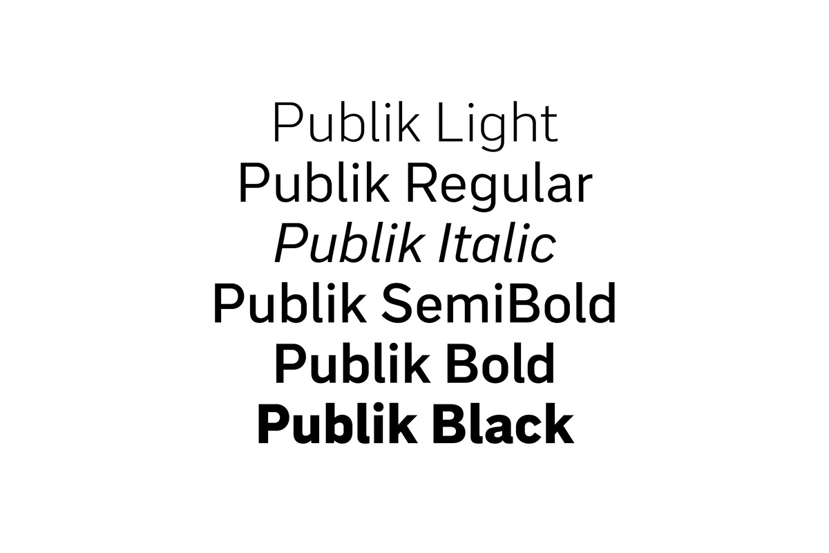
We named the finished result Publik. Publik is Swedish for audience, it is also a nod to SVT as a public service broadcaster. It comes in five weights and one italic.
We named the finished result Publik. Publik is Swedish for audience, it is also a nod to SVT as a public service broadcaster. It comes in five weights and one italic.

