

I had a pleasure to design this book series for the National Library of Poland.
They are the catalogues of manuscripts and autographs in the collection of the Library.
The catalogues are used by librarians and scholars, they are also a gift for donors of the manuscripts. This means that the audience is rather conservative. The goal was to create a functional, but elegant book.
/ / /
Miałam przyjemność zaprojektować dla Biblioteki Narodowej serię wydawniczą – Katalog rękopisów Biblioteki Narodowej.
Katalogi są używane przez bibliotekarzy i badaczy, stanowią również podarunek dla ofiarodawców rękopisów. Oznacza to, że potencjalni odbiorcy serii mogą mieć raczej konserwatywne oczekiwania co do estetyki i wizualności tej publikacji. Katalogi miały być funkcjonalne, a jednocześnie eleganckie.

For me it was a rare occasion to design a publication that doesn’t have to compete with the others on the bookstore shelf. I could also use fine paper and high-quality finishing.
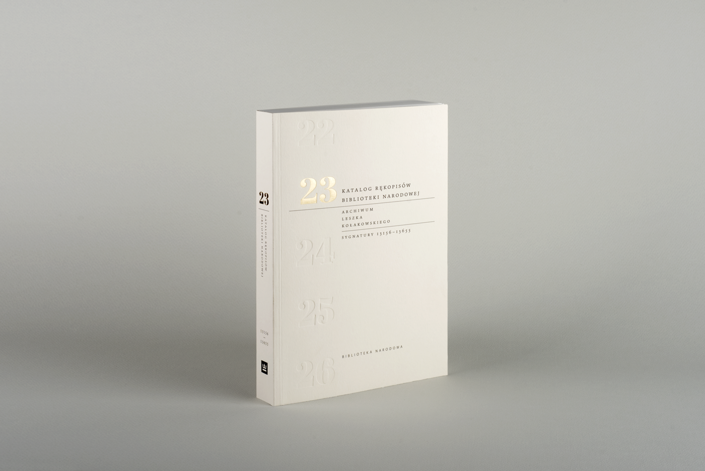
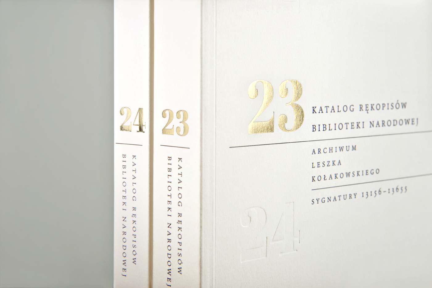
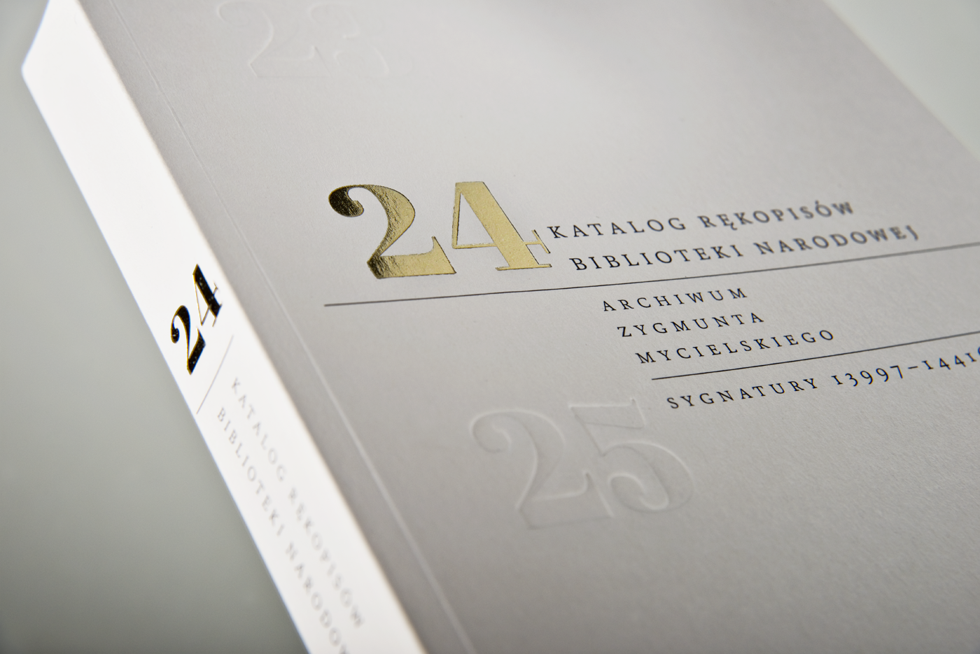
The cover is printed on Keaykolour by Arjowiggins – a very fine paper, but with a warm, natural feel. I added a clean, minimalist design and juxtaposed it with some rich finishing (blind embossing and hot stamping with golden foil). This creates a truly prestigious look of the book.
The cover is printed on Keaykolour by Arjowiggins – a very fine paper, but with a warm, natural feel. I added a clean, minimalist design and juxtaposed it with some rich finishing (blind embossing and hot stamping with golden foil). This creates a truly prestigious look of the book.
On every volume the numbers change as if moving in an old type of calendar.
/ / /
Dla mnie była to rzadka okazja do zaprojektowania książki, która nie musi walczyć o uwagę na półce w księgarni. Mogłam też użyć szlachetnego papieru i wykończeń (czyli zlecenie-marzenie!). Okładka jest wykonana z papieru Keaykolour (dystrybutor – Antalis), który łączy w sobie wysoką jakość i przyjazny, ciepły efekt. Naturalny kolor papieru i oszczędny projekt zestawiłam z „bogatym” wykończeniem (tłoczenia i złota folia). To połączenie tworzy wyjątkowy charakter publikacji.
Z każdym kolejnym tomem numery na okładce będą się przesuwać, trochę jak w kalendarzu starego typu.

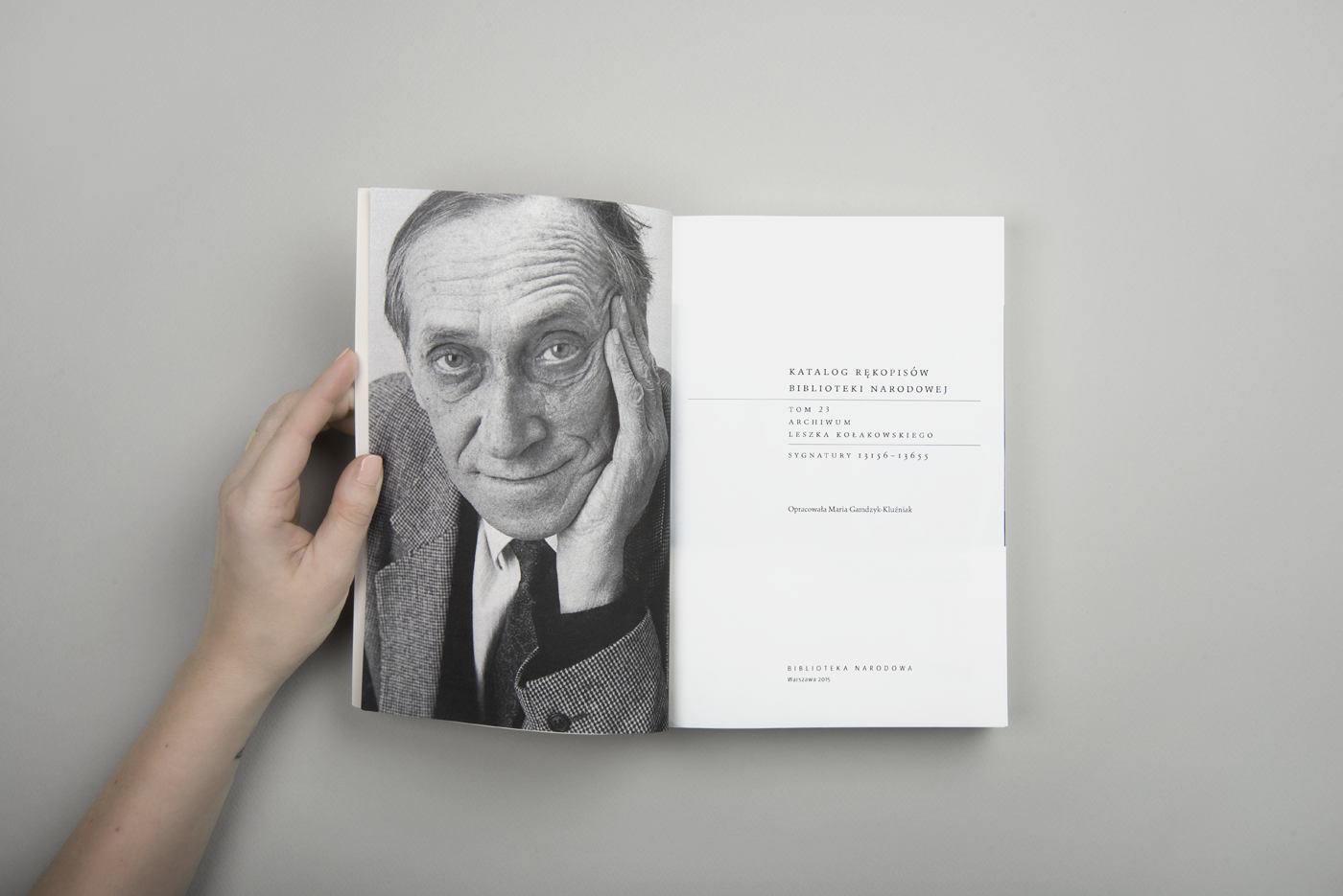
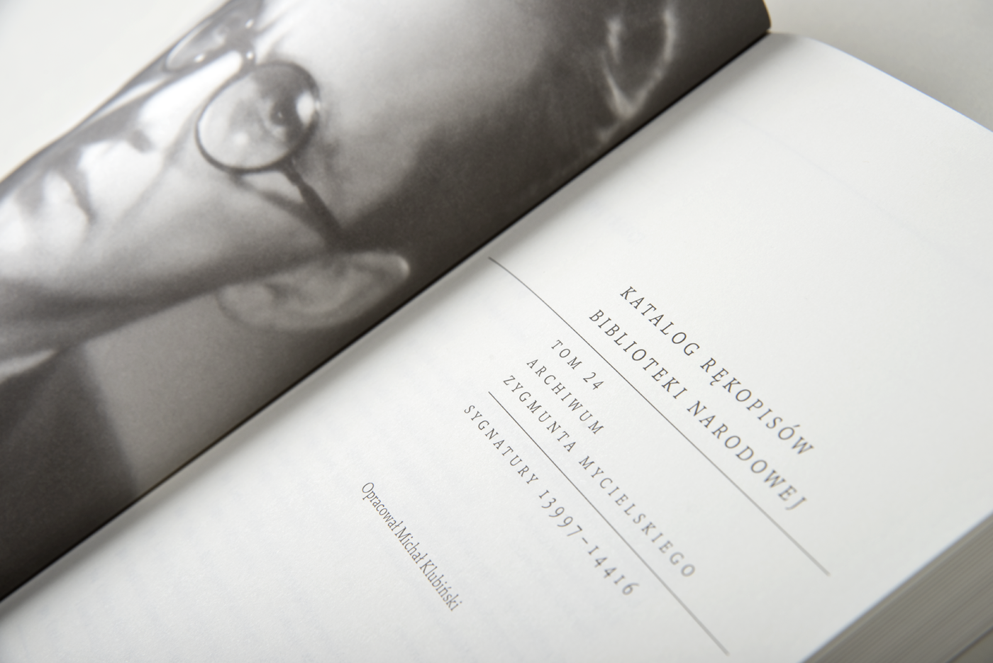
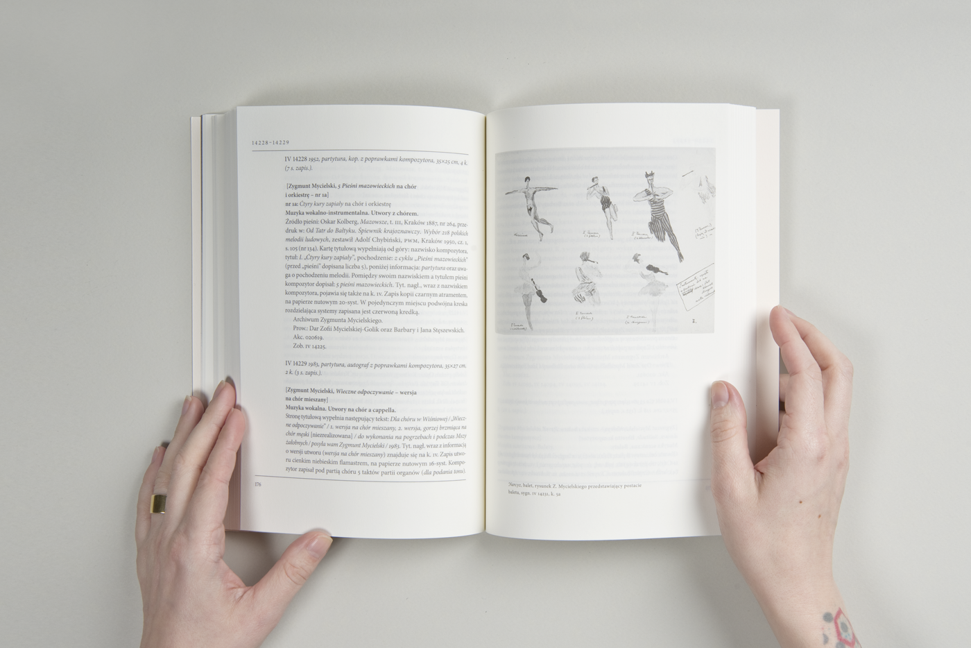
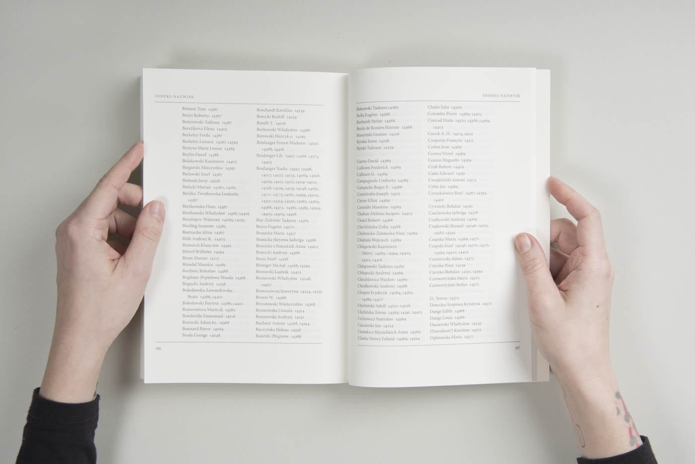
The book is printed on Munken Pure. The text is set in Minion Pro in 95% K – it's legible and subtle at the same time.
Each volume starts with a black & white photograph of the author of the manuscripts.
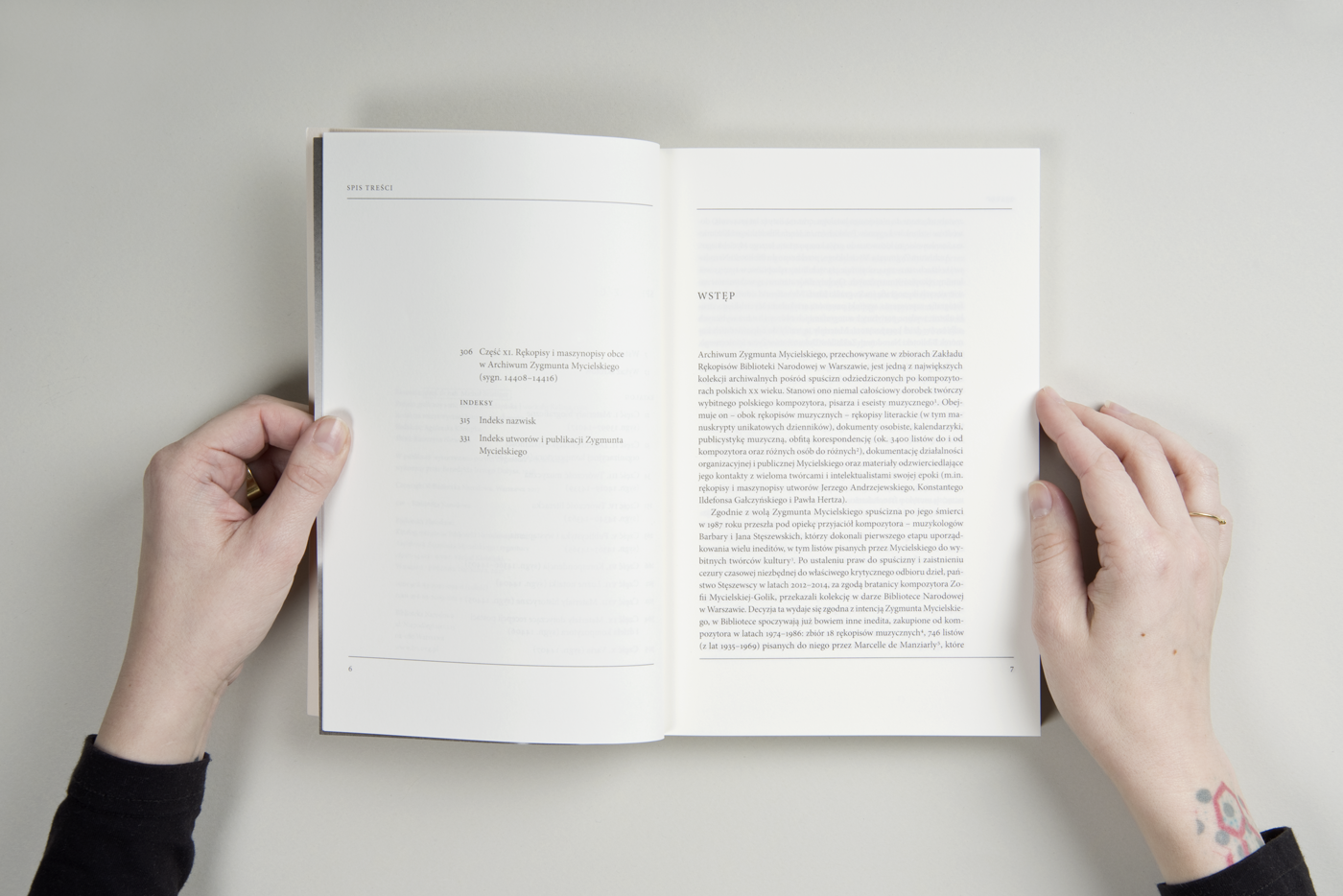
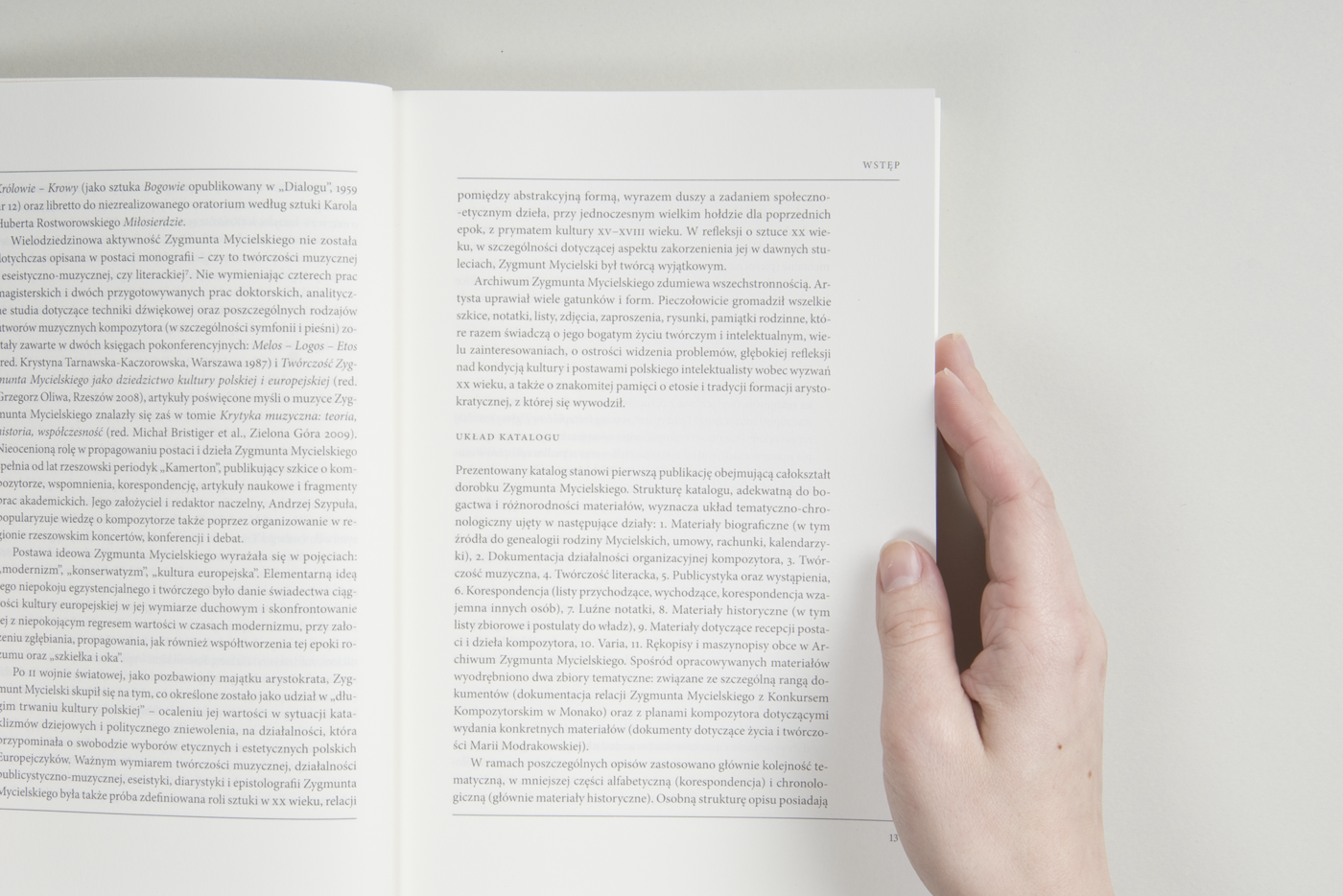
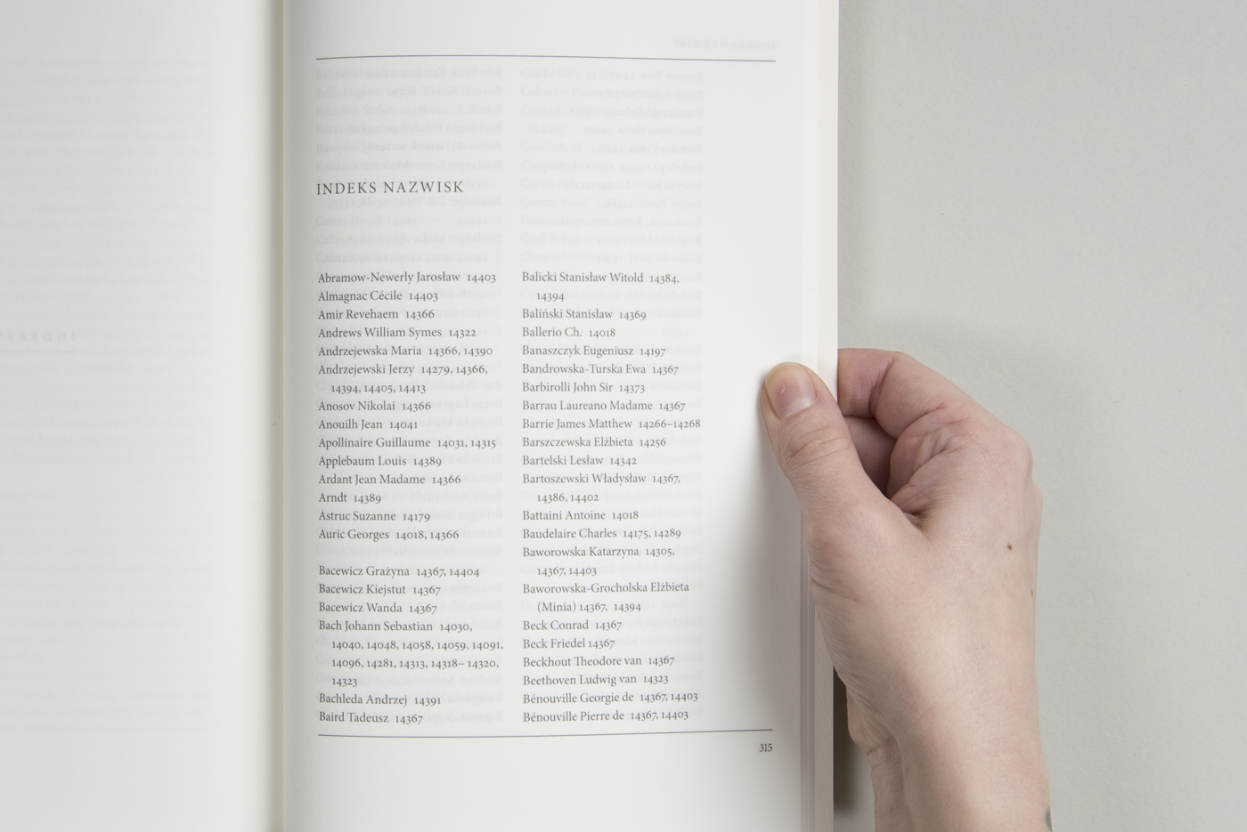
The text is not easy to set, as it has lots of short paragraphs and bibliographic signatures. To keep it clean and in order I used the horizontal lines on top and bottom of the column. The navigation is easy thanks to a well-visible running header and pagination.
/ / /
Książka została wydrukowana na papierze Munken Pure i złożona krojem Minion Pro w kolorze 95% K. Dzięki temu wygląda subtelnie, a jednocześnie zachowuje dobrą czytelność.
Każdy tom otwiera czarno-biała fotografia autora rękopisów.
Tekst jest dosyć wymagający ze względu na krótkie akapity i liczne podtytuły i oznakowania bibliograficzne. Żeby zachować czysty wygląd stronicy, granice kolumny zostały podkreślone poziomymi liniami. Żywa i bieżąca pagina są wyeksponowane, ułatwiając korzystanie z publikacji.
This publication has a nomination in the Most Beautiful Book of the Year contest in Poland.
/ / /
Publikacja jest nominowana w konkurskie PTWK na Najpiękniejszą Ksiażkę Roku.


