


For Footnotes' 10th anniversary I wanted to update the look of our website, as well as build it to be mobile and touchscreen friendly. The new site is fully responsive to allow for easy viewing on any current device width, and future-friendly for devices yet to be deployed. I also built the site using mobile-first methods so smaller screens with bandwidth limitations wouldn't need to download as many images and scripts.
www.footnotestapensemble.org
www.footnotestapensemble.org
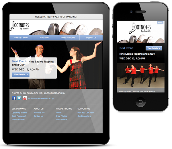
The main content breakpoint is at 480px where the navigation collapses into a toggled menu. This change was made so the menu doesn't take up space for the main site content on smaller screens. Content layout was also optimized for the smaller screen; for example on the homepage the main call-to-action to see our next event was moved to the top. The responsive photo slideshow is also not loaded in the smaller widths to save bandwidth, but instead uses a PHP random image rotator on reload.

Building the site mobile-first helped me focus on content hierarchy, which determined what HTML elements were built to show first in the smaller, single-column layout, and adjusted with media queries into multiple columns for larger displays.
Other considerations were made for the mobile view such as the toggled menu taking away the navigation's secondary function of breadcrumbs, so a breadcrumb-specific element is seen only in views under 480px.
As a member of Footnotes I wanted the user to easily learn more about the Ensemble and find out where they can see us dance. If you happen to be in the Triangle you should stop by to see a show!

