Magnet - Visual Identity
The Concept
This branding project was created as a student project for Magnet, a fictional film studio. "Magnet is a film studio formed from a collaboration of artists, writers, and directors who work together on independent creative projects. It produces digital content that leaves a lasting impression".
Solution
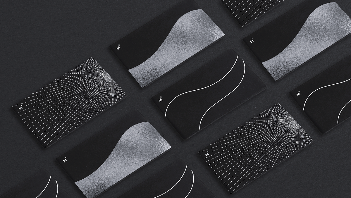
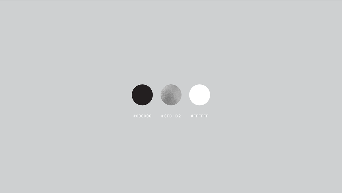
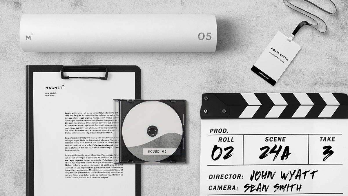
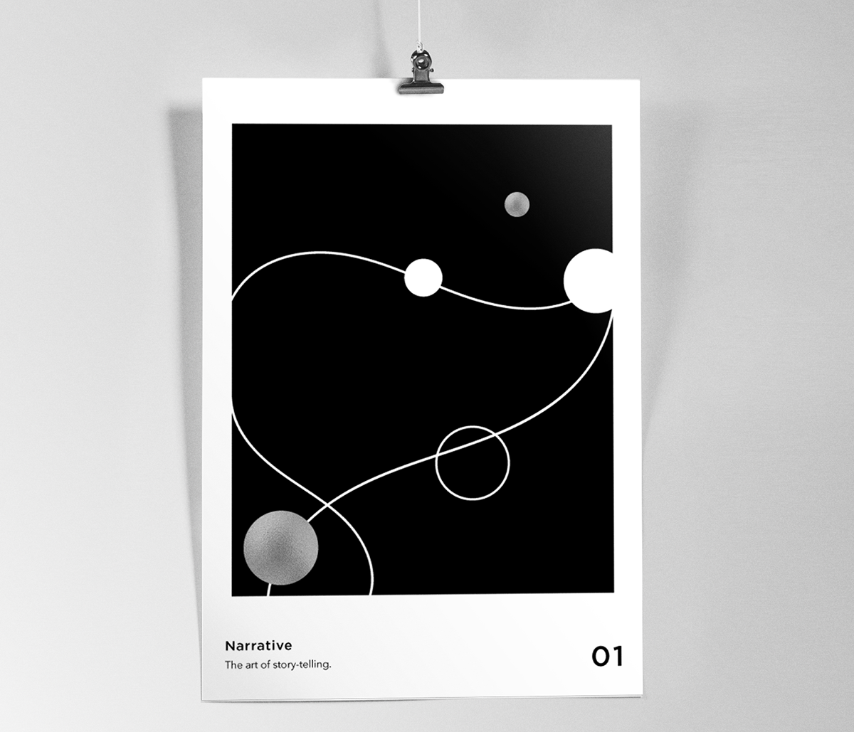
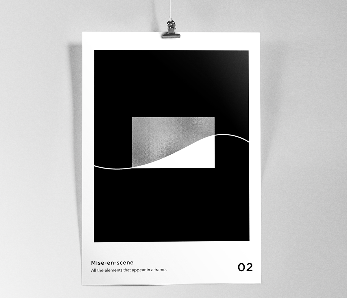
The goal was to create a unified visual identity, including the logo, communication design, and print collateral. The logo was created with a bold sans serif. The "plus" sign on the logo conveys the attractiveness of the studio's films, while also referencing the pull of magnetic waves. I looked to cinema and art for inspiration, including Citizen Kane and compositions by Wassily Kandinsky. I decided to keep the patterns abstract, while focusing on the shape and form of magnetic waves. The black and white palette was inspired by early cinema. The waves and lines within the patterns represent magnetic waves and cinematic light. I created an additional poster series to illustrate the elements of film-making.


Posters - The elements of film-making


_
August 2016


