The Theatre Institute in Warsaw has invited Manuka studio to design the identity of the Polish National Exhibition on Prague Quadrennial of Performance Design and Space 2015. With Marta Malesińska as the project manager, I designed the bilingual catalogue.
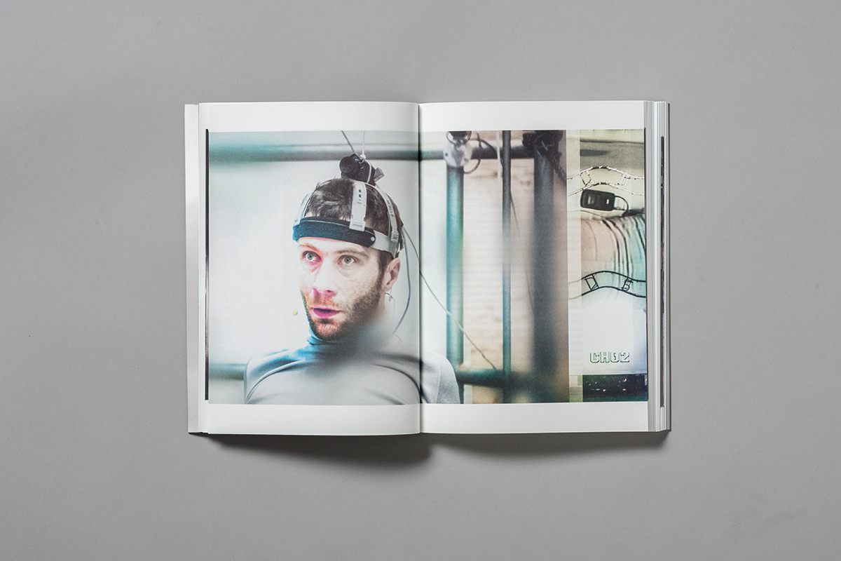
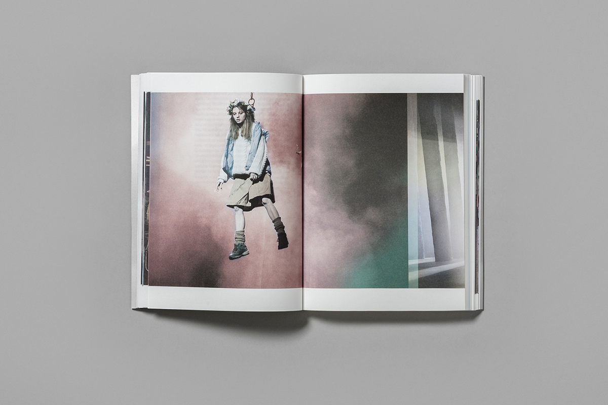
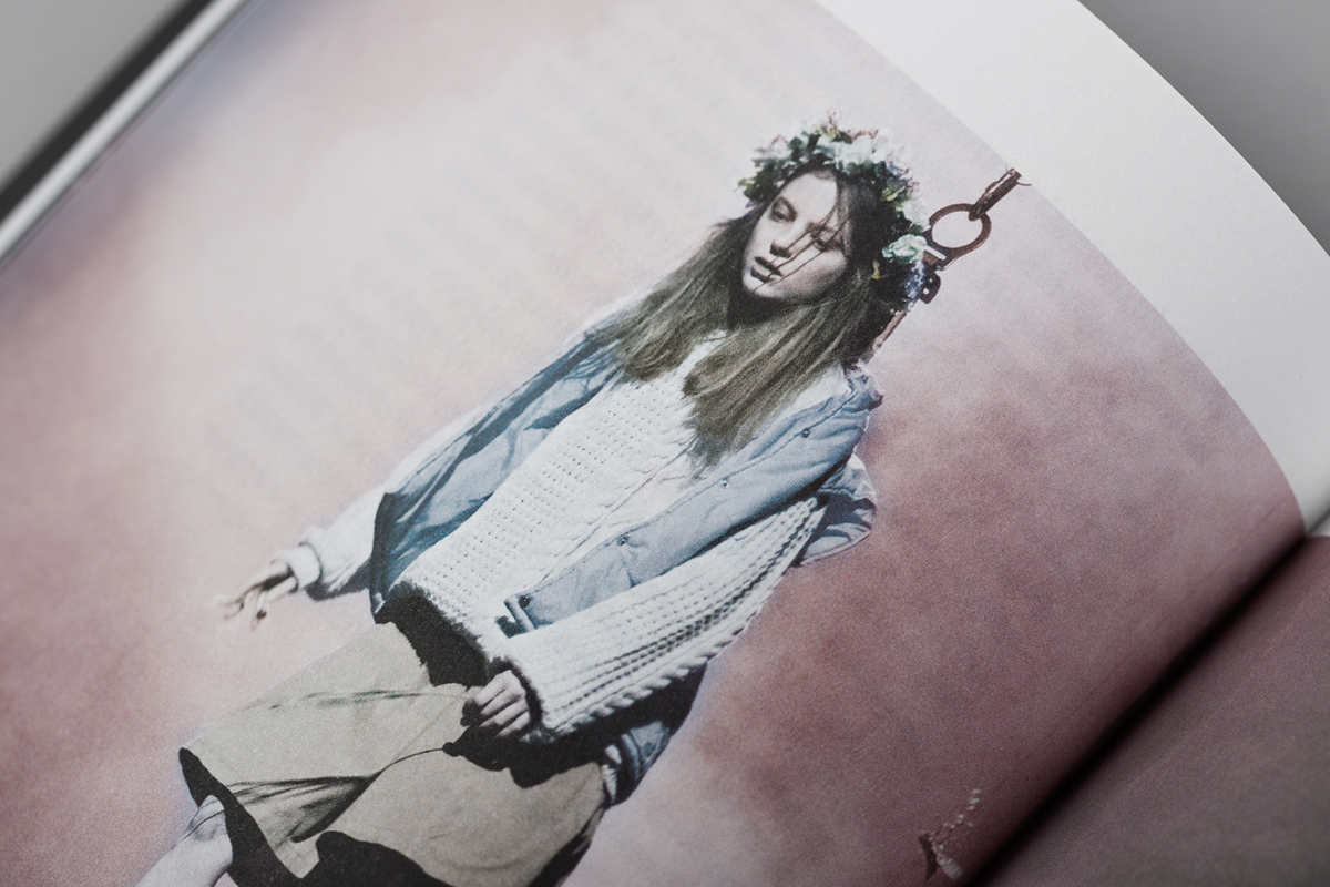
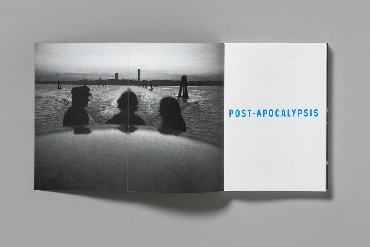
The exhibition, inspired by J. Grotowski’s production „Apocalypsis cum figuris”, explores the relationship between technology, human and nature, as well as the diffusion and mixing of those elements. It shows the (post-apocalyptic) world as a diffused network.
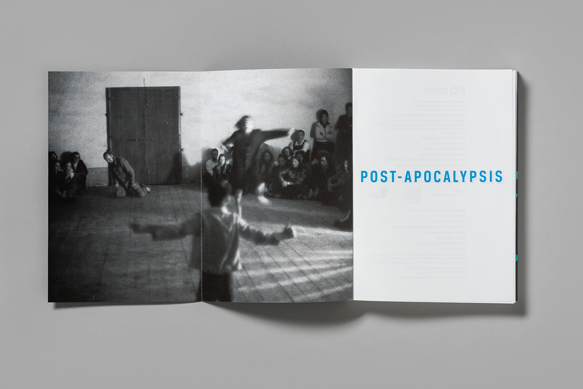
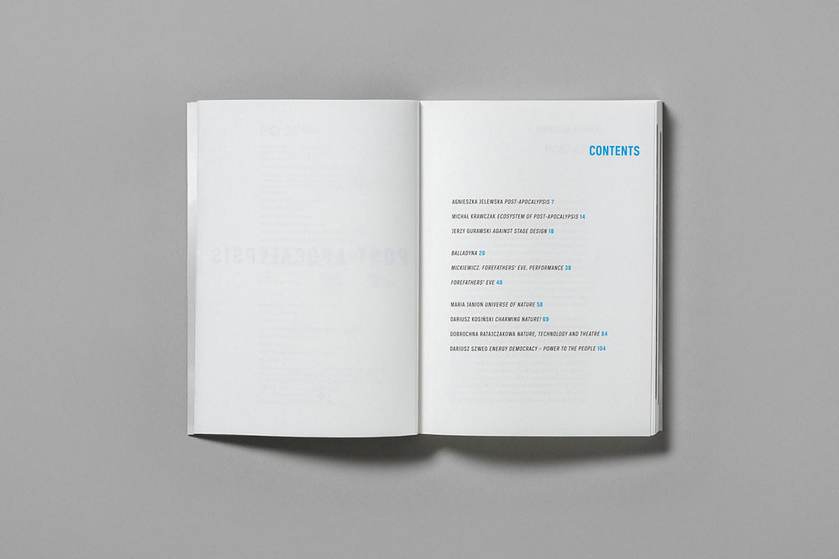
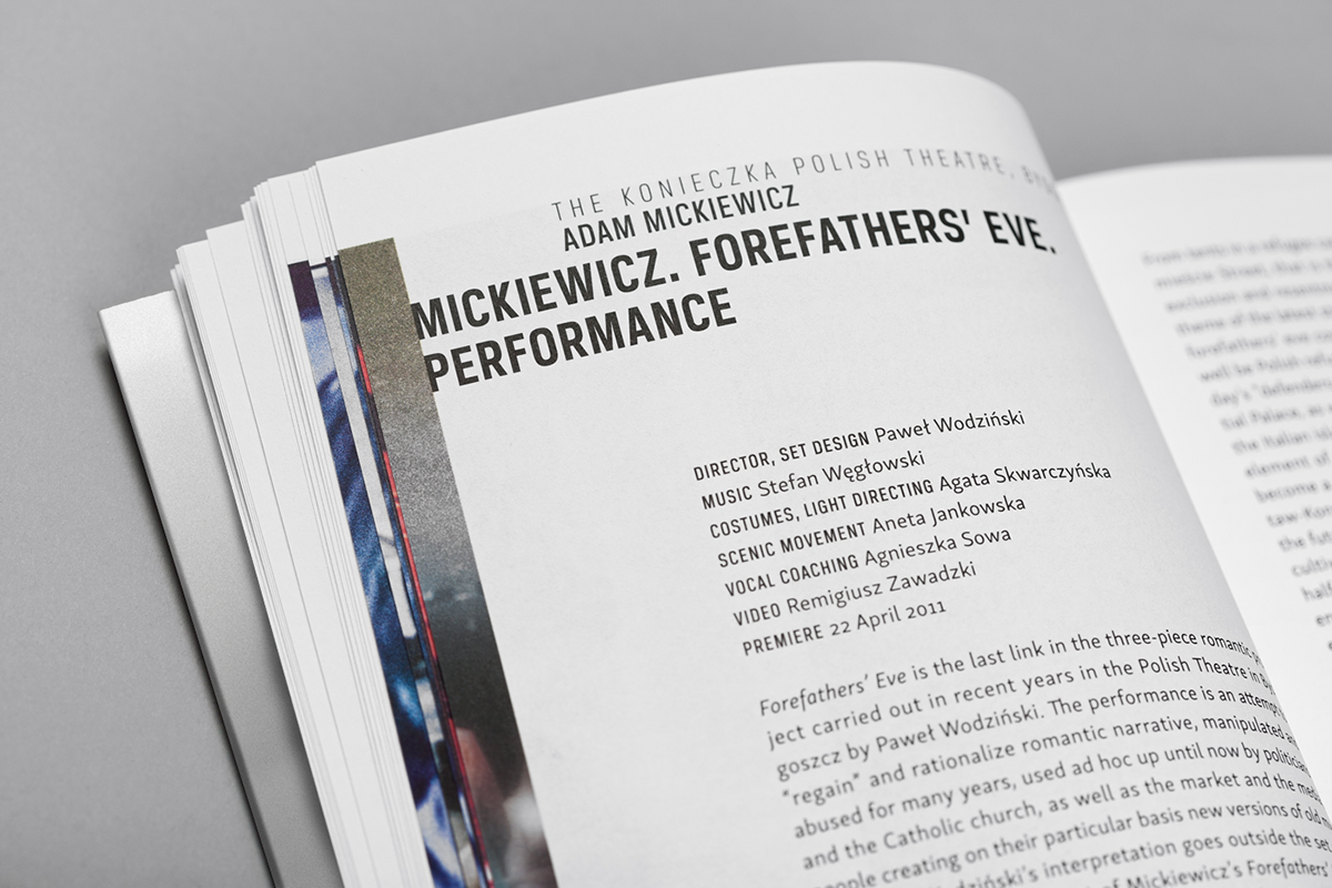
The publication consists of photos from theatre plays and essays by curators, historians and researchers (Maria Janion, Jerzy Gurawski, Dariusz Kosiński and others).
/ / /
Na zlecenie Instytutu Teatralnego im. Z. Raszewskiego Manuka studio opracowało identyfikację polskiej ekspozycji na Praskim Quadriennale 2015. Kierowniczką projektu była Marta Malesińska, mój wkład w ten projekt to layout dwujęzycznego katalogu.
Wystawa, zainspirowana spektaklem J. Grotowskiego „Apocalypsis cum figuris”, eksploruje temat związków między technologią, człowiekiem a przyrodą, mówi o przenikaniu się tych elementów, o ich mieszaniu, a także o sieciowej, rozproszonej naturze dzisiejszego (post-apokaliptycznego) świata.
Publikacja zawiera teksty kuratorskie i fotografie ze spektakli, a także eseje historyków, badaczy teatru i innych osób związanych z zagadnieniami obecnymi na wystawie (m. in. Marii Janion, Jerzego Gurawskiego, Dariusza Kosińskiego).
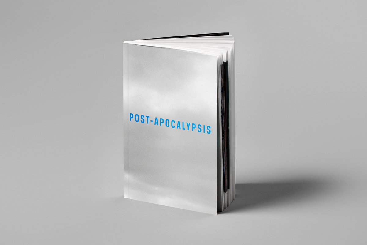
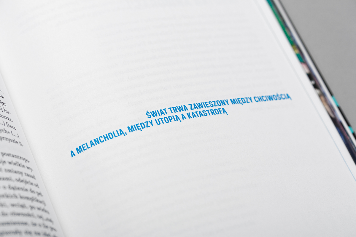
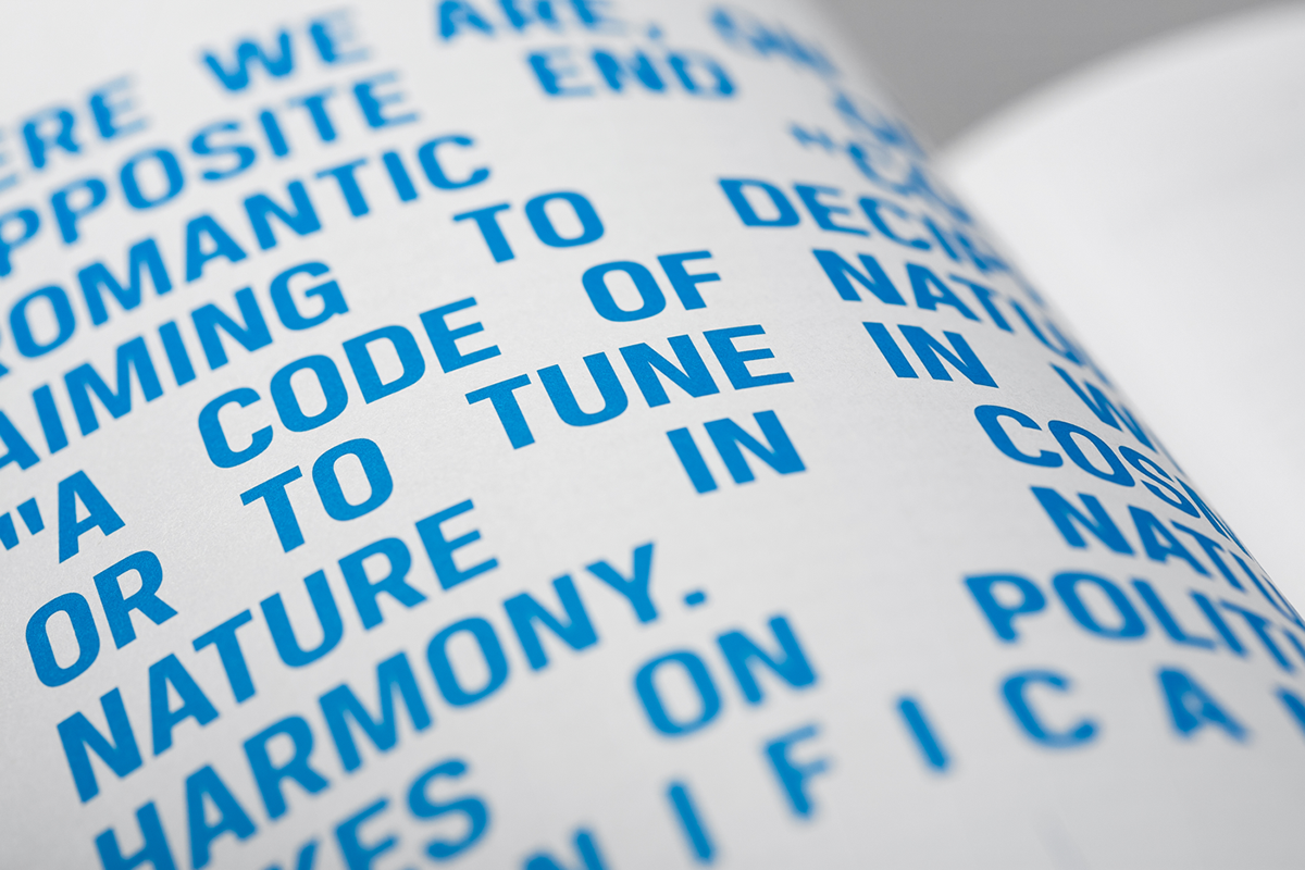
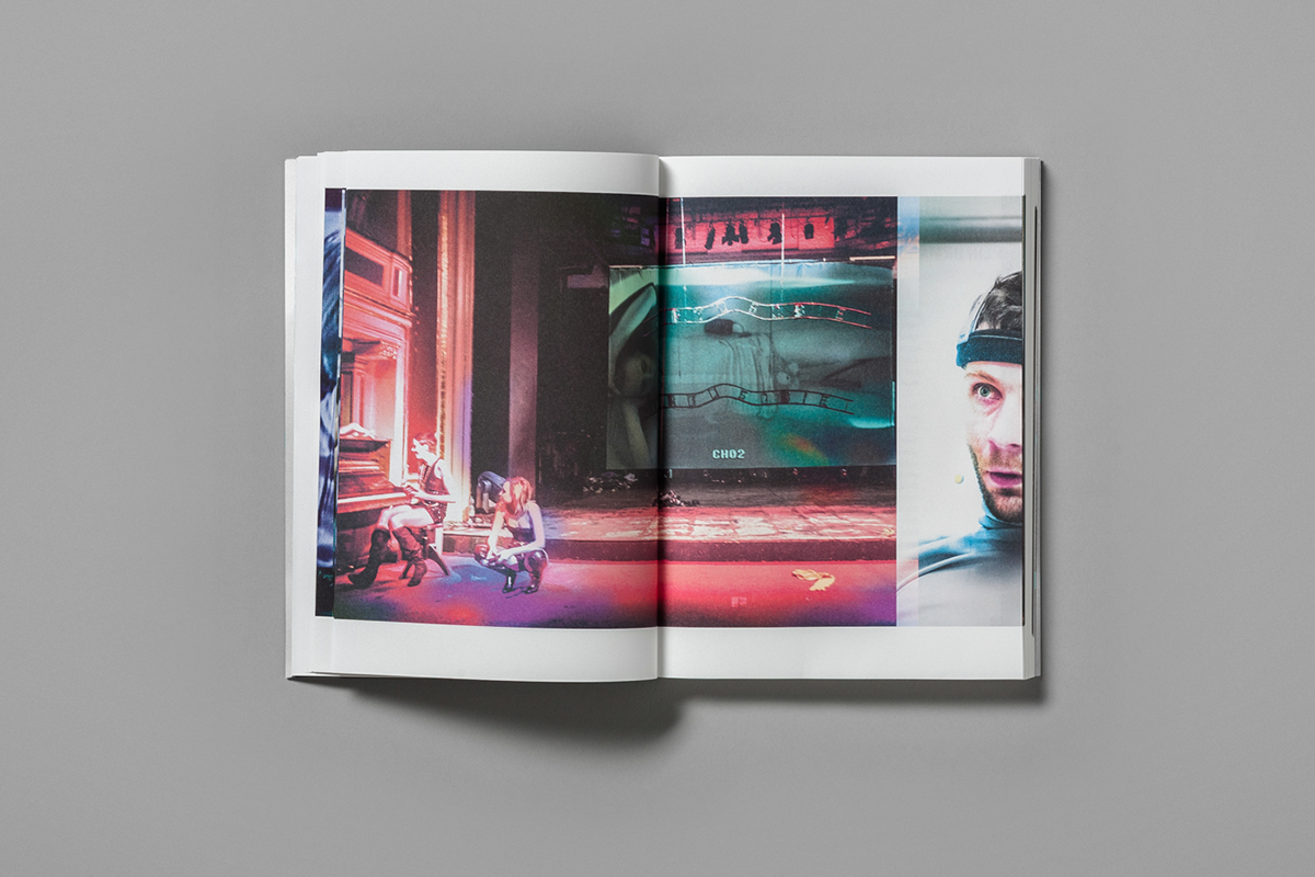
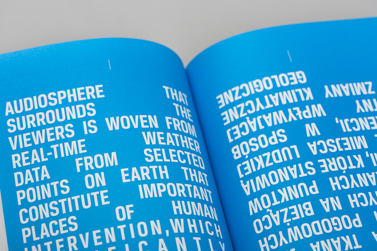
In our design we wanted to emphasize the ideas of fluidity, mutability and diffusion.
The photographs are crossing the borders of pages, blending with each other. Fragments of text seem to move freely in spaces.
/ / /
Katalog podkreśla idee płynności i zmienności świata, sieciowość i przenikanie się różnych rzeczywistości. Krawędzie stron nie stanowią granic dla fotografii, zdjęcia przechodzą z jednej strony na drugą i przenikają się wzajemnie.
Również fragmenty tekstów przemieszczają się swobodnie po powierzchni strony.


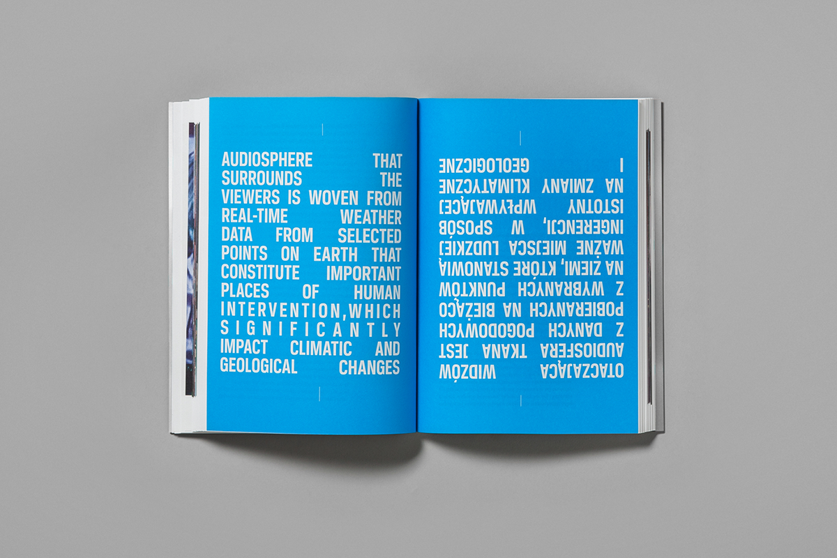
You can read the catalogue from both sides – there is Polish text on one end of the book, while English version starts on the other end. Both languages meet in the middle of the book.
/ / /
Katalog można czytać z dwóch stron – z jednej strony umieszczono teksty w języku polskim, z drugiej – anglojęzyczne. Obie wersje spotykają się pośrodku.
Polish National Exhibition has won the Golden Prize of the Quadrennial. We are proud to be part of this success.
More info: https://www.youtube.com/watch?v=f66vQSzgTC4
/ / /
Polska ekspozycja narodowa zdobyła Złoty Medal PQ2015. Jesteśmy dumne, że mogłyśmy dołożyć swoją cegiełkę do tego sukcesu.
Więcej informacji: https://www.youtube.com/watch?v=f66vQSzgTC4


