


Koodi
Introduction
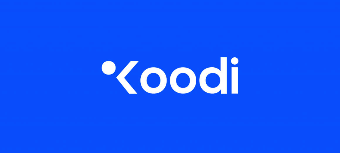
A new branding for Koodi. The icon is inspired on creating code and serving the people. The colors are inspired on the Finnish flag because Koodi means code in Finnish.
About Koodi
Koodi is an ICT consultancy company based in Antwerp. Its name is a Finnish translation for the word ‘code’. For more than 10 years the company is best known for its strong consultants and new technologies in the ICT sector.
Concept
I decided to base on the underlying vision and meaning of the company. For example, the Finnish colors and the special characters within the programming language form the basis for the new branding.
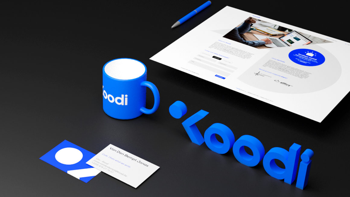
Website
The website is an architectural representation made by elements from the logo itself. The blue cirkel can be used for a call to action. The construction uses the same diagonal lines as the letter K.
Logo
The logo describes in one blink of an eye the story from the company Koodi. I choose for a minimalistic style to give it a timeless look. The shapes are inspired on code elements and gestures.


