Cūra Earth
Branding and Identity System
Branding and Identity System
GOAL:
While I was enrolled at MCAD, Cura Earth approached them looking for a complete brand refresh and I was fortunate enough to help out with this brand exploration. Cūra Earth combines science, social action, and creativity to achieve sustainable health of people, animals, and ecosystems all over the world. They are one of the few organizations working in the emerging fields of One Health and EcoHealth. These fields seek to forge collaborations amongst different healthcare professionals and ecological scientists, as well as perform research on how change in the earth’s environment affects human health.
CHALLENGE:
Our challenge was to create a global parent brand that would work for Cura Earth as a whole as well as it's sub-divisions.
SOLUTION:
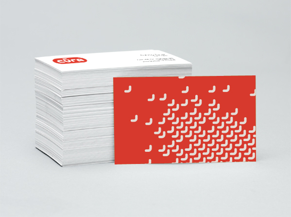
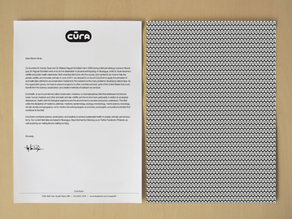
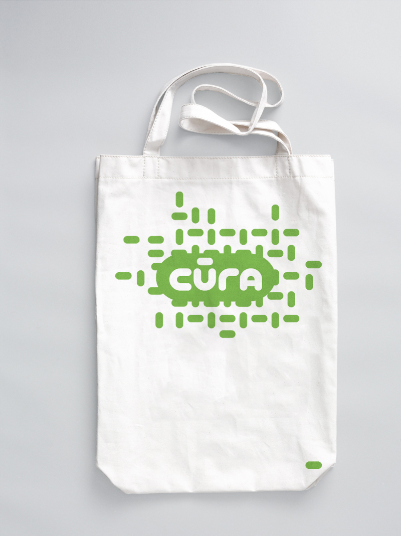
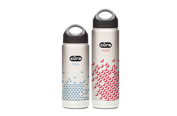
I developed a modular typographic identity system to allow for re-use of it's attributes across the organization. Using the diacritic of the Cura "u" as my inspiration, a typeface was designed which allowed for me to repurpose the letterforms into a variety of different patterns that were usable across various platforms.
