EAST CANTEEN - identity
Graphic identity
Find a name... simple, strong, distinctive, conveying at best the spirit of the place and its menu. Not just chinese, japanese, thai or korean, the restaurant's ambition is to mix all this things, to play on these various influences and cultures. This is, more generally talked, the simple idea of the EAST. And in the word EAST, there is EAT, which sounds like an injunction to be attracted by the sweet smell of cloudy woks of the asian street stalls.
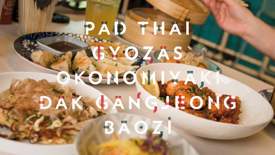
More than a logo, the identity of EAST takes the form of a double visual universe. First a work with photos, in which the letters hide and reveal, in a dazzling world of colored vapors and pigment's explosions. A radiant composition of colors expressing exciting and sparkling flavors, on a dark background evoking the dark streets where only luminous stands shine.
To complete this very visual approach and contribute to the creation of the menu, a graphic work is elaborated : a typography is developed by taking the EAST font on which are grafted small geometric attributes giving it an asian twist, as a synthesis of graphic features from ideograms and letters from different languages of Southeast Asia. Add to that some vapor clouds and two chopsticks that come subtract the S to ingest it, and here we are : EAT... uh no sorry : EAST !