The first part of this project was to begin playing with shapes in sketch form as my client knew which colours they wanted and that the influence was Cubic Zirconia, which is a clear flawless diamond but had no other criteria in mind. In this situation it's critical for speed and efficiency that concepts and ideas are hand drawn ensuring that only the final ideas are developed in software to give a clean corporate finish.


This compound shape developed as a result of sketching and further developed with much consideration given to the business name "Cubic Kitchens" as well as the negative shape which is seen as a cube.
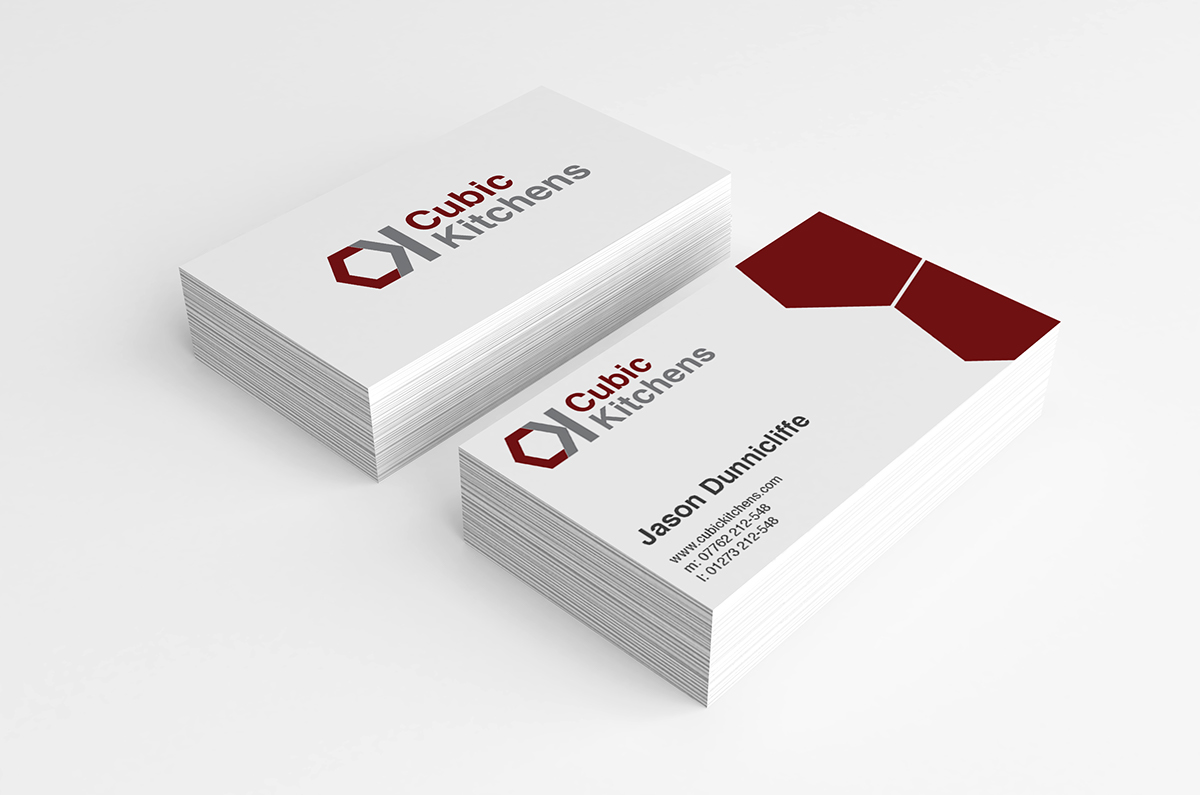
Secondly, the Logo was worked into the format of a double sided business card for my client adding the hexagon shapes on the right hand side which is also the compound shape of a cube.
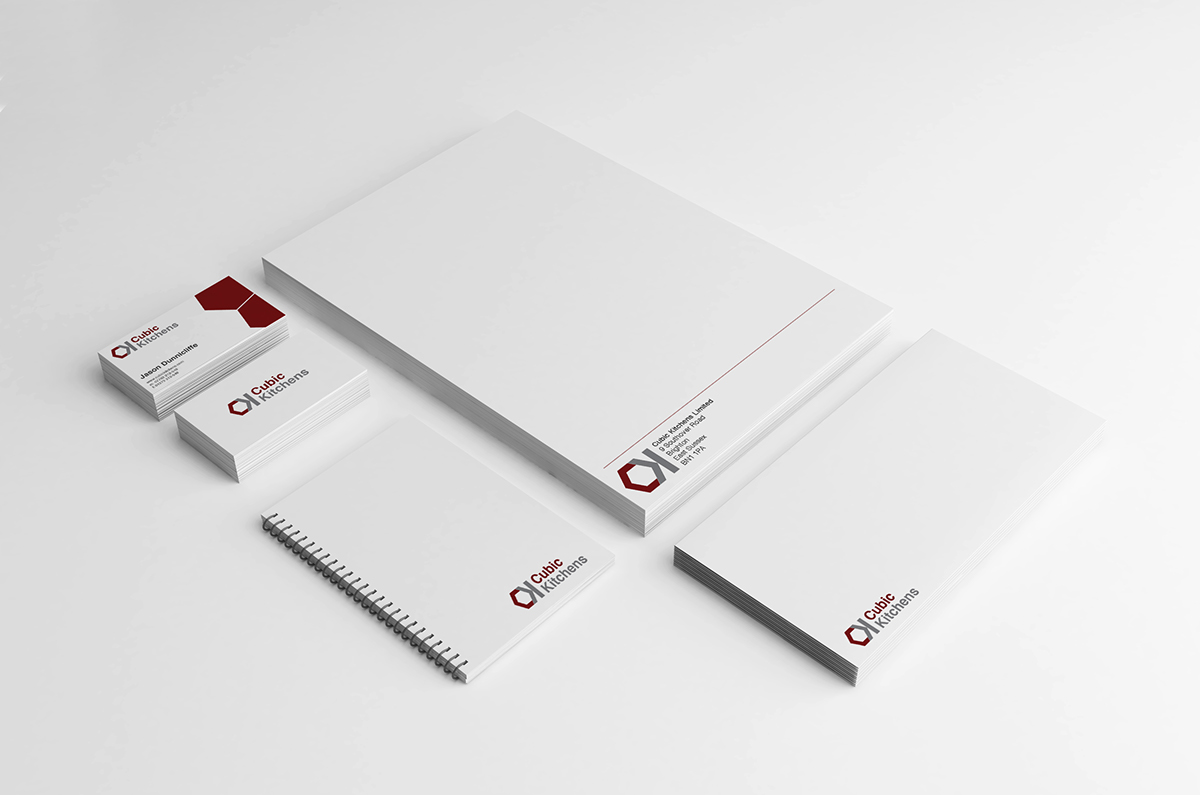
The next part of the project was to produce a letterhead which will be used to deliver quotes as well as an envelope design. In addition a note book was created allowing the business proprietor to make notes when measurements were taken on site.


Finally, Jason requested that I work on a "wrap livery" design as this industry is so competitive I felt it was important to develop brand awareness at every opportunity.

