"36 Days of Type is a project that invites Designers, Illustrators, and Graphic Artists to express their particular view on letters and numbers of our alphabet.
36 days of restless creativity, where participants are challenged to design a letter or number each day, resulting an outcome of the ability to represent the same symbol from many different perspectives.
A project that aims to be a space for creation around typography and its endless graphic possibilities"
All the following solutions had to fit into my normal work schedule with limited time for additional non-paying work. Most were done in less than one hour. The individual characters were posted to my instagram page on a daily basis for 36 days.

This A started out as a purely geometric piece, but I then decided to make the Arch more realistic. The Alligator was an Afterthought.

I wanted to make the b as big as possible without cropping. The red hole bumps it up a bit.

The fish making up the C are also the logo I designed for Cape Card.

I live on Cape Cod, and often walk Daphne, our Frenchie at Ropes Beach in Cotuit. I've been photographing this piece of driftwood from many angles, and realized when I was thinking about what to do for my letter D that I could position the driftwood so that it made quite a nice one.

No real concept here. Just a big fat e with lots of little ones making up the pattern on and behind the e.

After designing a typographic logo for a client, I decided to complete the alphabet which I've named TriPix. I've used some new characters and variants as part of this series. This variant of the letter F uses an angled middle horizontal bar.

A minimal wireframe double G design with carefully planned intersections of the two characters. I've always liked the look of the lower case g with two bowls.

H is for house. A very literal concept, but I haven't seen one done quite like this H.

I cropped the lower case I almost as much as possible so it would still read as an i.

J is for Jew. The Jewish star seems like a perfect building block for a Jewish J and alphabet.

This letter K started out as a Bodoni IBM K. I removed the serifs, slanted it, added the heavy horizontal & vertical ruled background, and then added primary RGB colors.
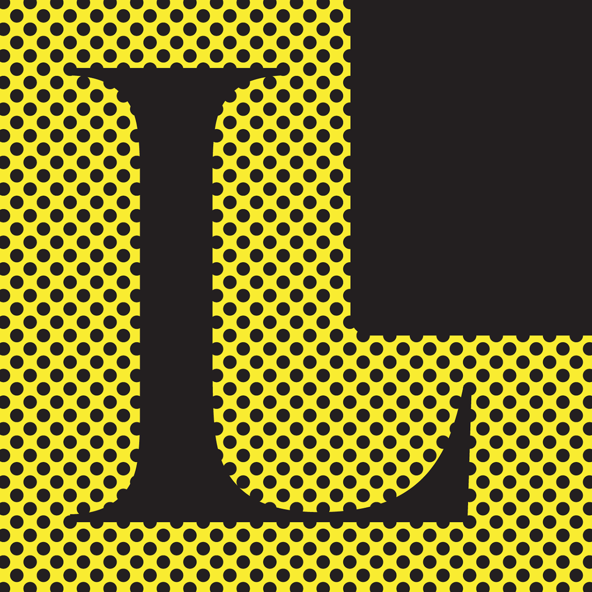
I started out just wanting to make a really large capital L to fill the square space, but thought it needed something more. The something more is a Baskerville Old Style capital L.

The M started out as a delicate serif gothic based on ITC Quorum Light. I then placed it inside an ornate gothic cap M that I drew to fill the square, but it dominated the inner letter too much so I changed it to white with a drop shadow.

This N is actually a flipped version of the letter S you will see further down.

I didn't have a lot of time to spend on the letter O. I was thinking of things that I could photograph in my house that were O shaped. When in the bathroom, I saw the perfect and very useful O.

Just a big eye popping Pop Art P.
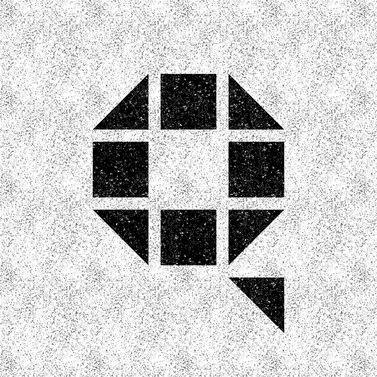
A new Q variant for my TriPix alphabet.
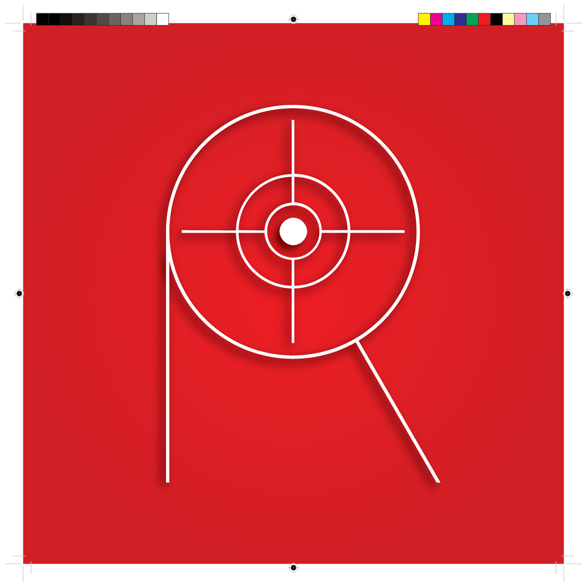
R for Register Mark. Before computers I had these in black on transparent tape to stick onto overlays on mechanicals of designs for the printer. Now they are added automatically when I generate a PDF file from Illustrator or InDesign.

S is for Sue Goble Newman, my incredible wife. I used a more subdued, beachy color scheme for her personal logo.

I love the design of the old pre-digital Boston T token almost as much as the NYC subway/bus tokens.

Lucky U. This was a photo I took on Sampson's Island one summer when there were horseshoe crabs everywhere. I originally arranged the horseshoes as an upside down U, but for this project, I rotated them so they would read as a U.

V is for view. This tree is in my backyard. Unfortunately, the view is not.
It's another photo I took at Barlow's Landing beach in Pocassett.
It's another photo I took at Barlow's Landing beach in Pocassett.

W is for Waves and Water. The W lettering is based on an upside down M from the typeface Radio AM. The photo was taken at Loop Beach in Cotuit.

Stacked triple X lettering. The pattern within the type is made up of tiny x's and the background uses an x pattern.

Y is for Yellow. This is just a pretty, decorative, curvy Y. I also posted a very angular, Escher-like Y on my Instagram feed.

Just because matzoh has a z in it and Z fell on the first full day of Passover — To create the Z, I photographed a piece of matzoh, and made very thin strips and stacked them on a seder platter in Photoshop.

Zero is the first number in the series. 0 f**ks in a circle is my solution.

This was an outake for a t-shirt design for the team responsible for opening Saks' new Houston store. I just loved the design of the boot so much, I used it as my number 1. The floor, baseboard, and wall were created in Photoshop.

I drew the number 2 similarly to the lower case g, but I joined and filled the double 2 to create this Escher-like effect.

I've always liked stencil typefaces. This 3 is divided into 3 parts and a cool retro texture was applied. This character could also be used as an M and possibly a W.

The four is an oblique stencil drawn like the 3, but creating 4 parts.

An art deco derived five cycle for my number 5. Created in Adobe illustrator with bevels added to the fork
and upper part of the 5 in Photoshop.
and upper part of the 5 in Photoshop.

The number 6 is based on Mondrian's geometric paintings and his use of color.

Hinged goth-like decorative lettered number 7.

Just a couple of illustrated 8 balls forming the number 8. This design was created in Adobe Illustrator.
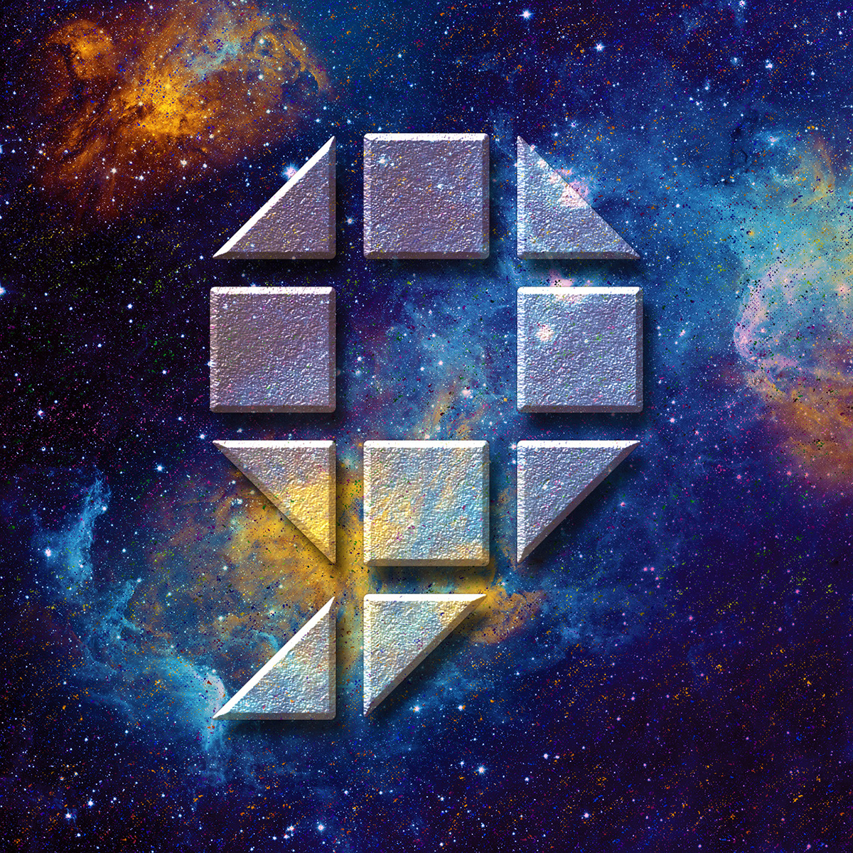
This galactic nebula 9 is a new character for my TriPix alphabet. Flipped horizontally, it becomes another Q variant.

The ampersand was not officially part of Thirty Six Days of Type 03, but I did some anyway.


