brief / Design a logo and logo typeface for a new on-line TV channel for kids. The content for the show will be, made for, by and with kids and students, who will also curate some arts practitioner pieces and acquired material where appropriate.

role / Concept, design, & art direction.
duration / 2 weeks.
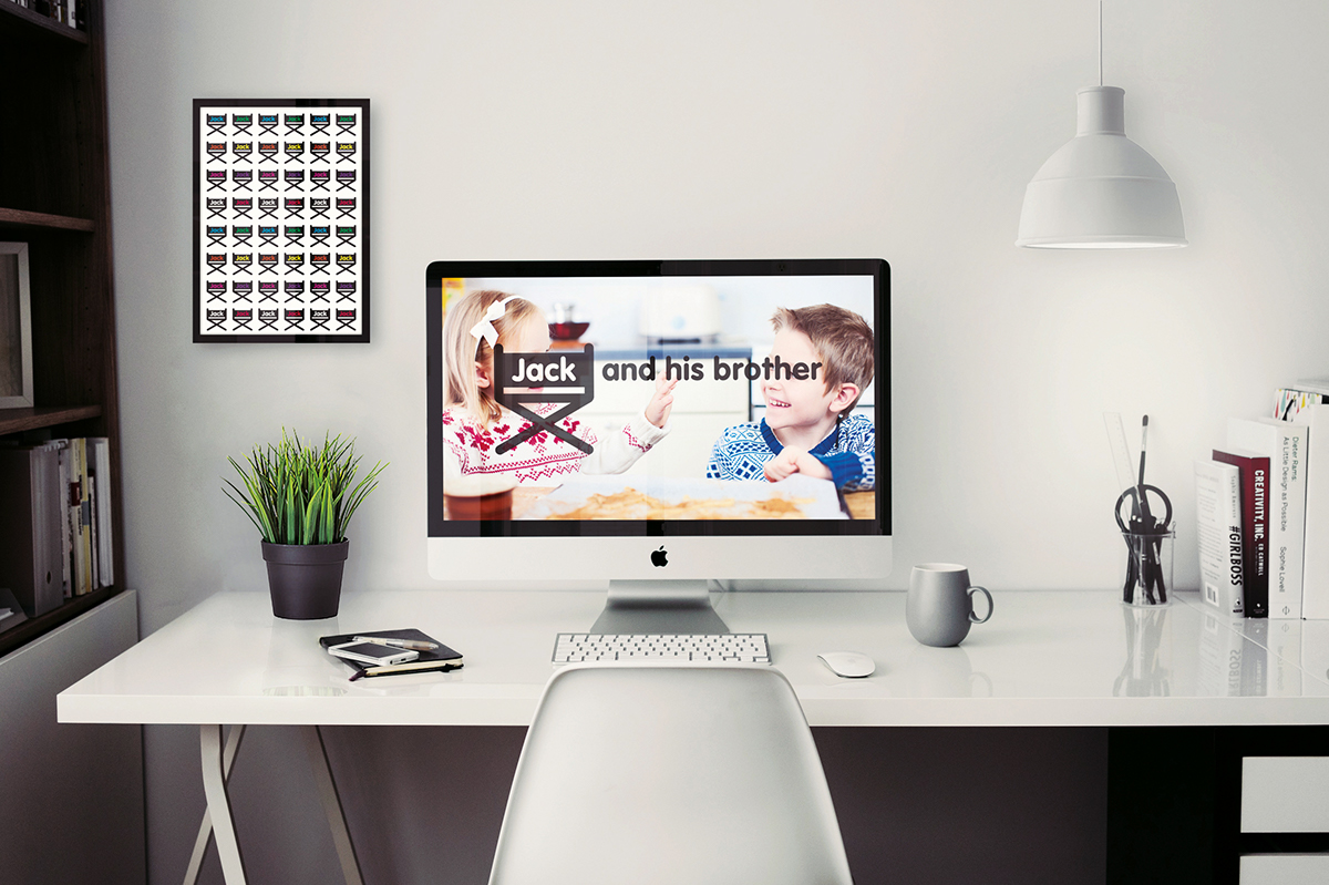
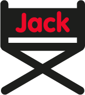
realisation / The logo was inspired by an object associated with production—the directors
chair—which acts as a metaphor for the concept that the programme is based—the children
controlling the show. The logo is all inclusive, intentionally suggesting that any child could
be involved with the activities corresponding with the show, representing the diverse nature
of the programme. The logo can be used in three different ways; chair and word-mark, chair
or word-mark. The different colours are bright and engaging, representing different subject
matters dealt with by the show.