Undergrad Print work

AIM Poster / December 2010
Guidelines: Investigate a specific social or cultural issue starting with a single word. Design a poster based on your research into the word, associated imagery and the larger issue at hand.
Statement: This poster comments on the fact that the government spends more money fighting wars than on medical research. The government uses 19 times more of our tax dollars funding death rather than saving lives. I used the word "aim" to play off the idea of aiming guns, and to enforce the idea of aiming at the right cause. The scene is dark at first glance but becomes playful as you realize there are toy army men in the image. I chose to use toys in the image so the violence of war would not be prominent. This way, the focus is on the idea of fighting breast cancer rather than on war itself. I made the letter ‘i’ out of pink ribbon so the viewer would see the pink ball in the middle of the poster as a symbol of breast cancer.
My Process: The idea for my image concept started with my wanting to show war without the gore and explosions that are common of war images, so that the focus would not be on the war itself, but on the idea of fighting breast cancer. Inspiration hit when I was looking through pictures of my younger cousins. I thought about how children view war, and how it is filtered in their eyes. To them, war is portrayed through the green army men they play with. That's exactly what I wanted in my poster; a filtered version of war, as if being viewed by a child. I began sketching out my poster with green army men and created a crude mock-up in Photoshop using images I grabbed from google. I then had to figure out how to recreate a cancer cell. I went to Meijer and checked the craft section for something to make a cancer cell. After finding nothing there, I went to buy a bucket of green army men for my poster in the toy section and came across a pink Koosh ball. Perfect! But how to make it look imperfect like a cancer cell? Silly string! I went home and arranged the toys how I wanted, found the best angle, the most dramatic lighting, and made some photo magic. This is the most fun I've had making a piece. I got to play with toys, photography, and typography!
Branding Exploration Publication / November 2011
Guidelines: Design a publication with at least eight pages. Choose a topic that you are interested in. It can be anything of your choosing.
Statement: I chose to create a publication about branding. I wanted to look into the minds of the branding experts and see what they had to say about the topic. I used articles written by Michael Bierut and Steven Heller. I wrote my own preface explaining the purpose of the publication and postface that spells out what I’ve learned through this exploration. The layouts are inspired by Emigre Magazine’s typographic experimentation and limited color palettes. I chose to take an analytical approach to the publication using callout images and footnotes that I wrote in response to the essays I selected.
Statement: I chose to create a publication about branding. I wanted to look into the minds of the branding experts and see what they had to say about the topic. I used articles written by Michael Bierut and Steven Heller. I wrote my own preface explaining the purpose of the publication and postface that spells out what I’ve learned through this exploration. The layouts are inspired by Emigre Magazine’s typographic experimentation and limited color palettes. I chose to take an analytical approach to the publication using callout images and footnotes that I wrote in response to the essays I selected.


Visiting Designer Brochure / November 2010
Guidelines: Pick any Graphic Designer that you would like to visit your school. After researching their work and images, create a tri-fold brochure to promote the event.
Statement: In this brochure, I wanted to showcase the color palette found in a lot of Chip Kidd’s book covers. I chose to do this by using minimal color so the images of Kidd’s work would stand out. I pulled the red and yellow colors from Kidd’s work and used them as accent colors in the brochure. The words on the front and back are not facing a single direction because the viewer will be holding the brochure in their hand and can easily turn it as necessary to read it.
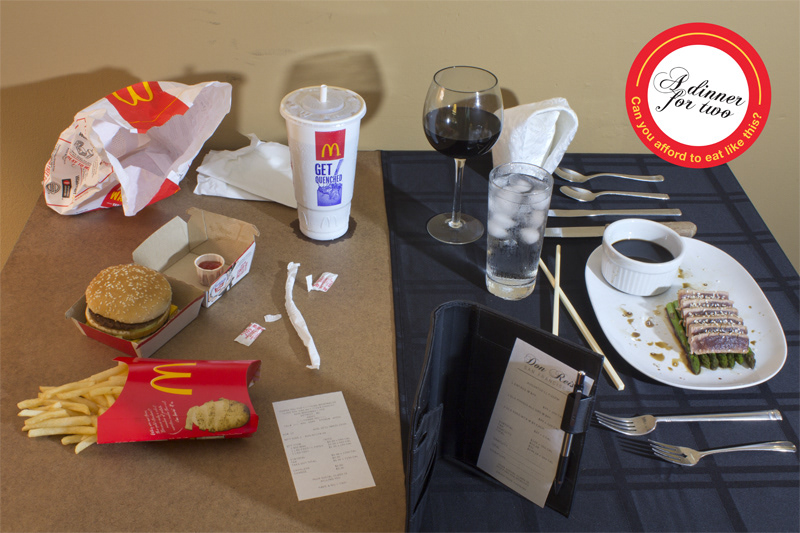
A Dinner for Two (Social Classes) / September 2011
Guidelines: Make a poster addressing a social concern you may have. Explore a medium you haven’t experimented with in creating an element of the poster.
Statement: This poster comments on the prices compared to the health of the kinds of meals that different social classes have access to. I put the two very different place settings across from each other as if they were at the same table because this is something you would never see in everyday life. A wealthy person never eats with a poor person, and I hope that this juxtoposition of scenes catches the attention of the viewers. The question “Can you afford to eat like this?” relates to both sides of the image, in one side asking if you can afford the price to eat healthy, and on the other side, if your body can afford to eat cheaply. The receipts in the foreground further the message by pointing out the price and calories in each meal.
Statement: This poster comments on the prices compared to the health of the kinds of meals that different social classes have access to. I put the two very different place settings across from each other as if they were at the same table because this is something you would never see in everyday life. A wealthy person never eats with a poor person, and I hope that this juxtoposition of scenes catches the attention of the viewers. The question “Can you afford to eat like this?” relates to both sides of the image, in one side asking if you can afford the price to eat healthy, and on the other side, if your body can afford to eat cheaply. The receipts in the foreground further the message by pointing out the price and calories in each meal.


Typographic Construction and Deconstruction / January 2011
Guidelines: Deconstruct and reconstruct the typography of an existing food package to create a visually dynamic layout using grids as the basis for construction.
Guidelines: Deconstruct and reconstruct the typography of an existing food package to create a visually dynamic layout using grids as the basis for construction.

Organizing Space with a Grid / February 2011
Guidelines: Use a grid, images, and the given copy to communicate the message in an exciting, dynamic, and visually arresting manner in two completely different compositions.
Guidelines: Use a grid, images, and the given copy to communicate the message in an exciting, dynamic, and visually arresting manner in two completely different compositions.

Third Coast Creatives Promotional Poster / July 2011
Guidelines: Design a poster that coincides with the Primarily Rye brand, but will appeal to college students in order to recruit interns.
Collaboration with: Berenice Valdes, Kara Leiby, Whitnee Webb, & Yi Liu
Statement: This was a collaborative project with four other interns at my summer internship at Primarily Rye. We chose a striking color combonation and a collage of sorts to entice college students to take a closer look. It is minimal to coincide with Primarily Rye’s brand, but gets the point across with brute force because we chose such a prominent image.

Journey to the Classroom / March 2011
Guidelines: Create a poster that contains directions from your place of residence to the design classroom.
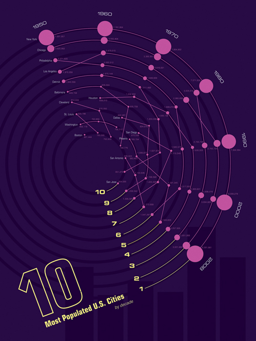
Graphic Data / April 2011
Guidelines: Create an infographic that shows the population changes for the ten most populated U.S. cities and their ranks throughout the decades, starting in 1950.

