
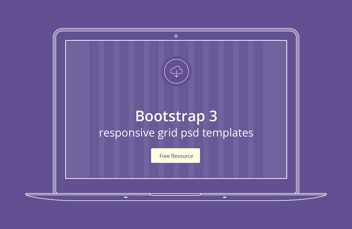
Bootstrap 3 responsive grid psd templates
In the download link you can find 3 grid templates for same base width 1140 with 3 different columns - 12, 16 and 24.
12 Column -
Full width: 1170px
Content width: 1140px
Column width 68-67px
Gutter width 30px
Content width: 1140px
Column width 68-67px
Gutter width 30px
16 Column -
Full width: 1160px
Content width: 1140px
Column width 53-52px
Gutter width 20px
Full width: 1160px
Content width: 1140px
Column width 53-52px
Gutter width 20px
24 Column -
Full width: 1152px
Content width: 1140px
Column width 36px
Gutter width 12px
Full width: 1152px
Content width: 1140px
Column width 36px
Gutter width 12px
Note:
With the new Bootstrap 3 grid you have gutter width and column width different from the ones in Bootstrap 2, and the container width includes two half gutter padding on the sides. Also, the columns have uneven width since they are set by percentages, and the width of the container doesn't match perfectly with even width.


