

Straightforward graphics and a vibrant palette frame customer insights to launch the first Brand Relevance Index
Prophet’s point of view, regarding brands, centered on Relentless Relevance. What that means is that Relentlessly Relevant brands consistently inspire us and move us to action. They make smart, bold moves that amaze customers, push competitors out of consideration, and – at times – define entirely new categories and markets. And they do it while remaining unwaveringly authentic to who they are. Relentlessly Relevant brands engage, surprise and connect. They delight, disrupt and deliver. They are restless. They push themselves to earn and re-earn customers’ loyalty – and they define and redefine what’s possible in their categories and in our world.
To take this point of view to market, Prophet worked with a research partner to create the Brand Relevance Index. This Index took the views of 10,000 customers across 27 different categories to rate over 400 brands based on the Relentlessly Relevant criteria. Working with the Marketing and Design teams, I assisted in design of the website and created all supporting elements for the launch of Prophet’s inaugural Brand Relevance Index. Assets included graphics for email communications and blog entries, collection and curation of over 350 logos, images for use across social media, a webinar presentation, infographics, and several other smaller components.
The visual style of the Brand Relevance Index was a combination of Prophet’s identity, subtle photography depicting each brand, and a rejuvenated take on the Prophet color palette, and a direct, inforgraphic-like approach to the dissemination of the content.
This microsite has launched, and can be found here.
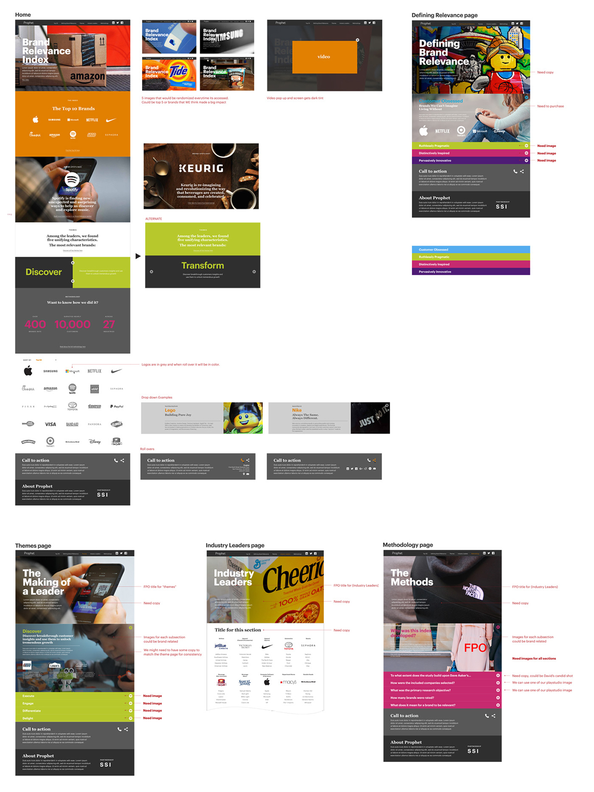
In-process design document showing how the pages of the microsite will unfold the story of the Brand Relevance Index. The home page will act as an overview, while the "Defining Relevance" page will delve into what makes a brand "relentlessly relevant." The themes page will share insights discovered from the study, and the methodology page will answer questions about the study itself. The industry leaders page will showcase the top five brands across several industry categories.

This series of banners appeared on the Prophet intranet to share information about the Brand Relevance Index. From left to right, the banners communicated a webinar session, a launch announcement, and a link to any information consultant teams needed to be informed about the Index.

To promote across social media, I looked broke the content up into discernible bits. Some posts captured a broad aspect, while others were meant to reveal significance through detail. In the left column, these Facebook posts start very broad, with the Index's "Top 10 Brands" and share the four key principles that define Relentlessly Relevant brands. Posts would become more detailed after the microsite's launch, delving into industry leading brands and themes derived from the study results. An example tweet might be: "Crafting tales based on fundamental human truths that deliver delight and joy is how @Pixar remains relevant. #BrandRelevance.”
Simple, direct, and brief animated banners were also created to generate buzz across social media platforms prior to the launch of the Index. In this banner, an unlikely comparision arose from the study that linked three disparate brands.
Simple, direct, and brief animated banners were also created to generate buzz across social media platforms prior to the launch of the Index. In this banner, the fight for the top of the computer software and hardware industry is teased.
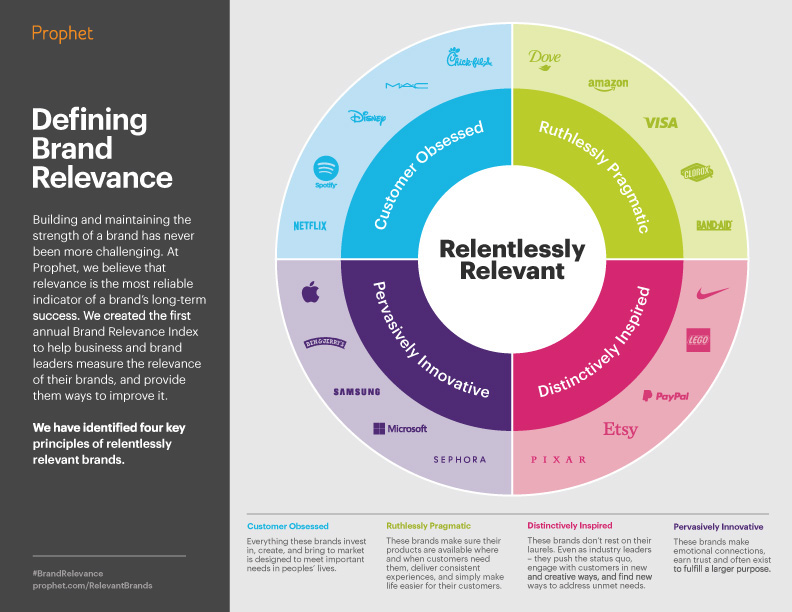
Working with an external design team, this infographic was created to support and promote the Brand Relevance Index after the launch. Here, the four key principles at the core of relentlessly relevant brands are defined, with industry examples that embody each principle.

Working with an external design team, this infographic was created to support and promote the Brand Relevance Index after the launch. Here, the five themes that emerged from the study results are shared, with definition and industry examples.


