What’s Typeset.io?
Typeset.io enables researchers to author research papers faster by providing an intuitive online collaborative writing platform. We are making the process of writing, collaborating on, and reviewing research documents quicker and easier than ever before.
It is better than Microsoft Word or LaTeX because it does not involve manual formatting or learning LaTeX. We have the best aspects of Microsoft Word + LaTeX shipped into one editor. We also support templates for journals (IEEE, ACM, Nature etc).
(I will talk in detail when we have the beta live)
The Concept:
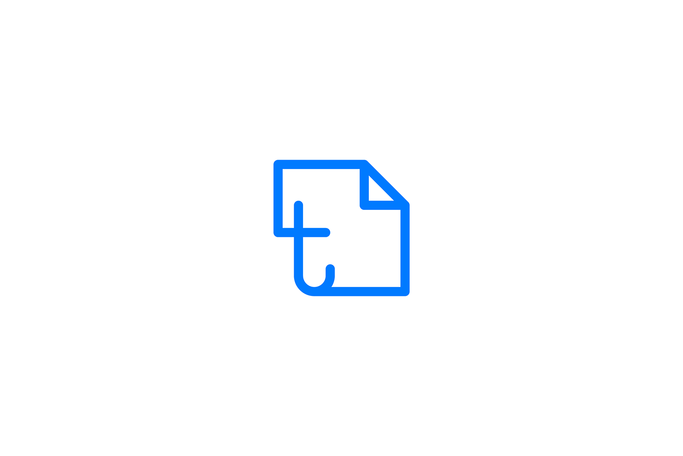
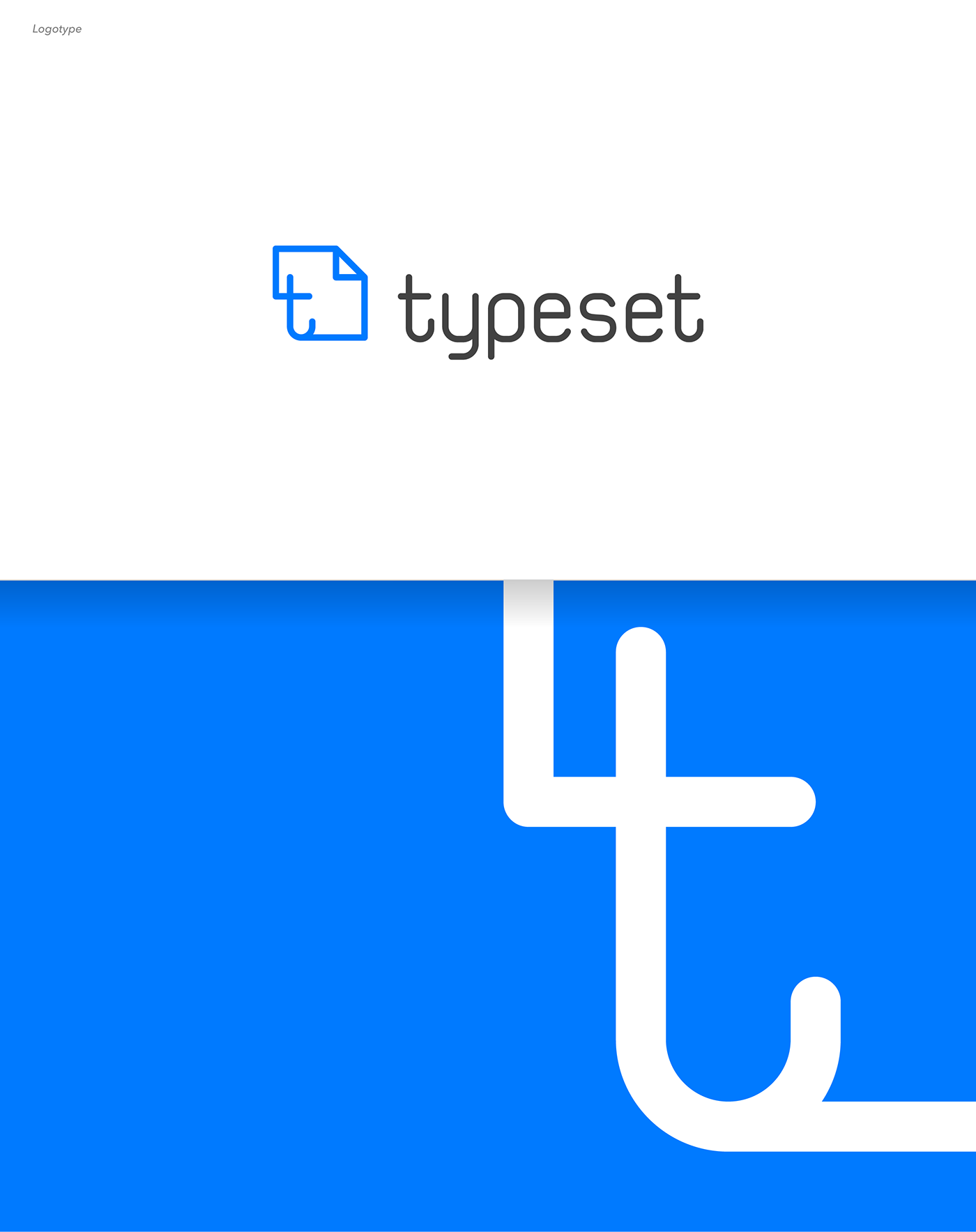
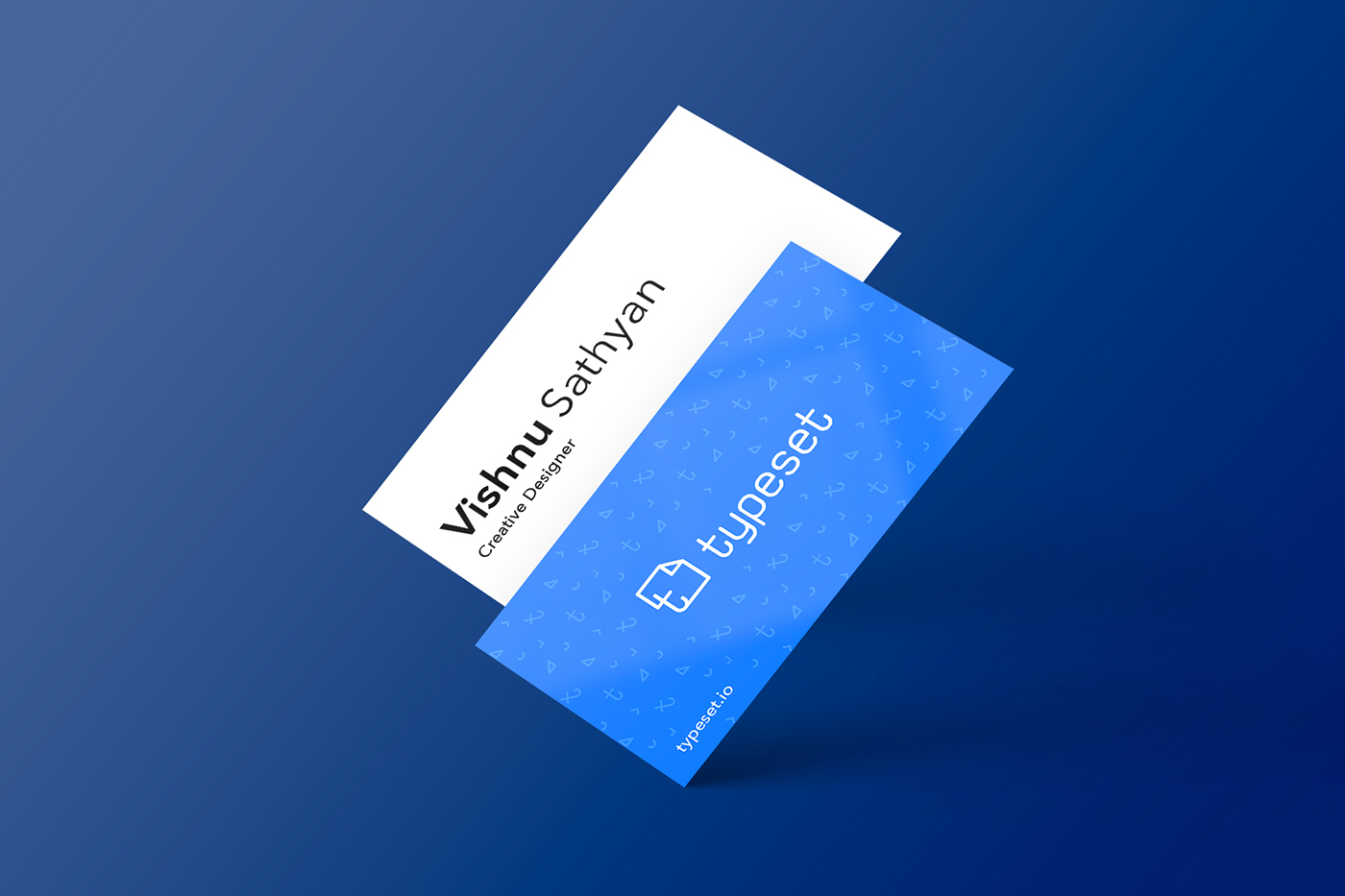
Since it’s about documents, papers, formatting, typing, etc. I decided to showcase the ‘doc’ in the logo and this meaning is shown directly through the logo symbol.
The Initial concept was to marry the ‘document’ with the letter ‘T’. The doc icon that everyone knows is the peeled rectangle. What I did was to put the ‘T’ inside.
Why line based logo?
Since the very first time, when man started to write the first letters in the then existing primitive language they expressed it with lines. Everything was stroke based, e.g., a rectangle was just the outline or an animal was just the outline. Later, man invented pen, pencil but the lines remained. When the printing machines came, the letters still remained as lines. Even the text that you are reading now are made of lines. ‘Lines’ are the basic of any art, I believe.
Why mono-spaced typeface?
When the brief was given to me, the first thing that came to my mind was the typewriter that I had seen in the 90’s. Next step was to find a conventional typewriter. I searched every nook and corner of the city I live in; finally Igave up on Google search results, and other directories as nothing could really show me a place where I could get one. Later, I met some old people and asked them about places where I could at least see one.
After like a week or so of searching, I found a place which was a dump yard of typewriters. No one bothered about these old machines. But I couldn’t wait to press the keys; I grabbed one and started to type. I typed all the symbols, alphabets and the brand name. I tried with different machines to get the feel of different fonts.
I took all these papers to my work station, scanned them and analysed the typography that has been used. I knew that they were mono-spaced typefaces. I started to look for similar looking fonts online. I did find a few, but nothing satisfied me. None of the available online version made me happy.
Ergo, I decided to create a custom typeface for this brand. I was pretty sure by then, that I wanted a mono spaced font.
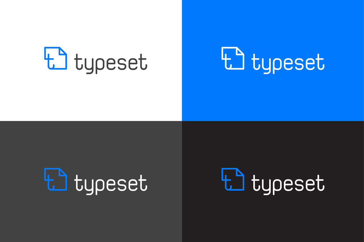
Why Blue?
The natural ink color is blue. Be it a ball pen or a fountain pen. Why? Well, I don’t know. But I knew that this color has something.
I chose many ink bottles of different colors, and few from ballpoint pens. Splattered all these onto individual white papers, and scanned them all. Later, I finally chose a color which was not too bright, yet not too blue. After countless iterations, I ended up with #007AFF which I call The Typeset Blue.
Why peeled as identity?
When I say ‘document’, the first thing that comes to mind is that of a paper peeled at one corner. I think people has long started to recognize it as such owing to the icons of Microsoft Word and Mac Pages, etc.
NOTE: I got to work on every single pixel of the app, I drew icons on my own, and designed layouts of the screens. Beta is going live soon, so pause for the effect.
Thank you for reading so far.