
TASK:
New brand logo and packaging design for a line of natural cosmetics.
Use color coding effectively, strengthen natural and professional image of the product.
DESIGN SOLUTIONS:
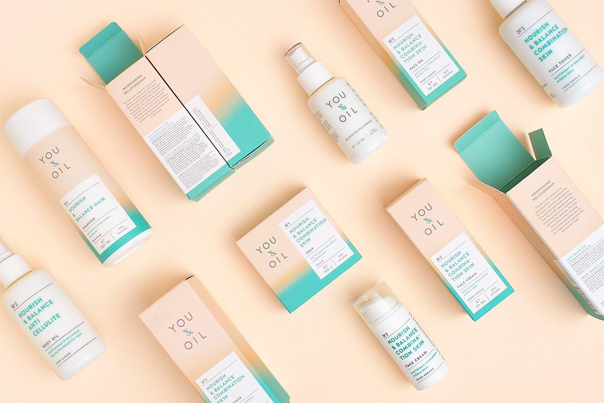
PRODUCT DIFFERENTIATION. All products divided into 5 colored lines depending on their effect:
Use color coding effectively, strengthen natural and professional image of the product.
DESIGN SOLUTIONS:
PRODUCT DIFFERENTIATION. All products divided into 5 colored lines depending on their effect:
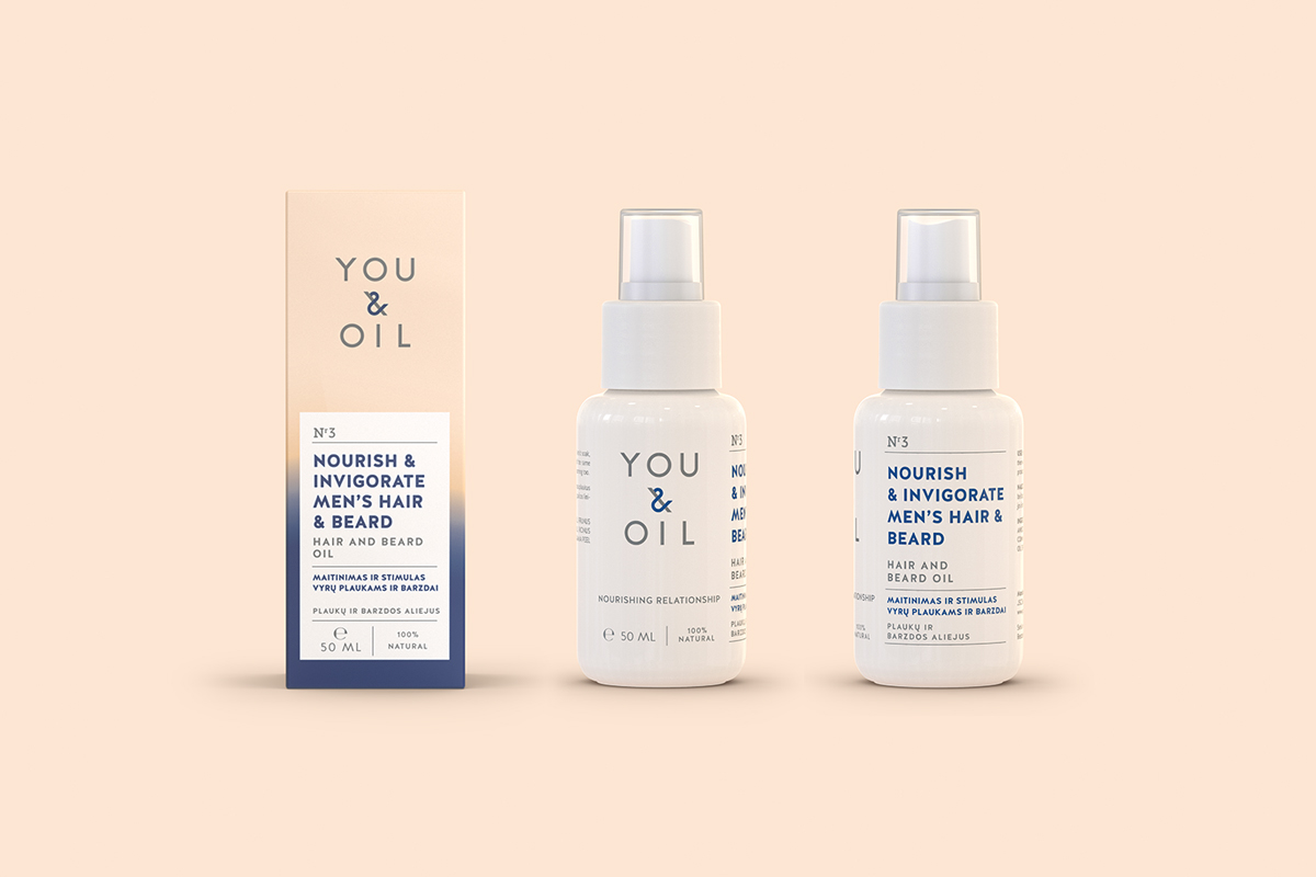
balance, energy, nutrition, calming effect and products for men.
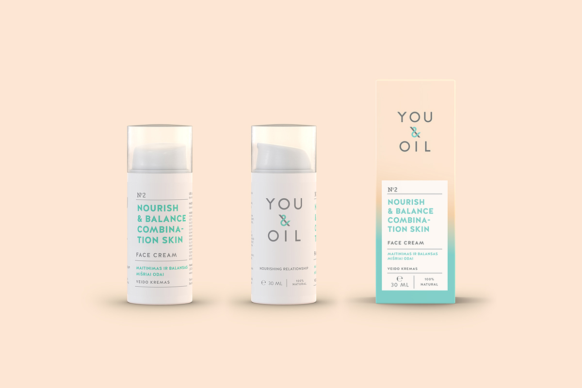
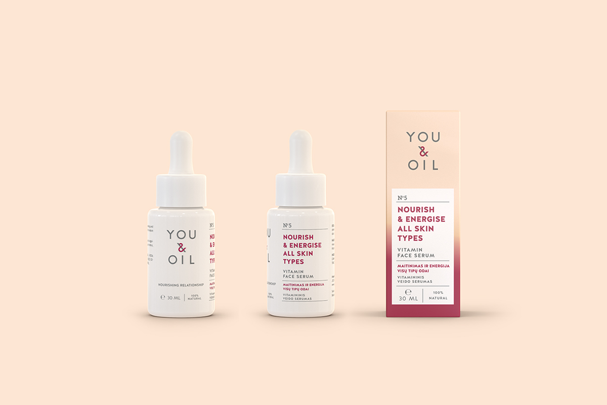
COMPETENCE. Redesigned logo, white "pharmaceutical" rectangles and lab-style numbering.
OIL EFFECT. Intensive color gradients symbolize the effect of oil on skin.
SENSORY EFFECT. Soft touch finishing conveys the feeling of healthy skin.
COMPETENCE. Redesigned logo, white "pharmaceutical" rectangles and lab-style numbering.
OIL EFFECT. Intensive color gradients symbolize the effect of oil on skin.
SENSORY EFFECT. Soft touch finishing conveys the feeling of healthy skin.


CREDITS
CLIENT
JSC Biokosmetikos manufaktūra
BRAND STRATEGY & IDENTITY INSIGHTS
Black Swan Brands: Giedrė Stabingytė, Andrius Skalandis
ART DIRECTION & DESIGN
Étiquette: Valerija Žilėnienė, Irmantas Savulionis, Algirdas Orantas
PHOTOSHOOT
Irmantas Savulionis, Valerija Žilėnienė
3D MODELLING
Tadas Svilainis
_
AWARDS
Lithuanian National Packaging Contest NAPA 2015, 1st prize at Health & Beauty category
_


