Cure + Care | Pharmacy Branding
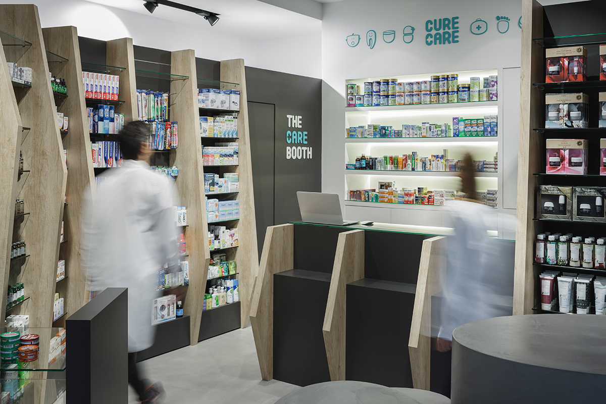
At our first meeting with our clients, it became clear to us that they did not want their pharmacy to be anything like any of the pharmacies out there. Our client needed a name that spoke to both types of clients, those buying medications and those buying cosmetic products. The final name Cure & Care did exactly that. It was a playful and elegant way to pair health and beauty.
For the logo design we redesigned Nord Bold rounded typeface to express the friendliness of Cure & Care brand.
More specifically, instead of using the typeface’s “A” we used the inverted version of “U, so the words Cure and Care could be seen as a reflection of one another. The logo incorporates a “plus” symbol into the C of Care, which plays a double role: as an “and” and as a pharmaceutical cross symbol. Obviously we had no intention of using standard pharmaceutical colors. That’s why we went for 326C Pantone, a brighter and friendlier version of green.