


HumanCentric
Branding, Stationery, & Web Design
Branding, Stationery, & Web Design
My first job after college was at HumanCentric, a multidisciplinary product design firm in Cary, NC. I started as a full-time contractor in December 2007, with the title “Digital Production Designer” working on mobile interfaces for Motorola’s iDEN division. By the summer of 2008 I had been hired on as a permanent employee with the title “Graphic Designer” until I was laid off in February 2009. The below pieces are all internal projects.
Holiday Card 2008
The first holiday season that I was employed as a Graphic Designer, I approached the Design Director about what the company did for holiday greetings. It turned out that the firm usually sent out a custom designed card to former and current clients and other contacts, but a card had not yet been created for the present year.
Since I had some free time on my workload and the design was basically needed NOW, I jumped right into work. Working with the Creative Director, I came up with ideas, presented them to the design team and the senior staff (including the CEO), made revisions, visited a print shop, did a press check and presented the final printed piece to the company. The work came in just in time to be sent out for the 2008 holiday season and we got a great response from the recipients.
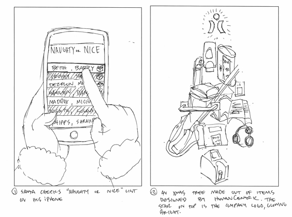
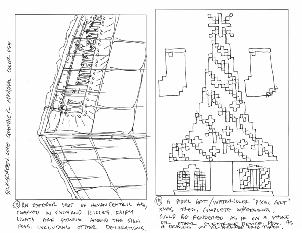
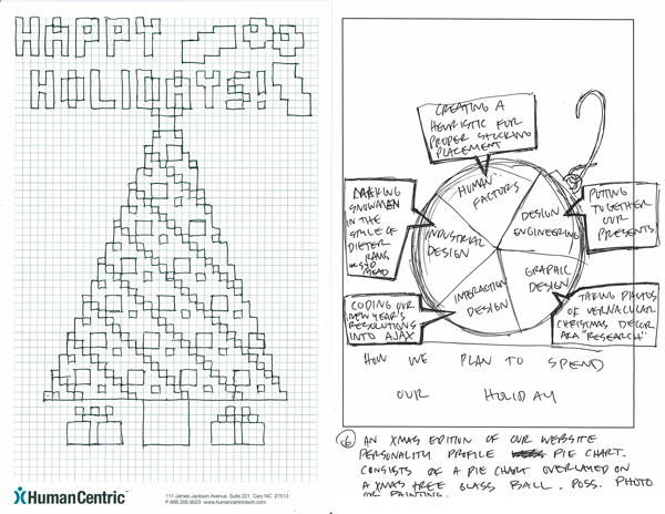
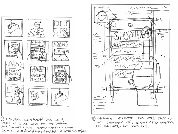
Initial Concepts

iSanta Concept

Product Christmas Tree Concept
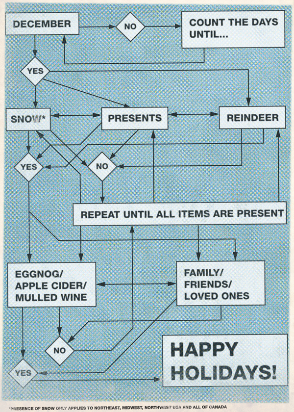
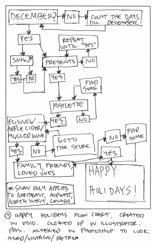
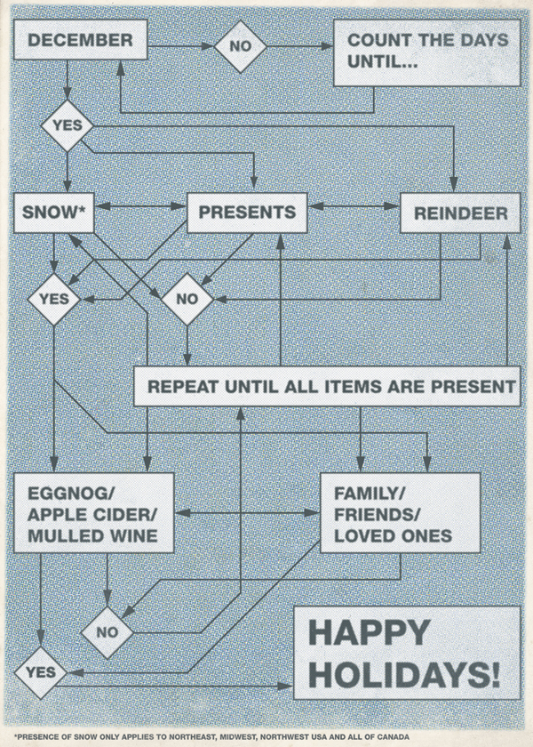
Happy Holidays Flowchart Concept
The basic brief for the card was to give recipients a peek inside our internal culture. HumanCentric is an interdisciplinary firm with a design team and a human factors team, so the card needed to solve the problem of portraying this collaborative environment in a creative way.
Holiday Card front
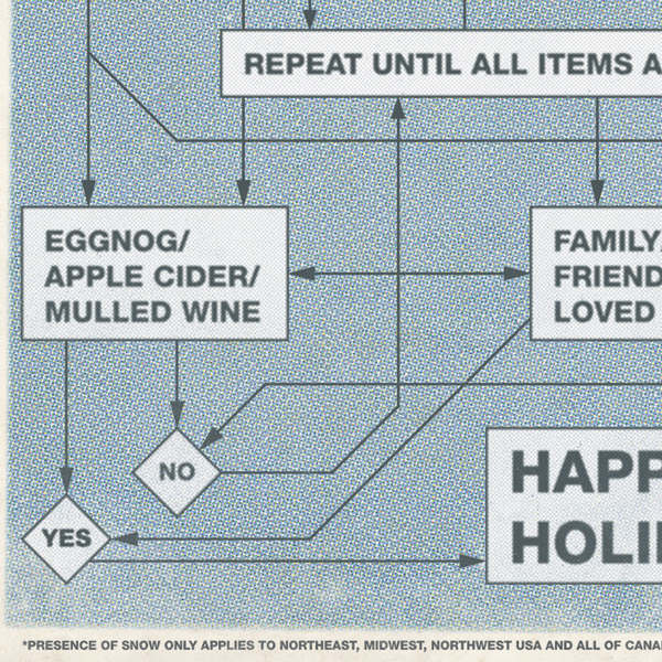
Detail of Card front

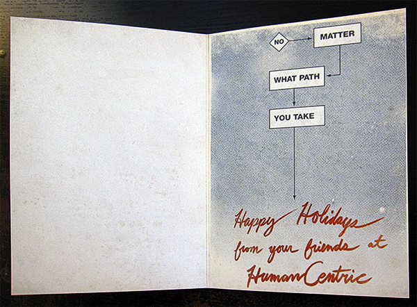
Layout of Card exterior
Layout of Card interior
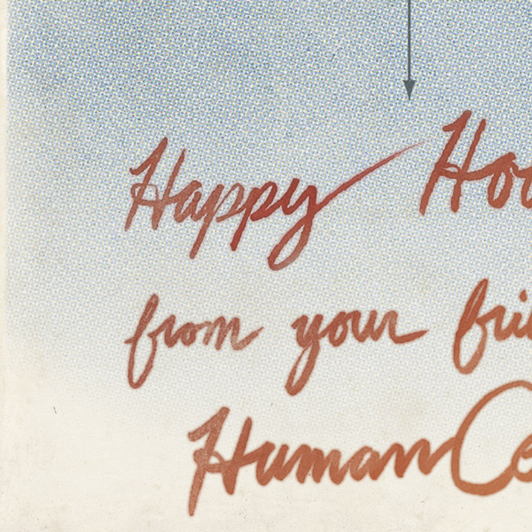
Detail of Card interior
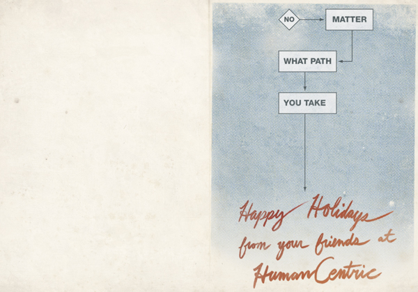
I thought that the idea of an absurd flow chart fit the best, and the members of the team that I presented this idea to agreed. I love creating and using found textures, treating Photoshop as a composition tool, not a primary source for images itself.
I wanted the card to look worn, cared for, and cherished. I think the interior signature pulls it all together, and was created primarily because there was not time for the card to be signed by everyone at the company.
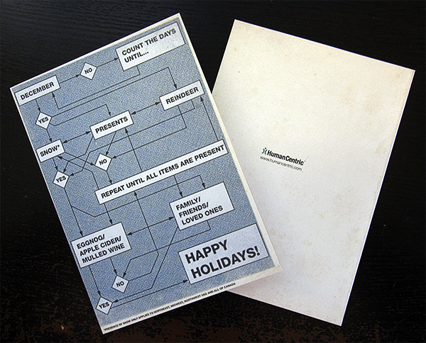
Photos of the finished card
Website Concepts
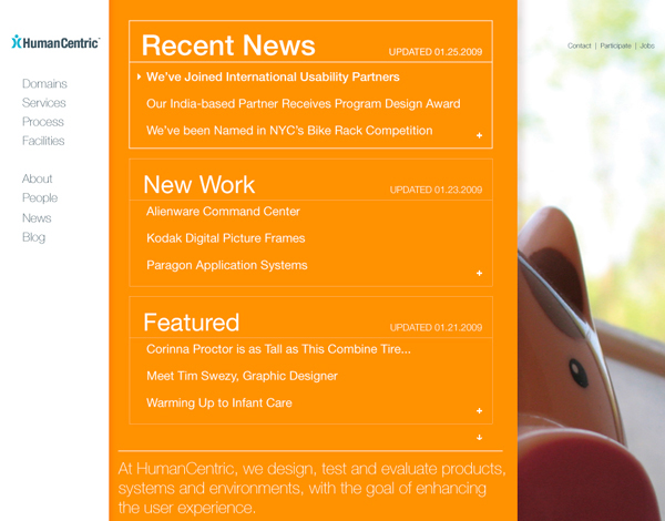
These are concepts I created for a redesign of the website. The designs are based on a preexisting grid, using already available media created by others (except for the flying pig on the green background which I shot). I focused on the home page and the proposed blog.
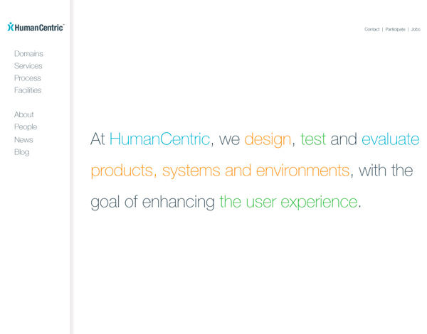
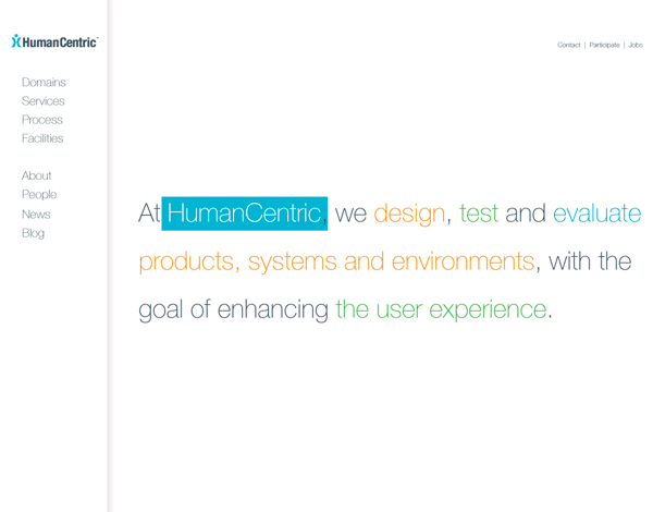
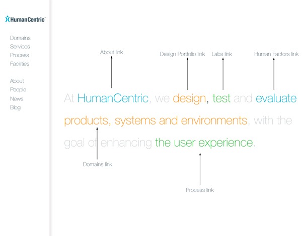
A concept employing a sentence-based navigation.
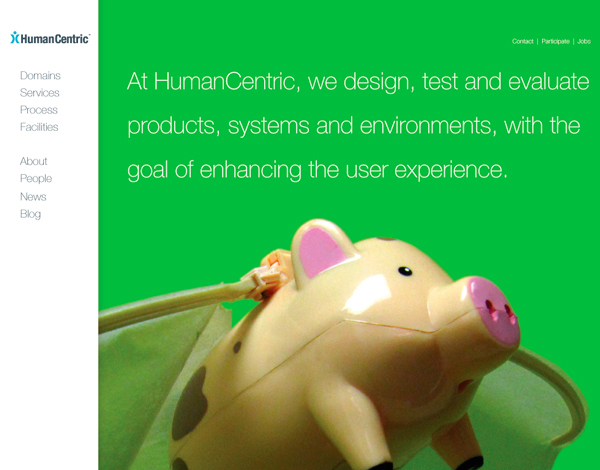
This set of images are concepts for the home page.
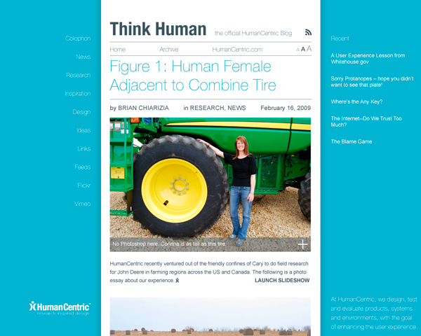
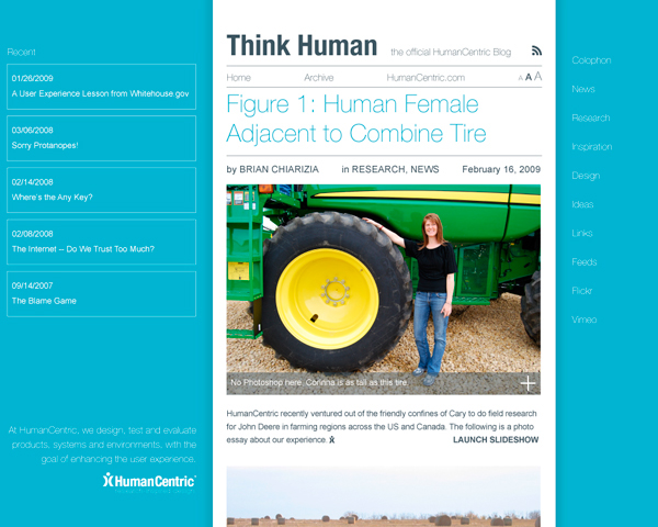
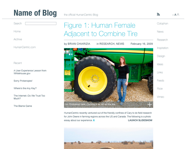
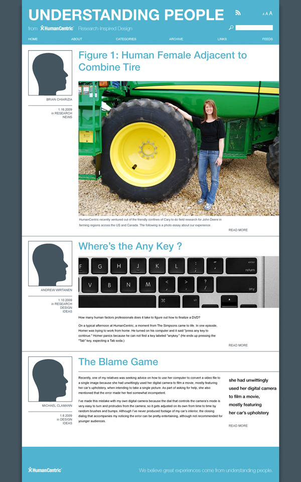
This set of images are concepts for the proposed blog.
Branding
This a collection of internal branding work. The firm has an interdisciplinary focus with about half of the company being human factors professionals and the other half being designers of various stripes. Both sides collaborate on projects and inform each other's work. As a result the internal culture was eclectic, humorous, friendly, and often sarcastic. The following items are culled from larger projects that I participated in. These projects were attempts at solidifying the company's branding internally so as to present a more unified whole to past, current, and future clients.
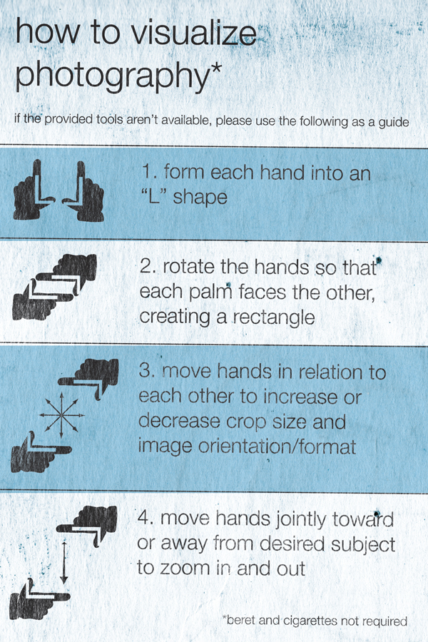
For a proposed branding guidelines book. Photography, especially related to user testing and the like, was considered an important part of the brand. Part of the brand refresh would have been to use more photography documenting the company's processes for creating work. To that end, those of us working on branding saw it as important to get everyone at the company, not just creative-types, to take more pictures. I thought a quick, tongue-in-cheek how-to would be great at making people more comfortable with the idea of photography.

Many co-workers and I were assigned on big long-term projects in mobile device interface design. The work included user interface graphics, creating and documenting user interface specifications and so on. The size and scope of many of the projects created a lot of stress. I thought the above diagram to be helpful in relieving tension. It ended up on a least a few cube walls after it made the rounds.
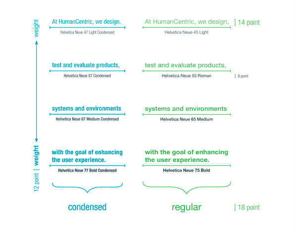
This is a page from the proposed branding guidelines book. Many non-designers do not always understand the intricacies of typography. So I created this diagram to illustrate common sizes and weights used throughout the company collateral materials.
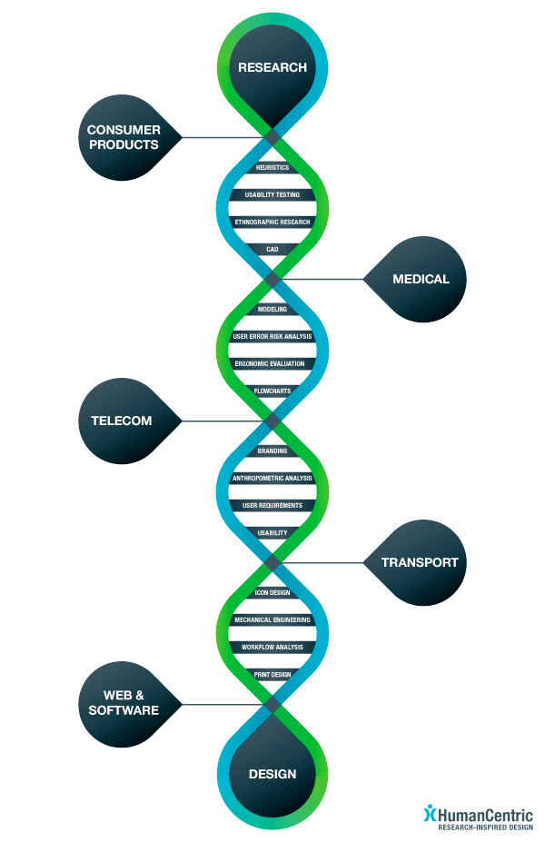
The above poster was designed to be the verso side of a mailer. The mailer would arrive folded up to 4.25"x5.5" and would fold out to 11"x17". The idea of showing the “DNA” of the company came from a brainstorming session where I was trying to find ways to express the intersections, and so, the interdisciplinary nature of projects at the company. Thinking about intersections led to drawing lots of crosses and x's. The DNA showed up because I needed the paths coming out of the intersections to fold back in to meet at the next intersection.
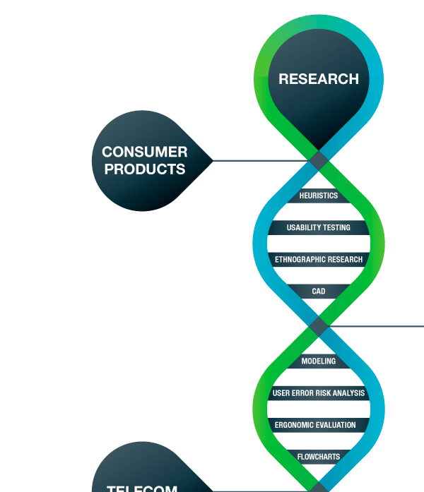
Detail of the above poster.


